Bento Grid
What is a Bento Grid?
A Bento Grid is a layout system that divides content into distinct, modular sections, similar to how a bento box divides food into compartments.
Each section can vary in size and shape, but is arranged in a structured tile-like manner.
If you need bento grid examples for inspiration, best practices to create a bento layout, or even an HTML/CSS template for a responsive bento UI design — keep reading.
Generate a bento grid with AI >
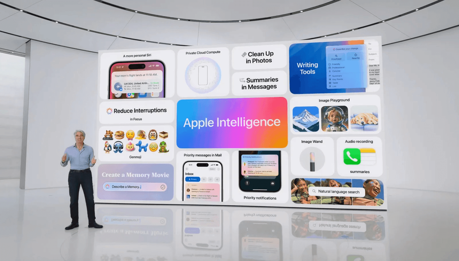
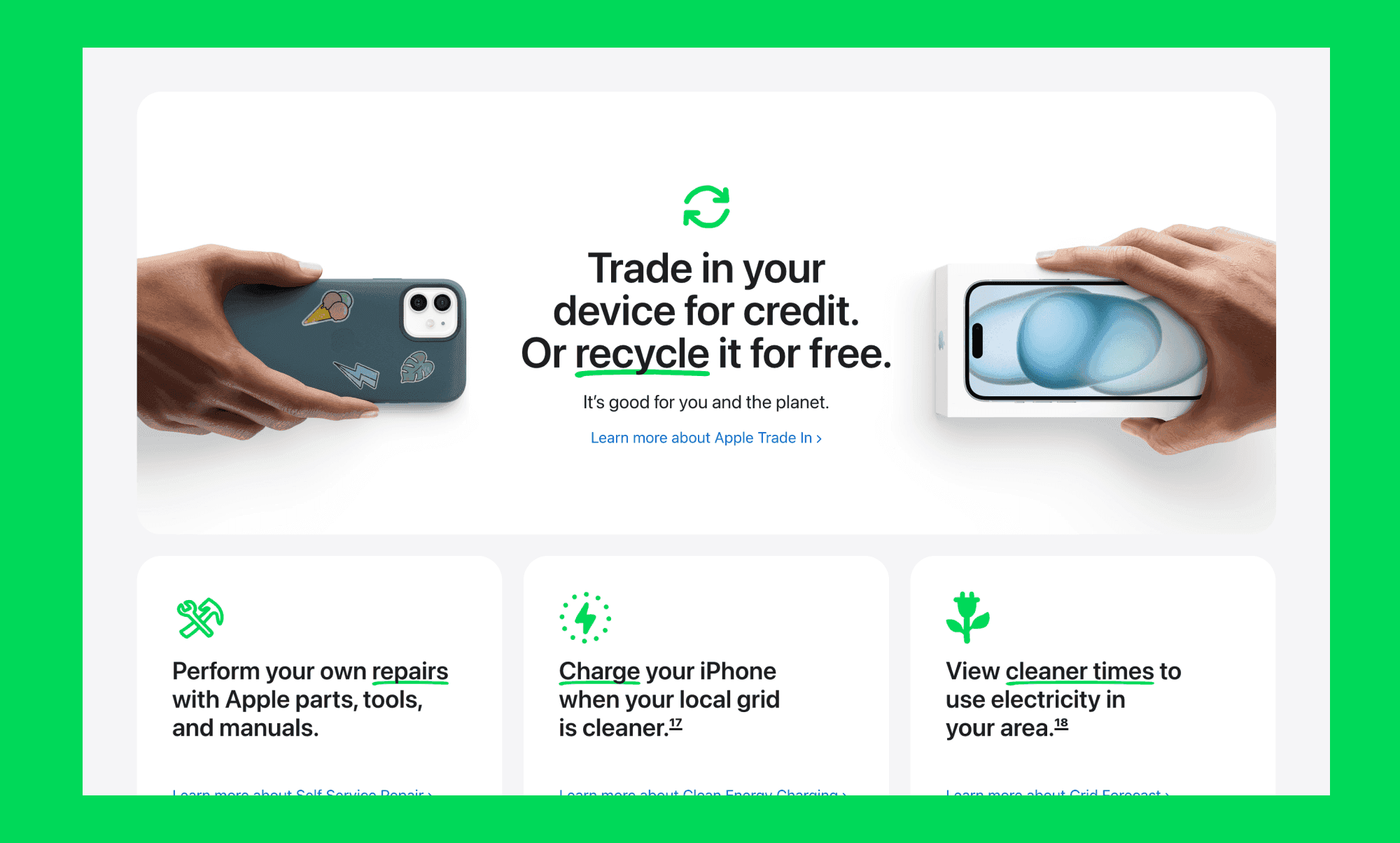
Apple’s Bento Grid Obsession
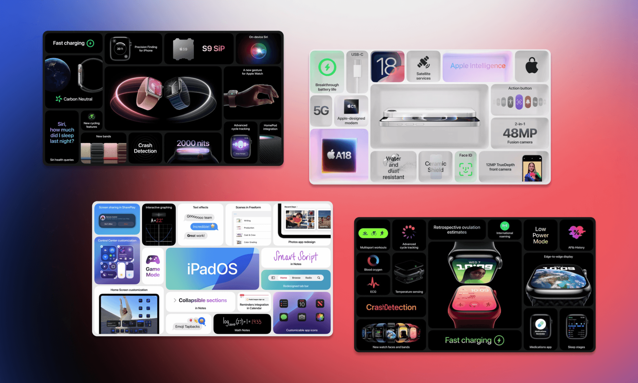
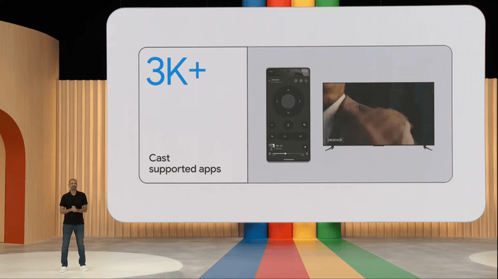
You were most likely introduced to a bento grid by Apple. It’s part of their keynotes, websites, product pages, manuals, and whatnot. The Apple bento grid usage became so popular that now it’s been quietly adapted even by competitors like Google.
Origins: From bento box to bento grid
Inspired by Japanese compartmentalized lunch boxes (called Bento Box), bento grids emerged as a modern UI/UX solution in the early 2020s.
Apple's adoption during product keynotes popularized the trend, legitimizing asymmetrical, modular layouts as an elegant alternative to rigid grid systems.
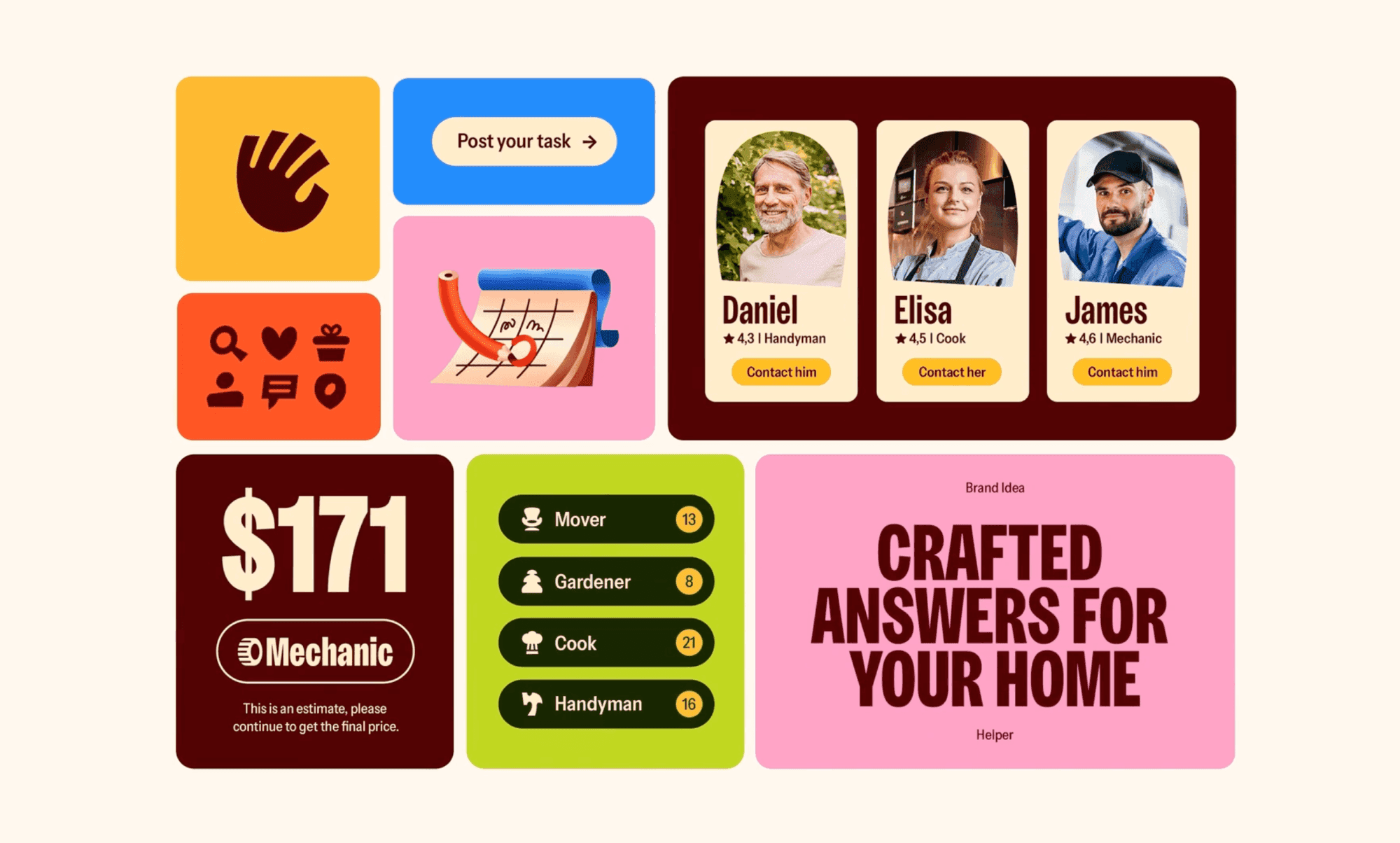
Examples of Bento Grid Layouts by Use Case
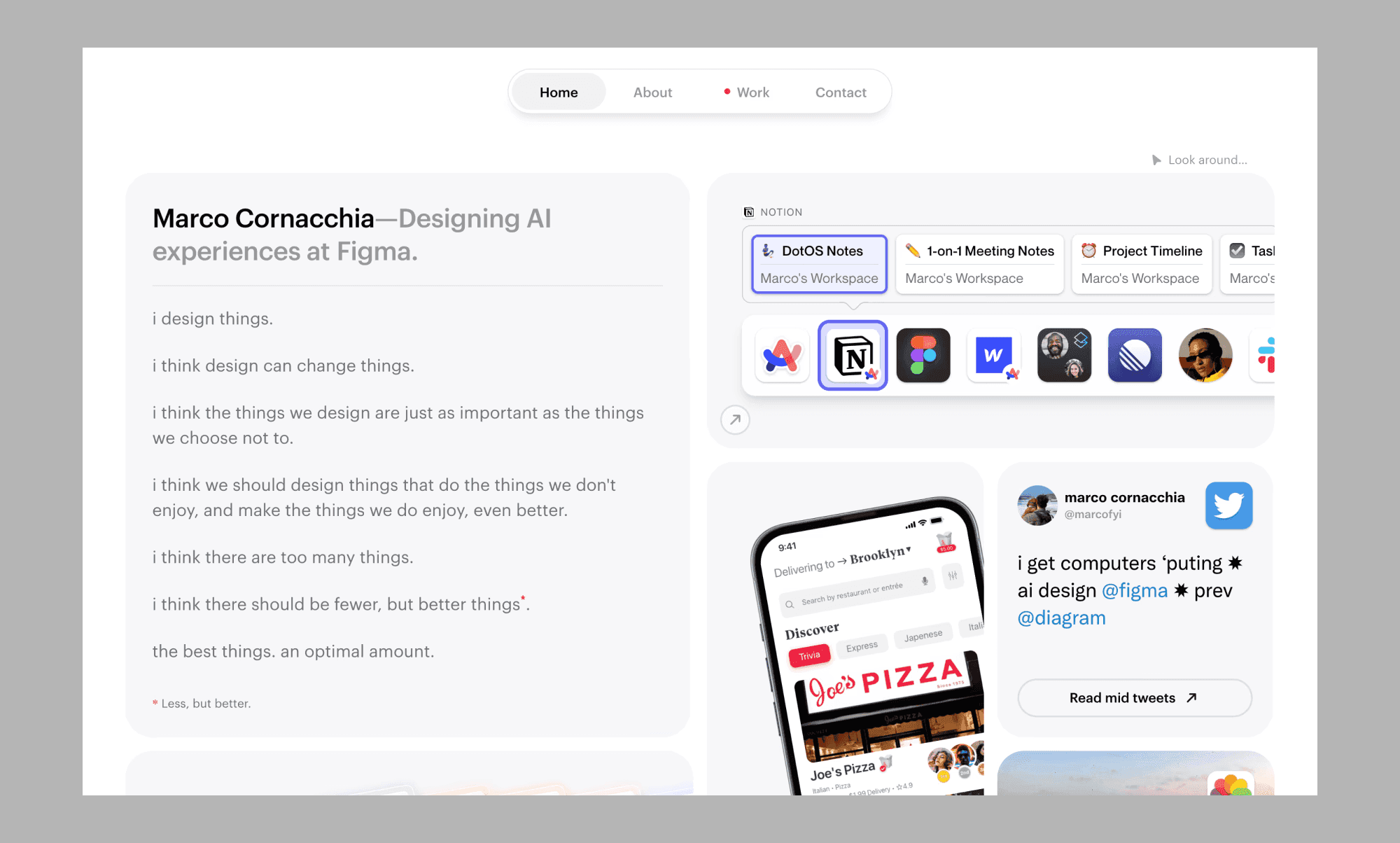
Portfolios
Bento Grids are ideal for portfolio websites, where showcasing a variety of projects in a clean and organized manner is crucial. Each project can be a separate module, allowing visitors to easily browse through your work.
Websites
E-commerce sites can use Bento Grids to display product categories, featured items, and promotions. The structured layout helps users find products quickly and enhances the overall shopping experience.
Presentations
Blogs and online magazines can benefit from Bento Grids by organizing content and images into distinct sections within 1 slide. This approach makes the content more digestible and engaging for readers.
Key Elements of a Bento Grid
Modular sections
Each section in a Bento Grid is a self-contained module that can hold different types of content. These modules can vary in size and shape, but they are arranged in a way that maintains the overall harmony of the layout.
Consistent margins and padding
Maintaining consistent margins and padding between modules is crucial for creating a visually appealing Bento Grid. This consistency ensures that each section is distinct yet part of a cohesive whole.
Responsive design
A key feature of Bento Grids is their adaptability to different screen sizes. Using responsive design techniques, you can ensure that your grid layout adjusts smoothly to various devices, providing an optimal viewing experience.
Visual hierarchy
Effective Bento box layouts in UI design use visual hierarchy to guide users' attention to the most important content. By varying the size and prominence of different modules, you can create a natural flow that directs users through your layout.
How to Create a Bento Grid (with Banani AI)
Step 1: Plan your content
Before creating a Bento Grid, plan out the content you want to display. Determine what types of content you have, such as images, text, videos, and how they should be grouped and prioritized.
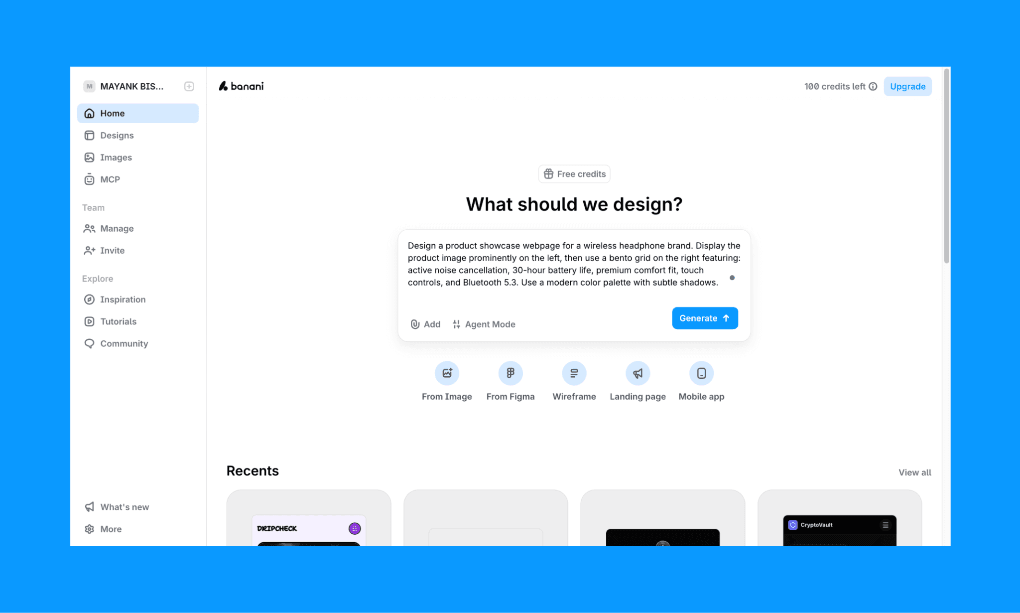
In Banani, log in (requires no credit card) and just type your prompt specifying that you’re looking for a bento grid. For example:
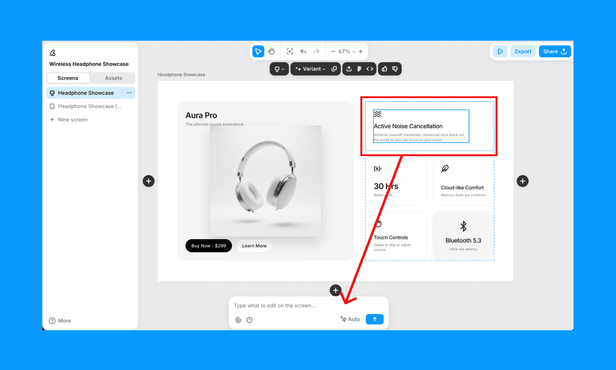
“Design a product showcase webpage for a wireless headphone brand. Display the product image prominently on the left, then use a bento grid on the right featuring: active noise cancellation, 30-hour battery life, premium comfort fit, touch controls, and Bluetooth 5.3. Use a modern color palette with subtle shadows.”
Step 2: Define your grid structure
Decide on the overall structure of your grid. Consider how many columns and rows you need and the relative sizes of each module. Sketching out a rough layout can help visualize the final design.
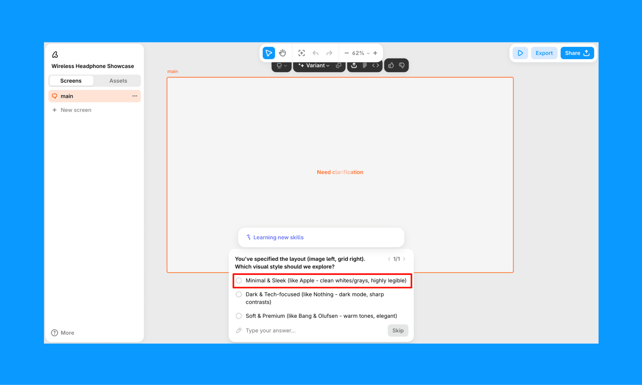
In Banani AI, the design Agent might ask you clarifying questions on the type of grid structure that you want (rows, columns, fitment, curves, etc.) and their colors as well. You can choose from its suggested option or type it in something specific.
Step 3: Design Each Module
Design the individual modules, ensuring they fit within the grid structure. Pay attention to the content within each module, using consistent margins and padding to maintain a clean and organized look.
Once Banani creates the bento grid, you can select any component and re-design it just by chatting with the AI chatbot in the canvas.
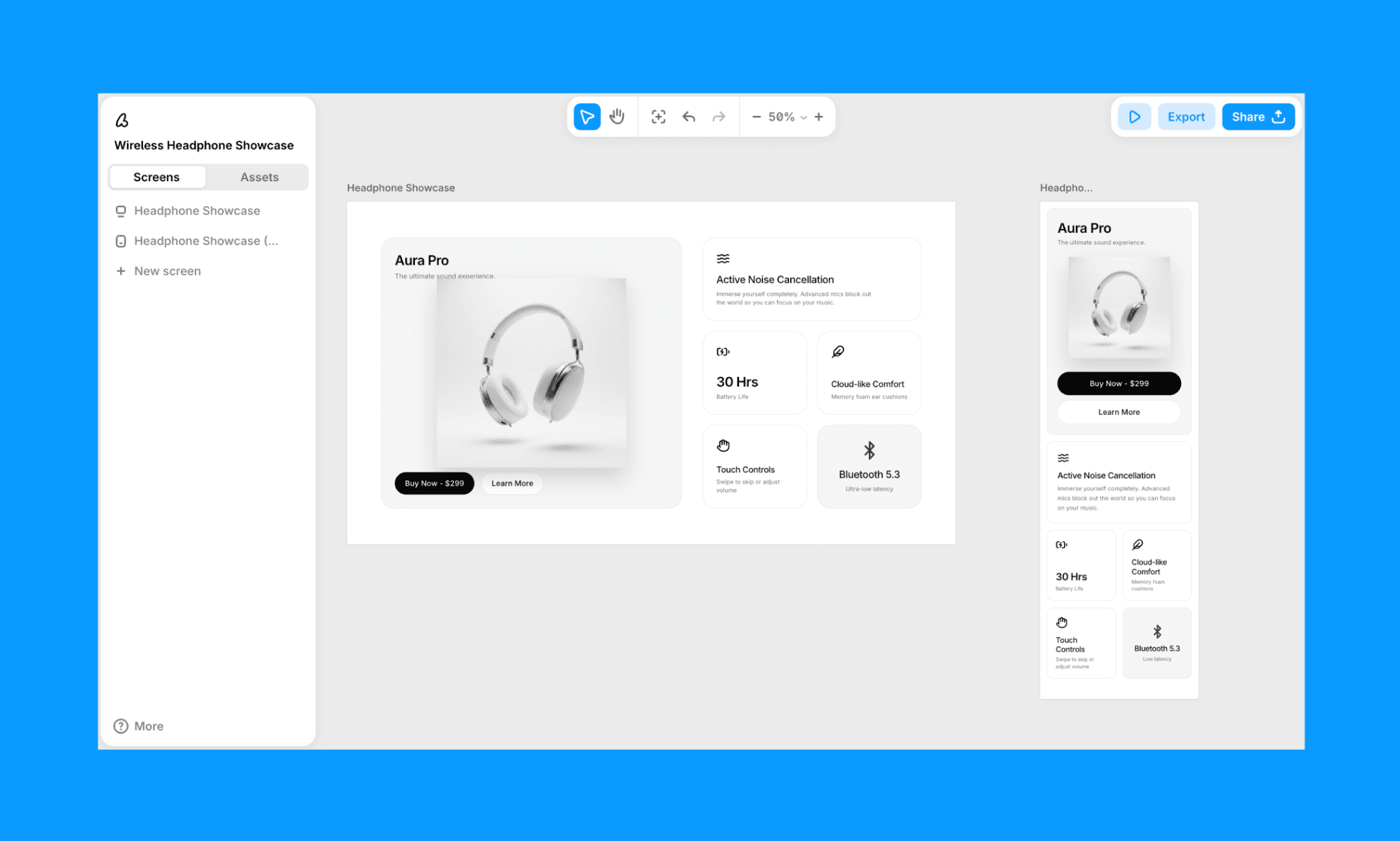
Step 4: Implement Responsive Design
Use CSS Grid or Flexbox to create a responsive Bento Grid. Define rules for how the grid should adjust on different screen sizes, ensuring that the layout remains cohesive and user-friendly.
To make the bento grid responsive in Banani, simply select your target screen, select the screen icon drop-down (here, desktop in example), and click generate mobile or desktop - whichever is applicable for you.
Step 5: Test and Iterate
Test your Bento Grid on various devices to ensure it looks and functions as intended. Gather feedback and make necessary adjustments to improve the overall usability and aesthetics of your layout.
With Banani, you can create unlimited variants of the bento grid just by selecting the desired screen and clicking on the ‘Variant’ drop-down. Edit and iterate as much as you need to perfect your bento design layout in both mobile and desktop.
Use Banani Bento Grid Creator, free >
HTML/CSS for a Bento Grid
When designers hand off Bento Grid designs to developers, the cleaner the code, the faster the implementation. HTML with CSS Grid and Flexbox should do the job (no JavaScript or frameworks needed). And a well-written bento grid code scales beautifully from desktop to mobile without redesign.
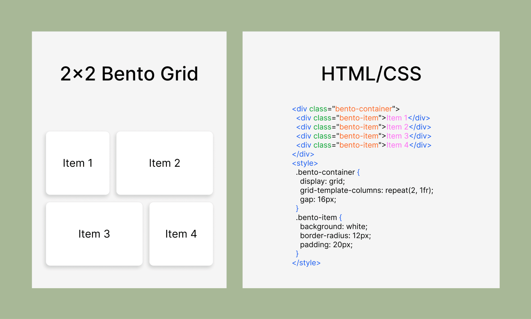
For example, the 2×2 Bento Grid shown above can contain a simple code structure like this:
<!-- HTML -->
<div class="bento-container">
<div class="bento-item">Box 1</div>
<div class="bento-item">Box 2</div>
<div class="bento-item">Box 3</div>
<div class="bento-item">Box 4</div></div>
<!-- CSS -->
<style>
.bento-container {
display: grid;
grid-template-columns: repeat(2, 1fr);
gap: 16px;
}.bento-item {
background: white;
border-radius: 12px;
padding: 24px;
min-height: 200px;}
</style>
Of course, you have to write boilerplate, make adjustments for box sizes, shadows, and others to get the final code.
Check out the Top Design-to-Code Tools of 2026 >
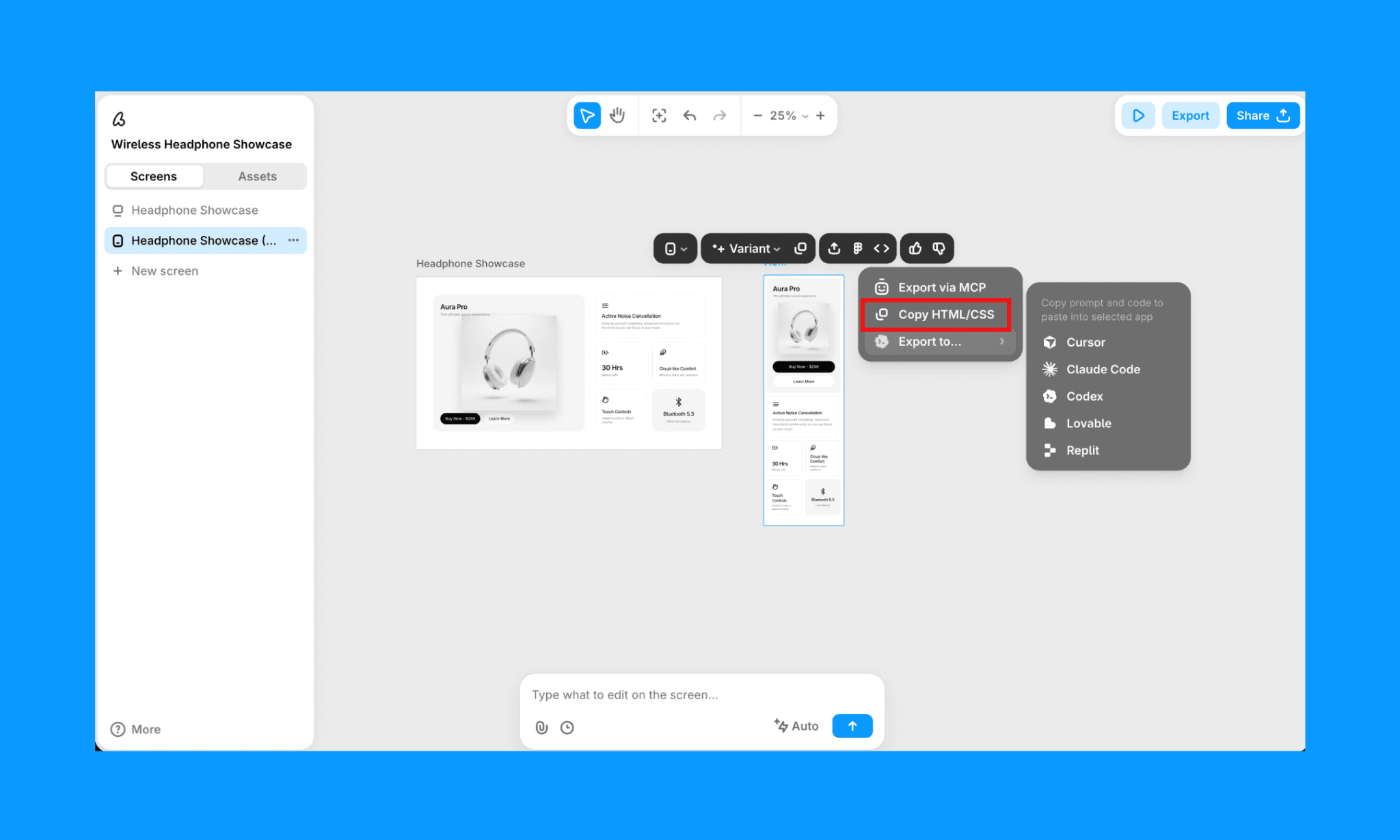
You can copy bento layout codes from an online template or use an AI coding agent or AI UI agent to help you write the code. If you use Banani AI, you can export your bento grid UI as clean HTML/CSS code with a click.
Summary
The Bento Grid is a versatile and visually appealing layout system that offers numerous benefits for web and UI design. By organizing content into modular sections, maintaining consistent margins and padding, and ensuring responsive design, you can create harmonious and user-friendly layouts.
FAQs on Bento Grid Layout
What is bento box design?
Bento box design is a layout system that organizes content into distinct, modular compartments of varying sizes. Each section holds a different element—images, text, features—arranged asymmetrically yet harmoniously to create visually appealing, organized interfaces.
Why is it called a bento?
The term "bento" comes from the traditional Japanese bento box viz. a compartmentalized lunch container where different foods occupy separate, neatly divided sections.
Web designers adopted this metaphor in UI/UX practices to describe modular, grid-based layouts that organize digital content the same way.
Why use a Bento grid layout?
The Bento grid system is effective for displaying a variety of content types in an organized and aesthetically pleasing way. Moreover, the size and placement of the box can help guide a user’s attention in the overall grid. A great way to show a lot without looking crammed up.
Can I create a bento grid design with AI?
Yes, bento grids can be designed using AI design agents, coding agents, and UI generators. If you use design-to-code platforms, you can not only design, but also export the code of your Bento grid.
Is there a free bento grid design generator?
Banani AI is a free bento grid generator. Especially useful for bento design layout in a mobile/web app UI. It lets you create a bento grid from a text prompt, edit it with its AI chatbot, and export it as Figma, code, or via MCP. No credit card required to get started!