Free Color Wheel & Color Palette Generator
Banani’s Color Wheel and Color Palette Generator helps you find beautiful color combinations instantly. Use our online color picker in HEX or RGB for UI design, websites, branding, presentations, and creative projects for free!
Curated directory of free design resources to help designers and developers create better user interfaces.
Pick a color
Pick a color
Palette type
Your Palette
How to use a color palette generator?
1
Pick a color
Choose a base color using the color wheel or HEX/RGB code.
Choose a base color using the color wheel or HEX/RGB code.
2
Select palette type
Click complementary, split, or monochromatic palette.
Click complementary, split, or monochromatic palette.
3
Copy and apply
Use your custom color palette in UI design, PPTs, or branding.
Use your custom color palette in UI design, PPTs, or branding.
Who uses color palette generator?
Online color palette generator are used by a variety of creative professionals and students alike. For instance, PMs use it for rapid UI design, vibe coders use it to create consistent color schemes in their AI app builders, and students to learn UI/UX fundamentals.
What is a Color Wheel?
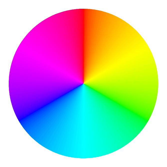
A color wheel is a circular chart that shows the relationship between all visible colors (to humans). It helps designers, artists, and creators understand color theory, explore color harmonies, and create balanced color combinations.
Who invented the color wheel?
Isaac Newton invented the color wheel in 1666 by mapping the visible light spectrum onto a circular format. It established the foundation for modern color theory and design principles.
How to use the color wheel?
Start by selecting a base color on the wheel. Use color harmony rules find combinations that work. With our free color wheel tool, you can instantly generate palettes based on these rules. You can take it further by vibe designing with Banani AI.
What is Color Theory?
Ever wondered how designers and artists craft perfect color schemes? They rely on color theory, a blend of art and science that helps determine which colors work well together. The concept of the color wheel lays the foundation of color theory.
Color Harmony
Color Harmony
Colors that work well together create what’s known as a "color harmony." Designers use these harmonies to achieve specific visual effects. The color wheel helps identify these harmonies through various color combination rules, enabling designers to create pleasing and effective color palettes.
Colors that work well together create what’s known as a "color harmony." Designers use these harmonies to achieve specific visual effects. The color wheel helps identify these harmonies through various color combination rules, enabling designers to create pleasing and effective color palettes.
What are the main types of color harmonies?
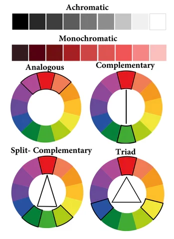
There are 4 main types of color harmonies: Monochromatic, Analogous, Complementary, Split-complementary, and Triadic.
What are the main types of color harmonies?
There are 4 main types of color harmonies: Monochromatic, Analogous, Complementary, Split-complementary, and Triadic.
Types of Color Wheels
Types of Color Wheels
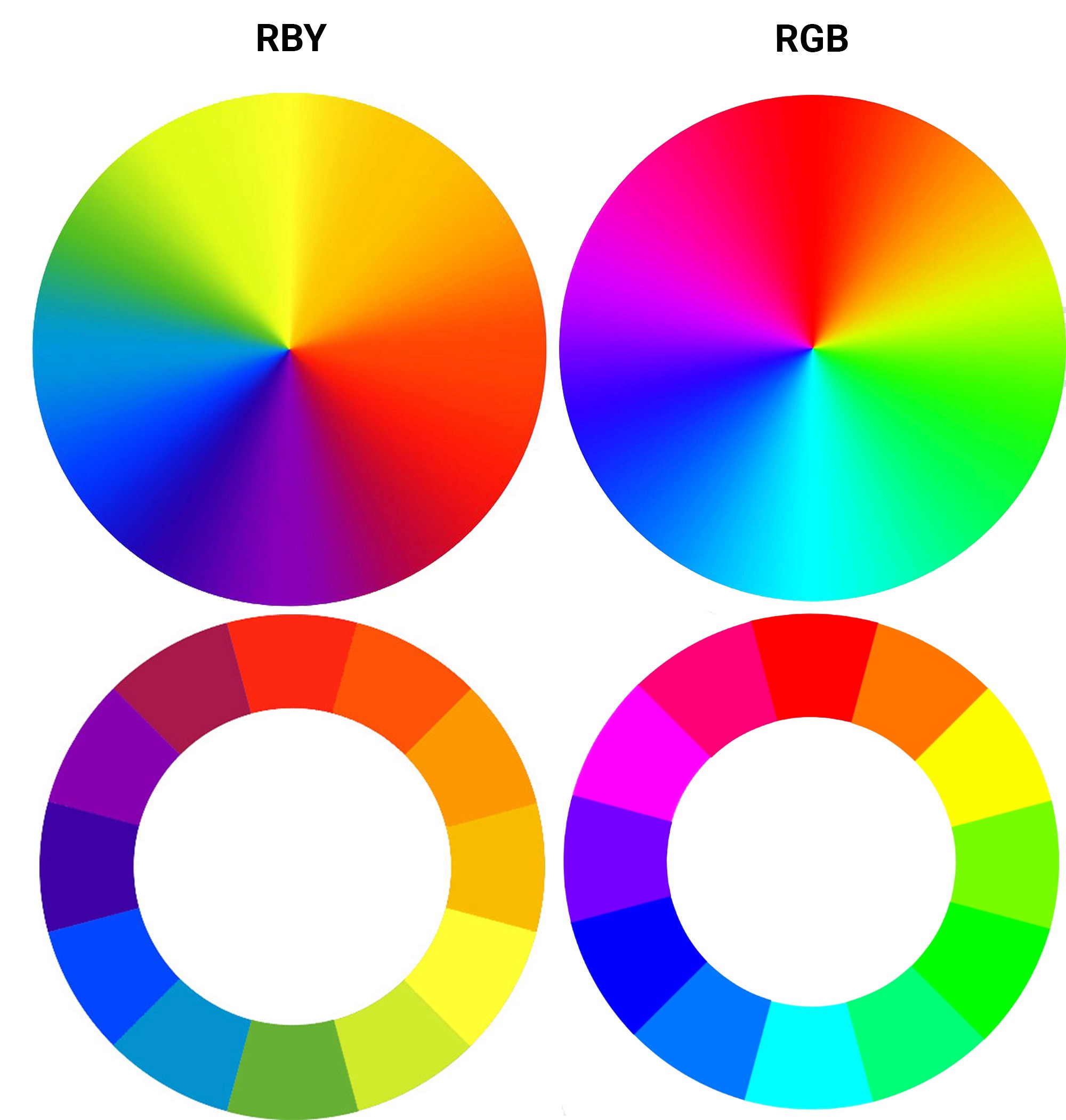
RYB Color Wheel
Used by artists for mixing paint colors. It includes primary colors (red, yellow, blue), secondary colors (orange, green, purple), and tertiary colors (red-orange, yellow-orange, etc.).
RGB Color Wheel
Designed for digital screens and online use, focusing on light mixing. It includes primary colors (red, green, blue) and secondary colors (cyan, magenta, yellow).
RYB Color Wheel
Used by artists for mixing paint colors. It includes primary colors (red, yellow, blue), secondary colors (orange, green, purple), and tertiary colors (red-orange, yellow-orange, etc.).
RGB Color Wheel
Designed for digital screens and online use, focusing on light mixing. It includes primary colors (red, green, blue) and secondary colors (cyan, magenta, yellow).
Color Combinations
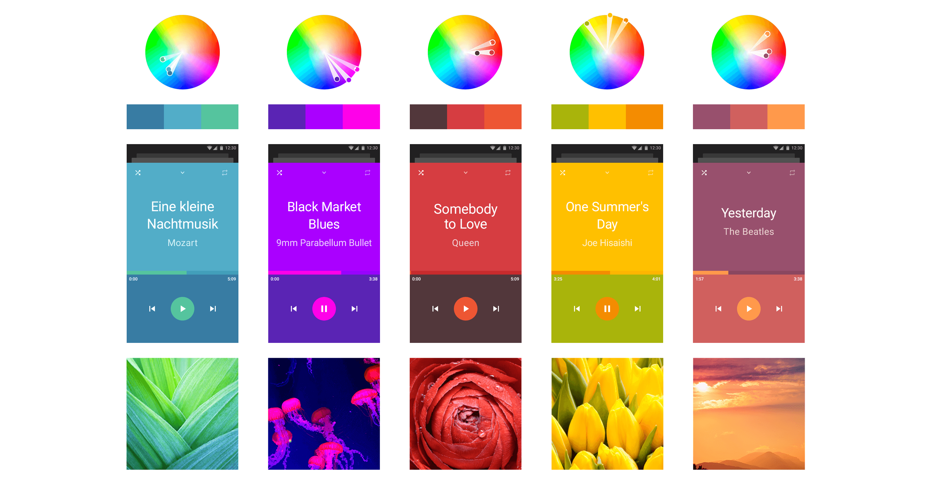
Complementary Colors
Colors located directly opposite each other on the wheel, creating high contrast and vibrant visuals.
Monochromatic Colors
Different shades, tints, and tones of a single base color, providing a subtle and cohesive look.
Analogous Colors
Three adjacent colors on the wheel, creating a harmonious but potentially overwhelming scheme. Use one dominant color with the others as accents.
Triadic Colors
Three colors evenly spaced on the wheel, offering high contrast but with more balance than complementary schemes.
Tetradic Colors
Four colors evenly spaced around the wheel, forming a rectangle. This color scheme works best when you need one dominant and other accent colors.
Split-Complementary Colors
A base color paired with the two colors adjacent to its complement, creating contrast with a softer.
Complementary Colors
Colors located directly opposite each other on the wheel, creating high contrast and vibrant visuals.
Monochromatic Colors
Different shades, tints, and tones of a single base color, providing a subtle and cohesive look.
Analogous Colors
Three adjacent colors on the wheel, creating a harmonious but potentially overwhelming scheme. Use one dominant color with the others as accents.
Triadic Colors
Three colors evenly spaced on the wheel, offering high contrast but with more balance than complementary schemes.
Tetradic Colors
Four colors evenly spaced around the wheel, forming a rectangle. This color scheme works best when you need one dominant and other accent colors.
Split-Complementary Colors
A base color paired with the two colors adjacent to its complement, creating contrast with a softer.
How do I create a complementary color scheme?
In our color wheel, choose one base color, then select the color directly opposite itself to create a complementary color scheme.
Complementary color schemes create strong contrast, vibrant visuals, and balanced palettes commonly used in popular mobile app UI interfaces.
In our color wheel, choose one base color, then select the color directly opposite itself to create a complementary color scheme.
Complementary color schemes create strong contrast, vibrant visuals, and balanced palettes commonly used in popular mobile app UI interfaces.
What is the 60/30/10/10 color rule?
The 60/30/10/10 rule helps balance colors in design. The idea is to use 60% primary color, 30% secondary color, and two 10% accent colors to create visually balanced design. It’s one of the most fundamental and universal design rules applied by professional visual artists.
Using Banani AI, you can design UI following 60/20/10/10 rule or other color rules simply with a text prompt.
The 60/30/10/10 rule helps balance colors in design. The idea is to use 60% primary color, 30% secondary color, and two 10% accent colors to create visually balanced design. It’s one of the most fundamental and universal design rules applied by professional visual artists.
Using Banani AI, you can design UI following 60/20/10/10 rule or other color rules simply with a text prompt.
Color Categories
Color Categories
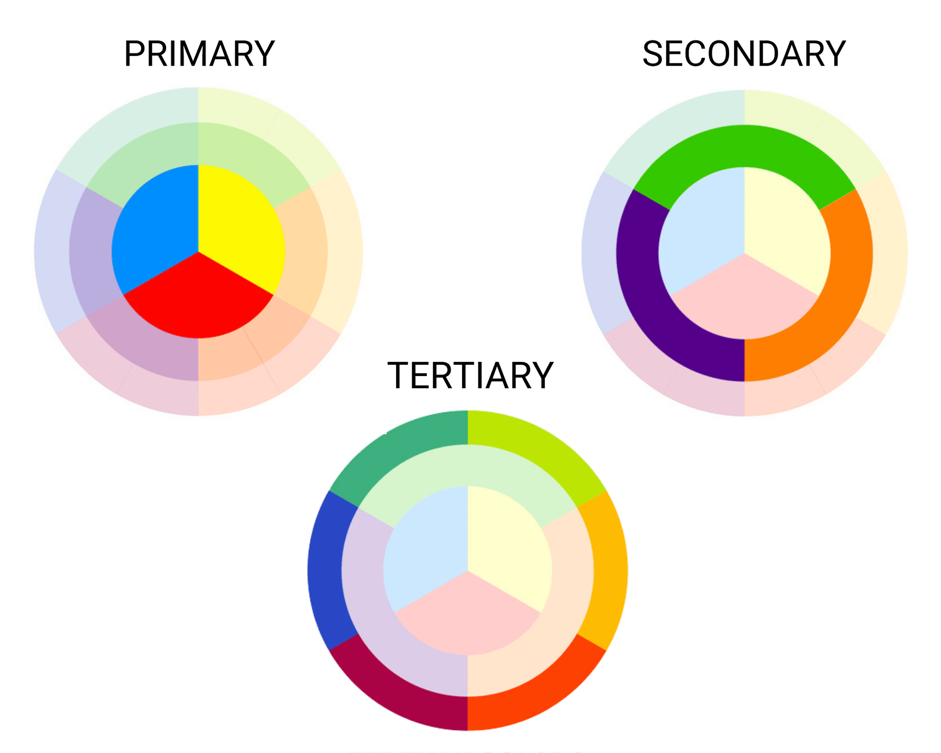
Primary Colors
In the RGB wheel: red, green, blue. These colors mix to create white light. In the RYB wheel: red, yellow, blue. These are foundational colors that mix to create secondary colors.
Secondary Colors
In the RGB wheel: cyan, magenta, yellow.
In the RYB wheel: purple, orange, green.
Tertiary Colors
Colors created by mixing a primary color with a secondary color, adding complexity to your palette.
Primary Colors
In the RGB wheel: red, green, blue. These colors mix to create white light. In the RYB wheel: red, yellow, blue. These are foundational colors that mix to create secondary colors.
Secondary Colors
In the RGB wheel: cyan, magenta, yellow.
In the RYB wheel: purple, orange, green.
Tertiary Colors
Colors created by mixing a primary color with a secondary color, adding complexity to your palette.
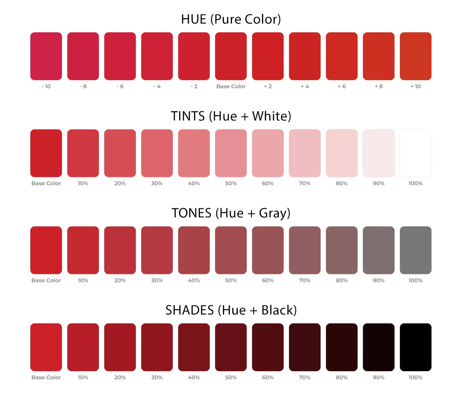
Shades, Tints, and Tones
Shades, Tints, and Tones
Shade
Created by adding black to a base hue, resulting in a darker and more dramatic color.
Tint
Formed by adding white to a base hue, making the color lighter and softer.
Tone
Produced by mixing black and white (or grey) with a base hue, creating a more nuanced version of the color.
Shade
Created by adding black to a base hue, resulting in a darker and more dramatic color.
Tint
Formed by adding white to a base hue, making the color lighter and softer.
Tone
Produced by mixing black and white (or grey) with a base hue, creating a more nuanced version of the color.
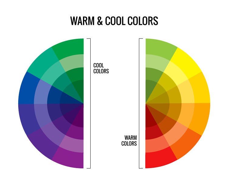
Warm and Cool Colors
Warm and Cool Colors
Warm Colors
Range from red to yellow, evoking feelings of warmth and energy.
Cool Colors
Range from blue to green and purple, associated with calmness and tranquility.
Warm Colors
Range from red to yellow, evoking feelings of warmth and energy.
Cool Colors
Range from blue to green and purple, associated with calmness and tranquility.
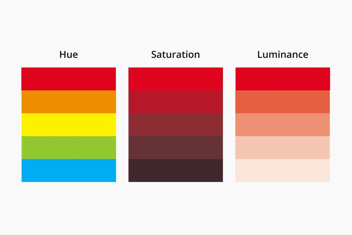
Hue, Saturation, and Luminance
Hue, Saturation, and Luminance
Hue
Any individual color on the color wheel.
Saturation
The intensity or purity of the color.
Luminance
The brightness or darkness of the color.
Hue
Any individual color on the color wheel.
Saturation
The intensity or purity of the color.
Luminance
The brightness or darkness of the color.
FAQs
How many colors are on the color wheel?
The standard color wheel has 12 colors: 3 primary colors, 3 secondary colors, and 6 tertiary colors arranged in a circular format to show color relationships and harmonies.
How does the color palette generator work?
A color palette generator uses color theory rules to create matching color combinations from a selected base color. It can generate complementary, monochromatic, analogous, triadic, and custom color palettes instantly.
What are good 3 color combos?
It’s quite subjective, but the most popular of the 3-color combos include blue-white-orange, black-white-red, green-beige-brown, and navy-cyan-purple. Use these and more in mobile/web UI with Banani AI.
How do I share my custom color palettes?
Using an color palette generator, you can copy HEX or RGB codes, export palettes, or share screenshots. If you want to use your palette in actual UI generation, Banani lets you generate interfaces with your custom colors and share them through preview links.
Can ChatGPT tell me my color palette?
Yes, ChatGPT can suggest color palettes based on moods, themes, brands, or reference images. For applying colors with AI to UI designs, tools like Banani work better.
What is an ideal contrast ratio for accessibility?
For accessibility, WCAG recommends a minimum contrast ratio of 4.5:1 for normal text and 3:1 for large text or UI elements to ensure readability across devices and users.
Is there an AI to generate UI in desired color combination?
Yes. AI UI tools like Banani can generate interfaces using your preferred color combinations, brand palettes, or reference styles. You can apply custom colors to new UI design or an existing UI screenshot – simply by chatting with its AI.
Curated directory of free design resources to help designers and developers create better user interfaces.
Need Color Inspirations?
Browse and edit the best-designed apps to save time on color palette research.
Browse and edit the best-designed apps to save time on color palette research.







TOOLS
Image to Figma
TOOLS
Image to Figma
TOOLS
Image to Figma
TOOLS
Image to Figma