While AI UI tools promise to eliminate the blank canvas and accelerate execution, their real value depends on who is using them and at what stage. That’s why we evaluated the leading AI UI makers based on output fidelity, Figma compatibility, free tier value, pricing, and overall workflow efficiency.
tl;dr: 2026 Top AI UI Design Tool
Features of AI UI Generator | Top examples |
Overall AI UI/UX designer | |
Prompt-based AI UI designers | |
Image-based AI UI designers | |
Figma-native AI UI designers | |
Responsive AI UI designers | |
Design-to-Code UI designers |
What is an AI-powered UI Generator
An AI-powered UI generator is a tool that uses artificial intelligence to transform user intent into functional digital interfaces. This intent can be input in the form of text prompts, screenshots, sketches, or even an existing app wireframe. The output can be low- to high-fidelity editable UI. For mobile, desktop, or both simultaneously. Many AI UI creator software go a step further with developer handoff features via Figma export, MCP, and code generation.
These modern AI UI tools aim to enable even non-designers to focus on ideation of their app or website design over pixel-pushing busywork.
AI Tool for UI vs UX vs Wireframing
While used interchangeably, these three terms (and consequently their tools) represent distinct design stages. AI wireframing tools focus on low-fidelity structural blueprints. AI UX tools prioritize user flows and interactivity. AI UI generators handle the look & feel, such as colors, typography, and iconography.
Latest AI design platforms blend elements of all three, but specialized tools are still required for easy collaboration, deep research, and production-ready output.
Read more about How to Design a User Interface Using AI
AI for UI Design Tool Comparison
AI UI Tool | Key Feature | Best For | Free Plan | Paid Plan |
Banani | 360° UI/UX + wireframing with MCP & code export | Founders, PMs, MVP builders | 20 generations/mo | $12/mo Individual, $17/mo/seat Team |
Uizard | Autodesigner 2.0 + AI heatmaps | Non-designers, rapid ideation | 2 projects, 3 AI gens/month | $12/mo user, $39/mo Business |
UX Pilot | Prompt-based flows + predictive heatmaps | UX validation teams | 7 screens, 45 credits | $14/mo Standard, $31/mo Team |
Google Stitch | Gemini-powered UI + Figma copy export | Quick UI drafts, dev scaffolding | 350 Standard + 200 Experimental gens | No paid plan |
Visily | Sketch/screenshot to editable UI | Workshops, early wireframing | 2 boards, 300 AI credits | $11/user/mo Pro |
Miro AI | Sticky notes to structured UI diagrams | Cross-team planning | 3 boards (no AI Prototype) | $8/mo Starter, $20/mo Business |
Figma Make | Create an editable Figma UI from a text prompt | Design teams in Figma | Not available on free tier | $16/mo Pro (3,000 AI credits) |
Relume AI | AI sitemap + wireframe generator | Marketing websites | 1-page project with limited AI ability | $18/mo Starter, $40/mo Pro |
Framer | Prompt to a responsive live website | Landing pages, live deployment | Free with subdomain | $10/mo Basic, $30/mo Pro |
Webflow | AI website builder with production CMS | Scalable marketing sites | 2 pages, limited AI | $14/mo Basic, $23/mo CMS |
Builder.io | UI to semantic frontend code | Dev teams, JS frameworks | 6 users, 60 Agent Credits | $24/mo user, $40/mo Team |
Locofy | UI to framework-ready code export | Frontend dev teams | Limited AI conversion | $0.40/token or $399/year Starter |
* Note: The monthly pricing plans are costlier for each tool, and some of them have an additional subscription plan for large teams and add-ons.
Banani: 360° AI UI/UX & Wireframing
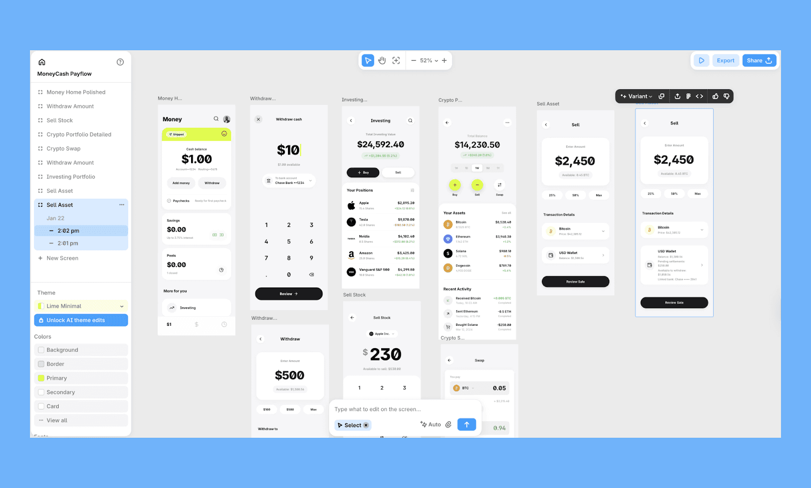
Popular for designing stunning UIs with AI, Banani is a high-fidelity AI UI copilot. Ideal for PMs and non-designer founders who want branding adaptation and layout variations —for both mobile and app UI.
You can start with a prompt, or go for screenshot-to-UI generation, and then hand off design to a developer via Figma, its MCP, or a simple one-click code export.
Key features of Banani AI UI designer
Generate up to 5 variants of UI flows from one prompt/image
Create desktop and mobile designs on the same canvas
Export to Figma or one-click production-ready code
Regenerate sections/elements of a design
Connect to AI coding agents via MCP support
Best use case of Banani
Founders validating product ideas without design teams
PMs building polished MVP demos fast
Startups iterating UI concepts before development
Price of Banani
Free plan: 20 free generations per month. Limited edits.
Paid plan: Individual plan starts at $12/mo (billed annually) with 100 credits. Team plan from $17/mo/seat (billed annually).
Best Prompt-based AI UI Designers
Uizard
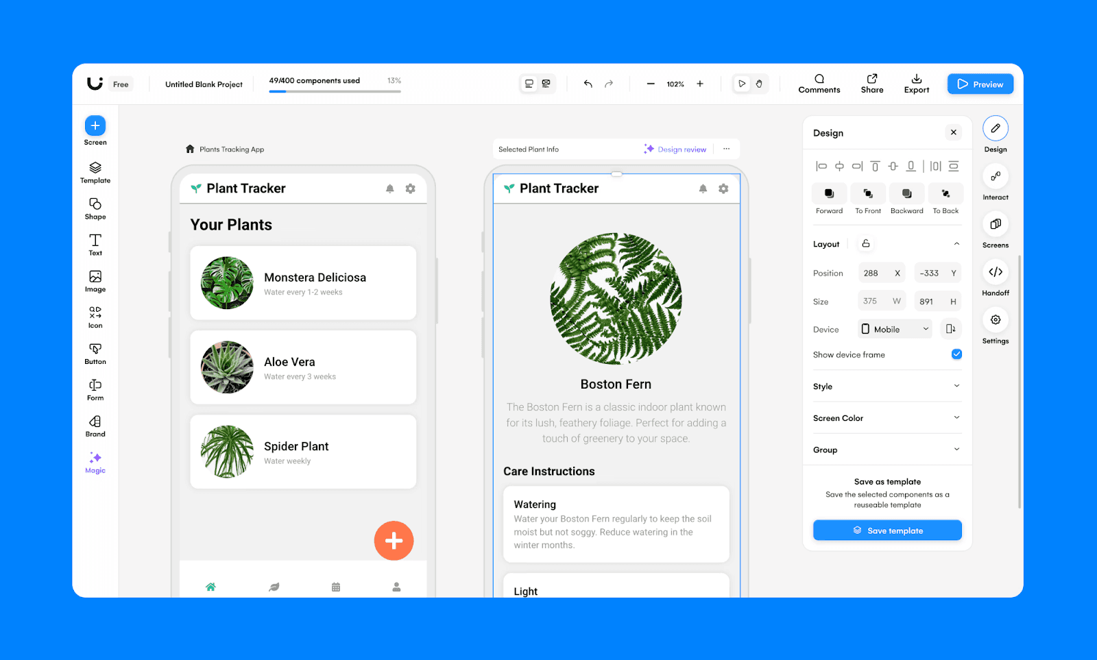
Uizard is a leading AI-powered prototyping tool designed for rapid ideation. By utilizing its "Autodesigner 2.0" engine, it transforms simple text prompts or hand-drawn sketches into editable, multi-screen mockups, making it a go-to for non-designers and fast-moving product teams.
Key features of Uizard AI UI designer
Generate multi-screen projects and themes from a single text prompt
Turn hand-drawn sketches or screenshots into editable UI mockups
Create AI heatmaps to predict user interaction with Focus Predictor
Apply consistent brand styles across your project using a URL or an image
Real-time collaboration and drag-and-drop adjustment tools
Best use case of Uizard
Quick UI visualization for founders without design experience
Early-stage prototype creation by PMs to align teams and stakeholders
Price of Uizard
Free plan: Includes 2 projects, 10 templates, and 3 AI generations per month
Paid plan: Individual plan starts at $12/mo/user (billed annually) for 100 projects and 500 AI generations. Business plan from $39/mo/seat (billed annually).
UX Pilot
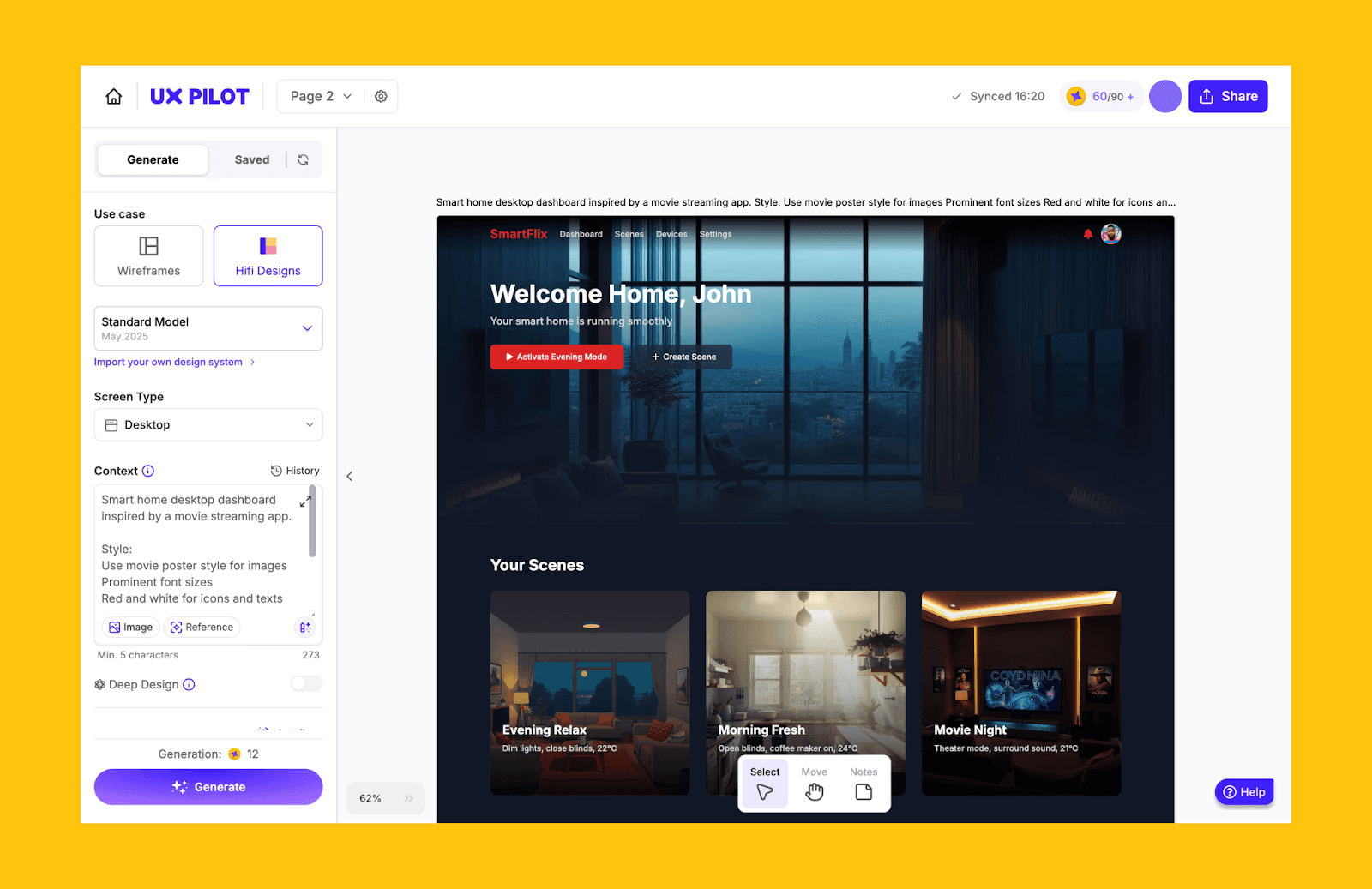
UX Pilot is a UI and UX AI platform built for teams that care about structure as much as visuals. It excels at understanding complex, multi-layered prompts to generate logically connected screen flows and wireframes. It also combines high-fidelity screen generation with predictive heatmaps, usability analysis, and structured flow creation.
Key features of UX Pilot AI UI designer
Create connected user journeys from a single prompt
Iterate on specific sections of a screen using text prompt
Simulate user attention with AI-powered heatmaps
Scan designs for accessibility issues and WCAG compliance
Export to Figma or generate frontend-ready code
Best use case of UX Pilot
Product teams validating UX decisions before development
Designers who want usability insights alongside UI generation
Agencies defending design decisions with data-backed visuals
Price of UX Pilot
Free plan: Up to 7 screens. 45 credits offered one time
Paid plan: Standard plan at $14/mo (billed annually) for 70 screens and 420 credits in total. Team plan starts at $31/mo/user (billed annually).
Google Stitch (formerly Galileo AI)
Google Stitch is a Gemini-powered AI UI generator focused on rapid screen creation and lightweight frontend export. Originally launched as Galileo AI and now integrated into Google’s ecosystem, Stitch turns text prompts or reference images into editable web and mobile UI.
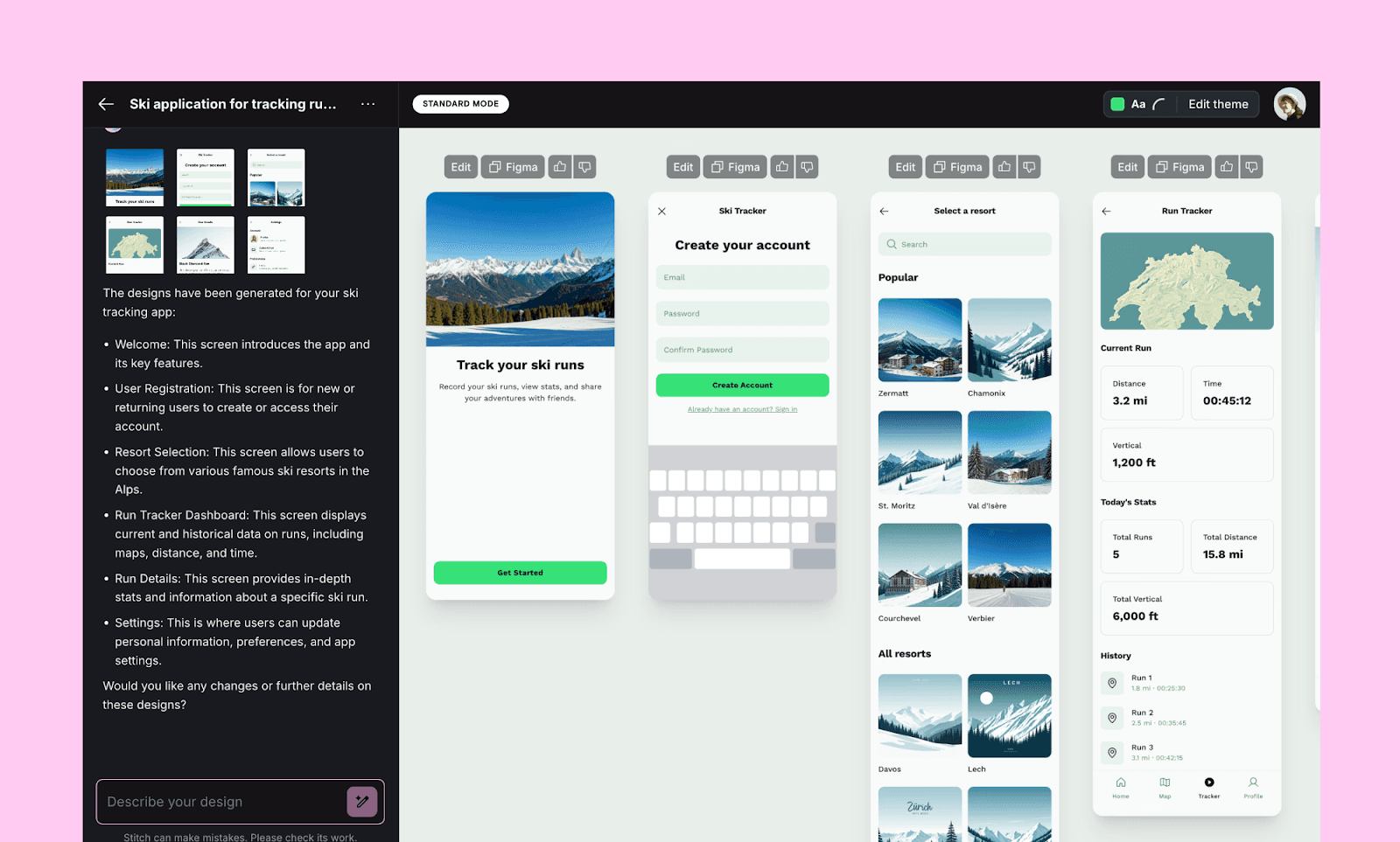
Key features of Google Stitch AI UI designer
Choose between Standard (fast) & Experimental (high-quality) modes
Generate mobile and web UI from simple text prompts
Convert screenshots or sketches into structured layouts
One-click "Copy to Figma" for editable Figma export
Generate HTML/CSS & Tailwind code for frontend handoff
Best use case of Google Stitch
Early-stage product ideation and quick UI drafts
Developers needing basic frontend scaffolding fast
Price of Google Stitch
Free plan: Monthly allowance of 350 Standard generations and 200 Experimental generations
Paid plan: No paid plan.
Read about Google Stitch Alternatives >
Best Sketch-based AI UI Designers
Visily
Visily is an AI-assisted UI design tool built for teams without deep design expertise. With a large pre-built template library and intuitive editor, Visily helps founders, PMs, and cross-functional teams visualize product ideas quickly without mastering complex design software.
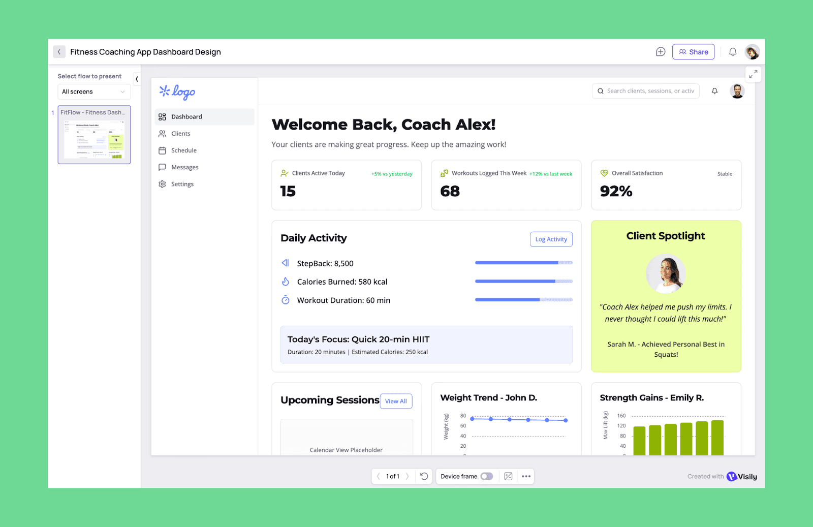
Key features of Visily AI UI designer
Convert images or screenshots into UI screens
Transform hand-drawn sketches into digital wireframes
Switch between wireframe and high-fidelity modes on the same board
Extract consistent brand styles, fonts, and colors from a URL or image
Drag-and-drop from an extensive library of 1,500+ templates
Best use case of Visily
Product discussions requiring quick visual alignment
Coaches conducting collaborative design workshops
Price of Visily
Free plan: 2 editable boards and 300 AI credits/workspace/month
Paid plan: Pro at $11/ user/month (billed annually) with unlimited boards and 3,000 AI credits/editor/month.
Miro AI
Miro AI extends Miro’s collaborative whiteboard into AI-powered wireframing and interface ideation. It helps teams convert their rough ideas, sticky notes, and diagrams on a Miro board into basic UI layouts. You can also upload reference images and prompts to edit the UI into a multi-screen interactive design.
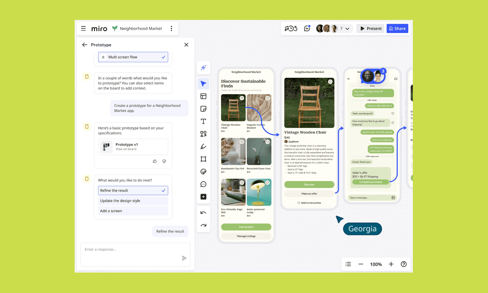
Key features of Miro AI UI designer
Convert sticky notes and flowcharts into structured diagrams
Specialized AI Sidekicks (agents) for UI/UX consulting
Create user journey maps and flow-based prototypes
Real-time collaboration with comments and live cursors
Integrate with Figma, Jira, and other product tools
Best use case of Miro AI
Cross-functional team alignment across product development
Synthesizing interview transcripts and user feedback into UI design
Early-stage structure planning prior to high-fidelity UI tools
Price of Miro AI
Free plan: Single workspace with 3 boards, but no AI Prototype feature
Paid plan: Starter plan of $8/mo/seat includes limited Miro Prototypes credits
For more credits, go for the Business Plan at $20/mo/seat or the Enterprise plan
Best Figma-native AI UI Designers
Figma Make
Figma Make is Figma’s native AI suite, powered by models like Claude 3.7. Integrated deeply within the Figma ecosystem, Make accelerates creation from an early idea to a polished interface without leaving the design workspace. It supports prompts to UI design, component creation, editable layers, interactive flows, and more.
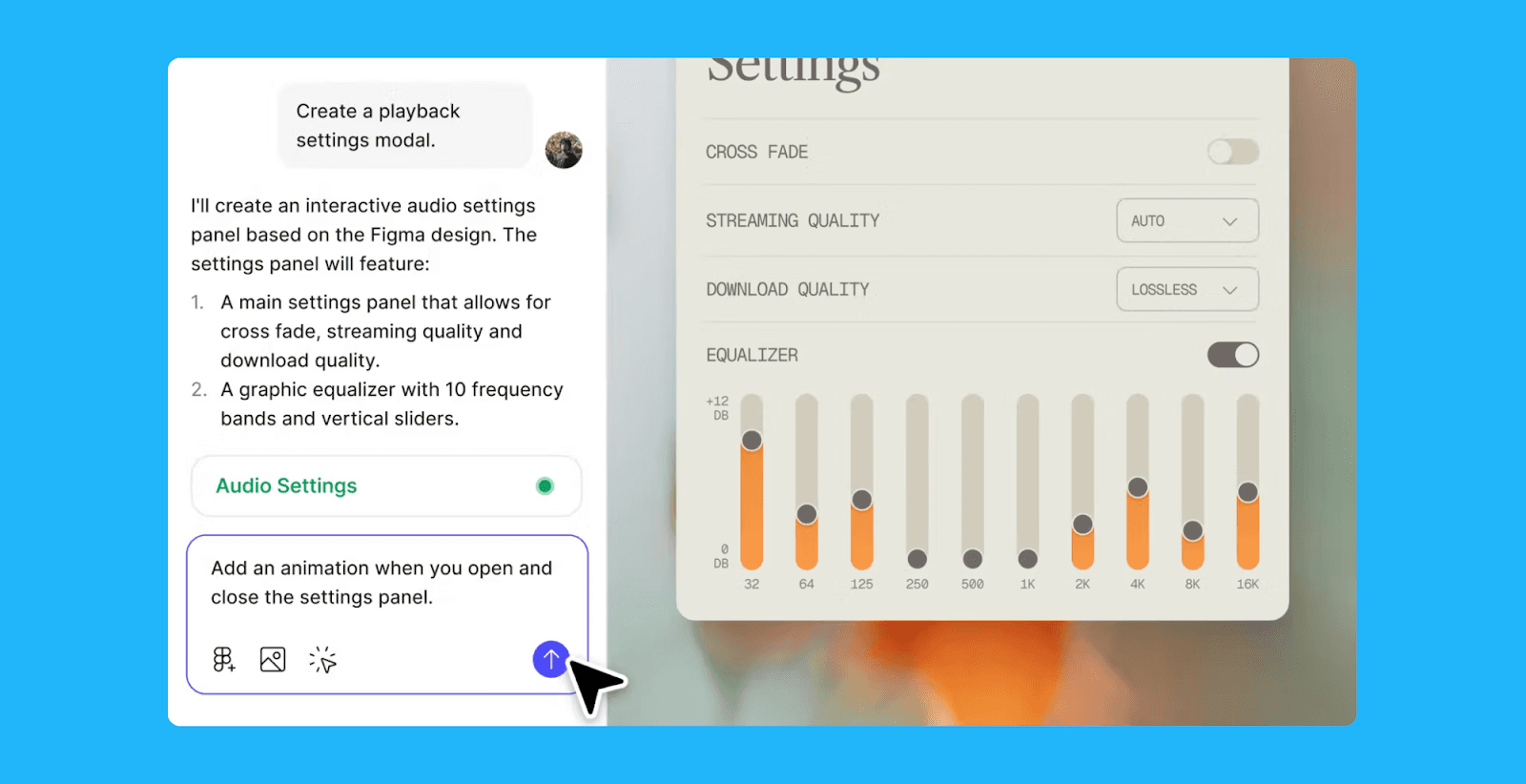
Key features of Figma Make UI designer
Transform text prompts into editable, multi-screen designs and wireframes
Automatically link static designs into interactive, clickable prototypes
Edit and refine AI output as native Figma layers
Build responsive websites or apps to preview without coding
Search your team’s entire library using screenshots or descriptions
Best use case of Figma Make
Designers sketching high-fidelity UI concepts with rapid iterations
Product teams turning ideas into interactive prototypes fast
Teams using shared design systems for consistent output
Price of Figma Make
Free plan: Figma Make is not available in the Figma free tier or Starter plan.
Paid plan: Professional Plan ($16/mo billed annually) includes Figma Make with 3,000 AI credits/mo. Organization and Enterprise plans, respectively, cost $55 and $90 per month and are billed annually.
Read about Figma Make Alternatives >
Relume AI
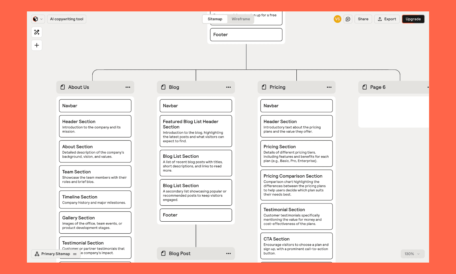
Relume AI is a website-focused AI design tool that generates structured sitemaps, wireframes, and UI layouts from simple prompts. Built primarily for web designers and agencies, it combines AI generation with a large component library mapped to real Figma components.
Key features of Relume AI UI designer
Generate an entire website’s information architecture
Create page-level wireframes with AI
Define a global design system (typography, colors, and spacing)
Populates wireframes with contextual, brand-aware copy
Effortlessly copy-paste layouts into Figma and Webflow
Best use case of Relume AI
Web designers building structured marketing websites quickly
Agencies producing scalable SaaS or landing page systems
Teams aligning sitemap, wireframe, and UI in one workflow
Price of Relume AI
Free plan: 1 project of 1 page, and 1,000+ Figma components
Paid plan: Starter plan costs $18/mo (billed annually) and includes 1 project of 5 pages. Replume Pro ($40/mo) and Team plan ($36/mo/seat, minimum 3 seats) offer unlimited projects with unlimited pages.
Responsive AI UI Designers
Framer
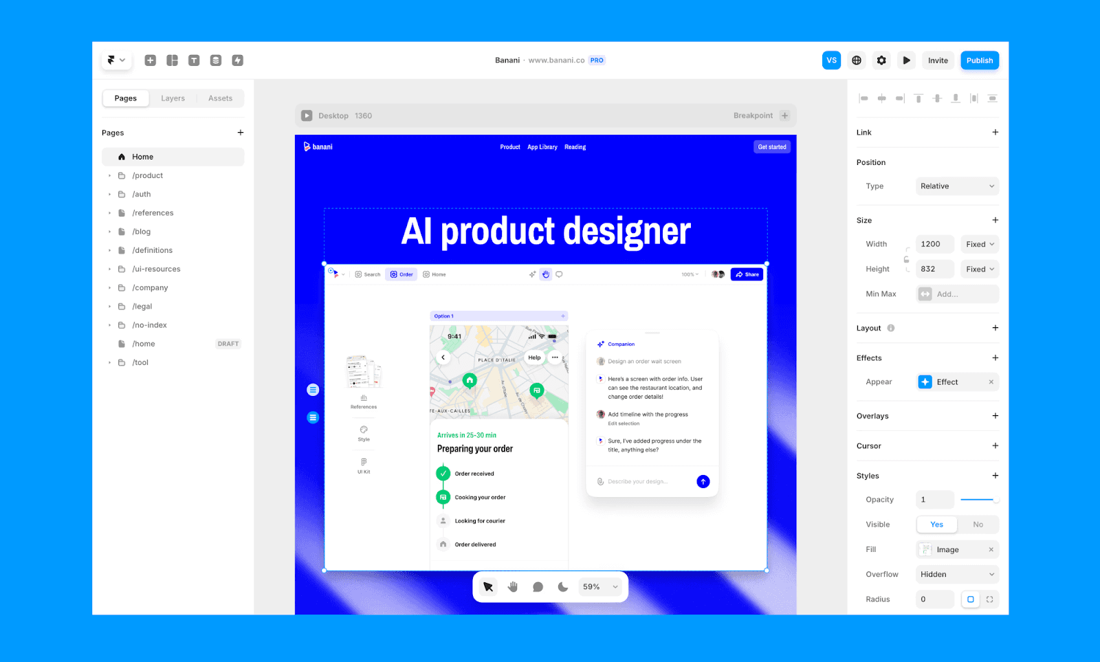
Framer is a powerhouse for design-to-publish workflows, bridging the gap between high-fidelity UI design and live, responsive websites. Unlike traditional prototyping tools, Framer uses a professional-grade visual editor that generates real, production-ready code under the hood, allowing you to launch fully functional sites directly from your canvas.
Key features of Framer AI UI designer
Generate entire responsive page layouts and structures from a prompt
Layout automatically cascades across desktop, tablet, and mobile views
Generate custom components using an AI-powered code assistant
Create advanced interactions like 3D transforms and hover states
Publish instantly with hosting, SEO, and performance optimization
Best use case of Framer
Founders launching landing pages without developers
Designers needing design-to-live deployment in one tool
Price of Framer
Free plan: Includes a Framer subdomain, 1k pages, and basic AI features
Paid plan: Basic plan starts at $10/mo/site (billed annually) for custom domains. Pro plan at $30/mo/site adds staging, CMS, and advanced analytics.
Browse Framer Free Templates >
Webflow
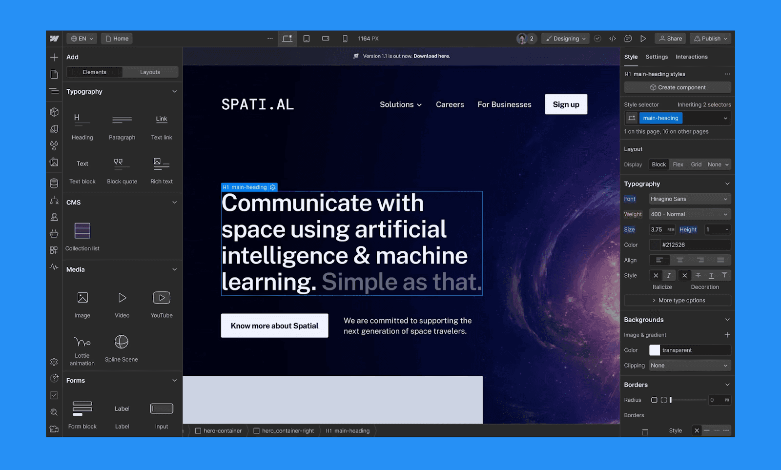
Webflow has evolved from a visual site builder into a comprehensive AI-native Website Experience Platform. In addition to generating AI-assisted UI mockups, it also assembles production-ready, multi-page sites built on Flowkit (a modular CSS framework), ensuring your site remains structured, scalable, and fully responsive from the first prompt.
Key features of Webflow AI UI designer
Generate responsive page sections from structured prompts
Chat-based refactoring of sections for better responsiveness
Automatically audits site content and generates schema markup
Convert layouts directly into production-ready HTML/CSS
Publish live sites with hosting and CMS built-in
Best use case of Webflow
Teams building scalable marketing or CMS-driven websites
Founders building tools that require both visual design and functional logic
Designers who want full responsive control before launch
Price of Webflow
Free plan: Includes a webflow.io domain, 2 pages, 50 CMS items, and limited access to the AI Site Builder
Paid plan: Basic plan starts at $14/mo (billed annually) for custom domains. CMS plan at $23/mo includes 2,000 CMS items and AI-powered SEO/AEO tools. Business plan at $39/mo for advanced AI capabilities.
Read the Framer vs Webflow Comparison >
Design-to-Code AI UI Designers
Builder.io
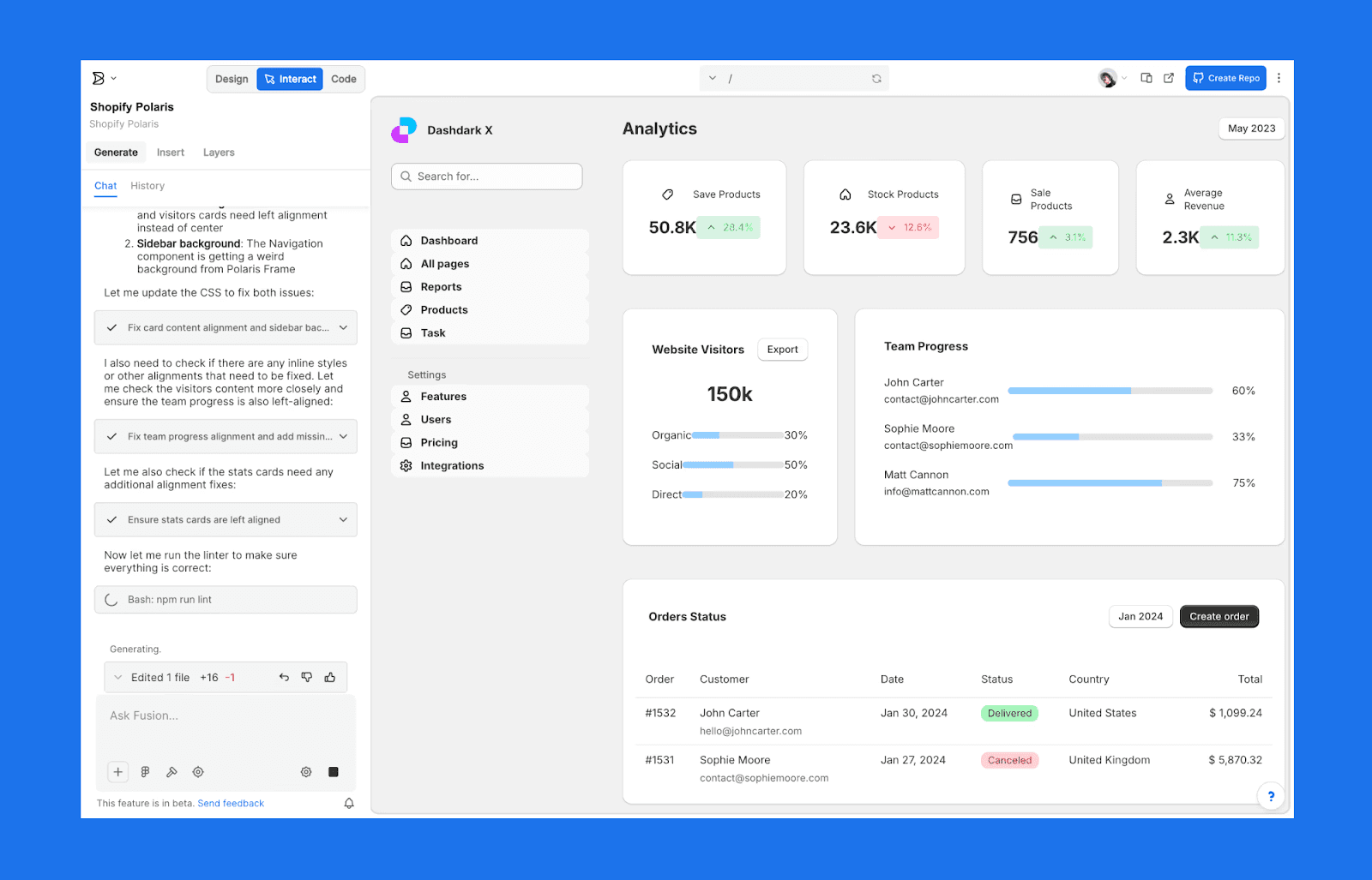
Builder.io is an AI UI development platform that transforms the traditional handoff into a continuous workflow. Its Visual Copilot tool utilizes an AI-powered compiler to turn Figma designs into clean, semantic code for any major frontend framework, allowing teams to ship production-ready UIs in minutes rather than days.
Key features of Builder.io AI UI designer
One-click conversion of Figma designs into high-quality code
Interprets flat design files and generates fully responsive layouts
Iterate on the generated code using natural language prompts
A visual IDE (currently in beta) that plugs directly into your codebase
Export clean React, Vue, Angular, or Qwik components
Best use case of Builder.io
Developers who want AI-assisted UI without losing code control
Product teams working within modern JavaScript frameworks
Companies needing visual editing layered over production code
Price of Builder.io
Free plan: Includes up to 6 users and 60 monthly Agent Credits
Paid plan: Starts at $24/mo per user (billed annually) for 500 monthly Agent Credits per user. Supports up to 5 users. For more seats, go for the Team plan at $40/mo per user (billed annually).
Locofy
Locofy is a developer-focused design-to-code tool that converts Figma, Penpot and Adobe XD designs into production-ready frontend code. Rather than generating UI from scratch, Locofy’s strength lies in translating existing hi-fi designs into structured React, Next.js, HTML/CSS, or other framework-based code with responsive logic built in.
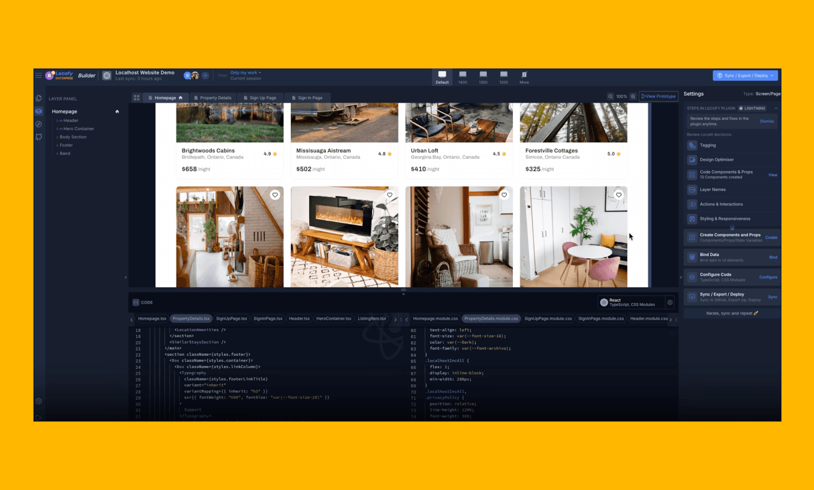
Key features of Locofy AI UI designer
Lightning flow feature converts Figma layers into extensible front-end code
Intelligently adapts designs for multiple screen sizes
Connects to your existing GitHub, Storybook, or custom component libraries
View your designs running on actual live code before exporting
Generate React, Next.js, Gatsby, or plain HTML/CSS output
Best use case of Locofy
Developers converting approved UI designs into working code
Teams reducing manual frontend build time
Startups moving from Figma mockups to MVP faster
Price of Locofy
Free plan: Includes basic design-to-code conversion with limited AI features
Paid plan: Pay As You Go model at $0.40 per token. Starter Plan $399/ year for ~2.5k tokens. (Tokens are consumed based on screen height and complexity.)
Read about the 2026 Best AI Design-to-Code Tools >
Is Figma Enough for AI UI Design?
Yes, but with caveats. Figma’s native AI features, such as Figma Make, help accelerate layout generation, copy updates, and basic prototyping directly within your existing workflow. Excellent for collaboration and context switching for teams adept at the Figma environment.
However, its AI is still evolving. Complex multi-screen generation or advanced image-to-UI workflows often require Figma UI plugins or specialized AI UI tools.
Read more about Figma Make Alternatives: Free & Paid >
How to Pick the Best AI for UI/UX?
With so many AI UI tools in 2026, the right choice depends less on hype and more on capability fit. You can use the pointers below as a checklist to choose the best AI UI designer tool to evaluate what actually matters for your workflow:
Prompt-to-wireframe capability: Start by checking if the tool can generate structured, multi-screen layouts from simple text prompts.
Sketch conversion: If you ideate visually, look for an AI that converts hand-drawn sketches or screenshots into editable UI.
Collaboration: Prioritize shared editing, comments, and design system compatibility for smooth team alignment.
Integrations: Check for seamless Figma export, frontend framework support, GitHub connectivity, or CMS integrations that fit your existing stack.
Design hand-off: If speed to production matters, evaluate the features of code export or MCP support.
Further considering your budget, these should help you narrow down the options to a couple. Then, test run the features of the tools you will use the most to finalize the AI UI tool best for you.
Verdict: Is there a ‘best’ AI for UI?
It’s subjective. Choosing the best AI for UI design in 2026 is about picking the tool that bridges your specific gap between ideation and production. The market has fast evolved from a basic AI UI builder to high-fidelity interfaces with deep architectural automation and developer handoff features.
Still, most times, it helps to start with something simple and scalable. For example, with Banani, you can upload a hand-drawn sketch to create a lo-fi wireframe, then convert it into a hi-fi UI design with text prompts, and ultimately export its code for development.
Ready to use the right AI UI Design tool for you in 2026? Get started for free!
FAQs on AI for UI Creation
Which AI is the best for UI Design?
Banani AI is the best AI for UI design, especially for design-first projects. For production-ready UI design, go for Framer, and Builder.io is great for code-sensitive design projects.
How is AI used in UI design?
AI is used in UI design process to generate layouts, components, color systems, and multi-screen flows directly from prompts, sketches, or screenshots. Some AI UI tools can also assist with iteration, responsiveness, and developer handoff.
Can ChatGPT generate UI design?
No, ChatGPT cannot generate UI design. But it can suggest layout ideas, structure, and even basic HTML/CSS. There are some smart prompts to use ChatGPT for UI/UX design.
Which AI is best for UI coding?
AI tools that offer structured code export—such as React, HTML, or Tailwind—are better suited for UI coding. The best choice depends on your frontend stack and handoff workflow.
Is Figma the best UI design tool?
Figma remains one of the most popular UI tools due to collaboration and ecosystem strength. However, Figma AI features are still evolving compared to standalone AI UI generators.
What are the AI alternatives to Figma for UI design?
Depending on your use case, Figma has multiple AI UI alternatives. For instance, Mobbin for ideation, Banani for wireframing, Lovable for prototyping, and so on.


