

Landing pages
I wanted something that didn't look like every other AI-generated startup page. So instead of asking for a "clean modern landing page," I focused on style and feeling in the prompt.
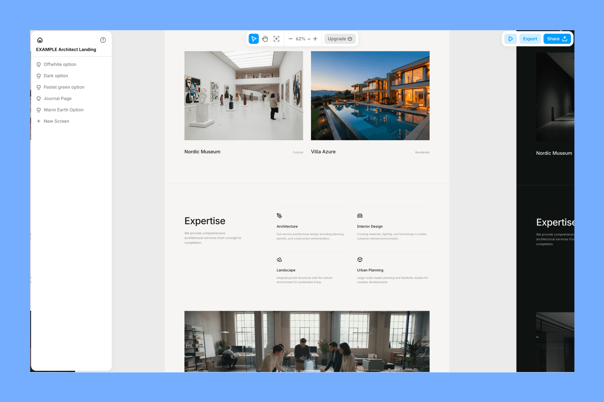
The output was genuinely good. Here you can see it:
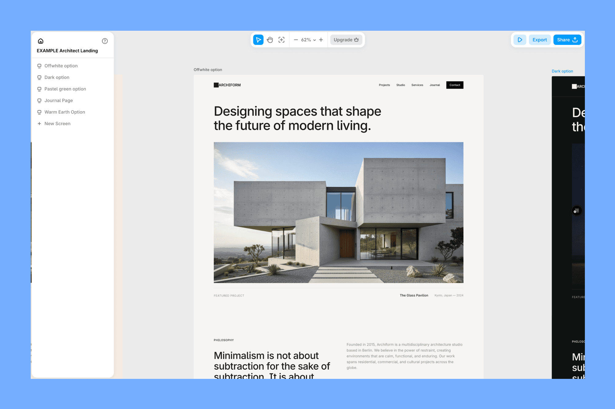
The layout had real hierarchy, the hover states worked, and the gradient animation was smooth. It didn't default to the usual white background with a blue CTA button. I have tweaked the font pairing, but as a starting point, it saved me at least an hour of setup.
Here's a prompt I wrote:
Landing page for a modern architect studio. Use the same off-white background across all sections of the page. Use editorial headlines, focus on images and content first. The overall feeling is cold restraint: a studio that doesn't need to explain itself.
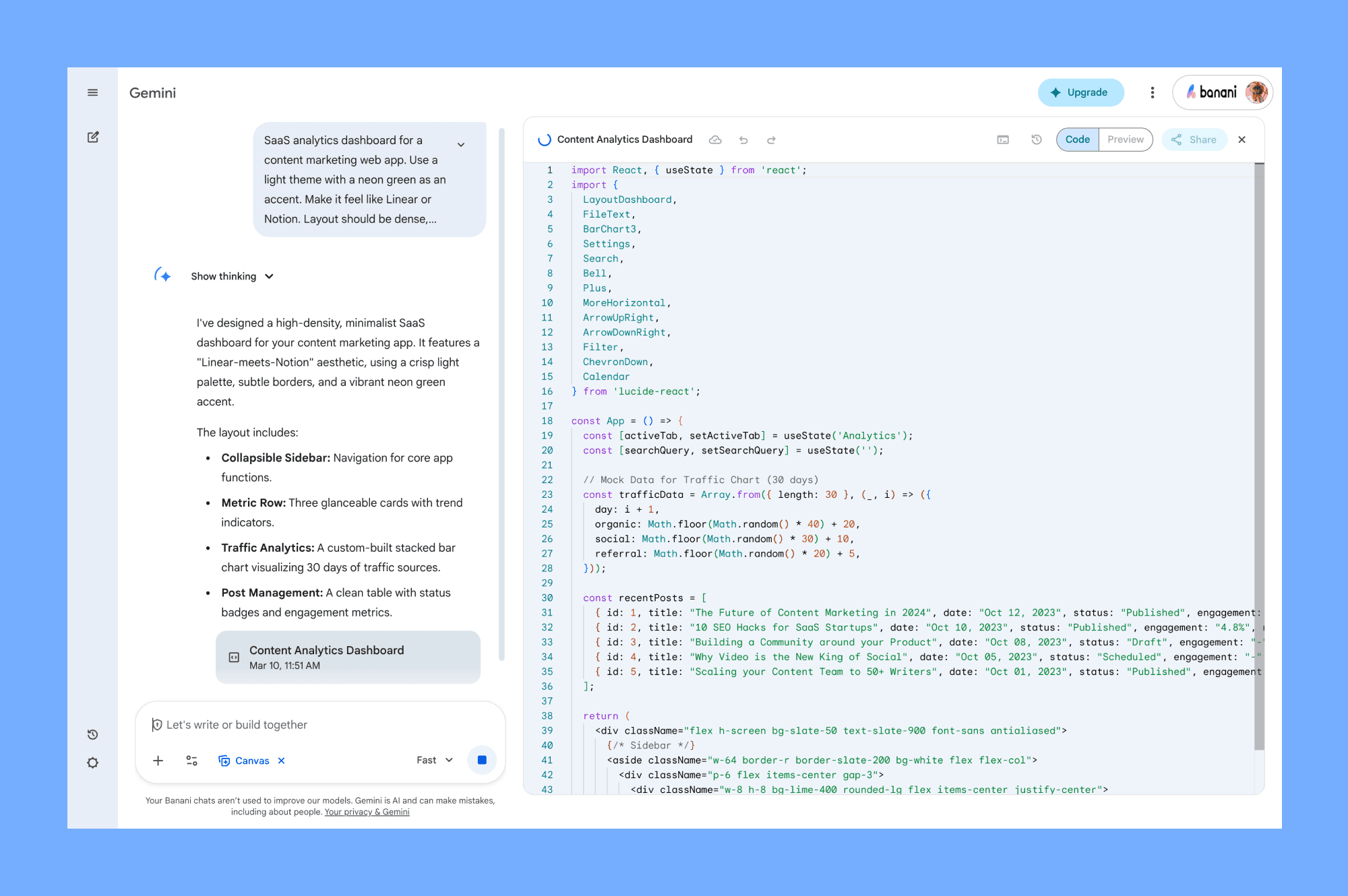
SaaS designs
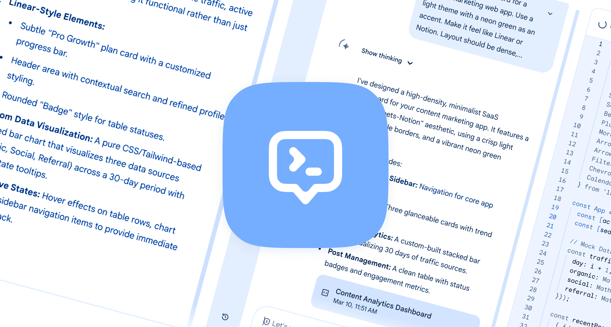
For this one, I wanted to see how it handled a more complex interface with data, navigation, and multiple states. This is where Gemini 3.1 Pro really showed what it can do!
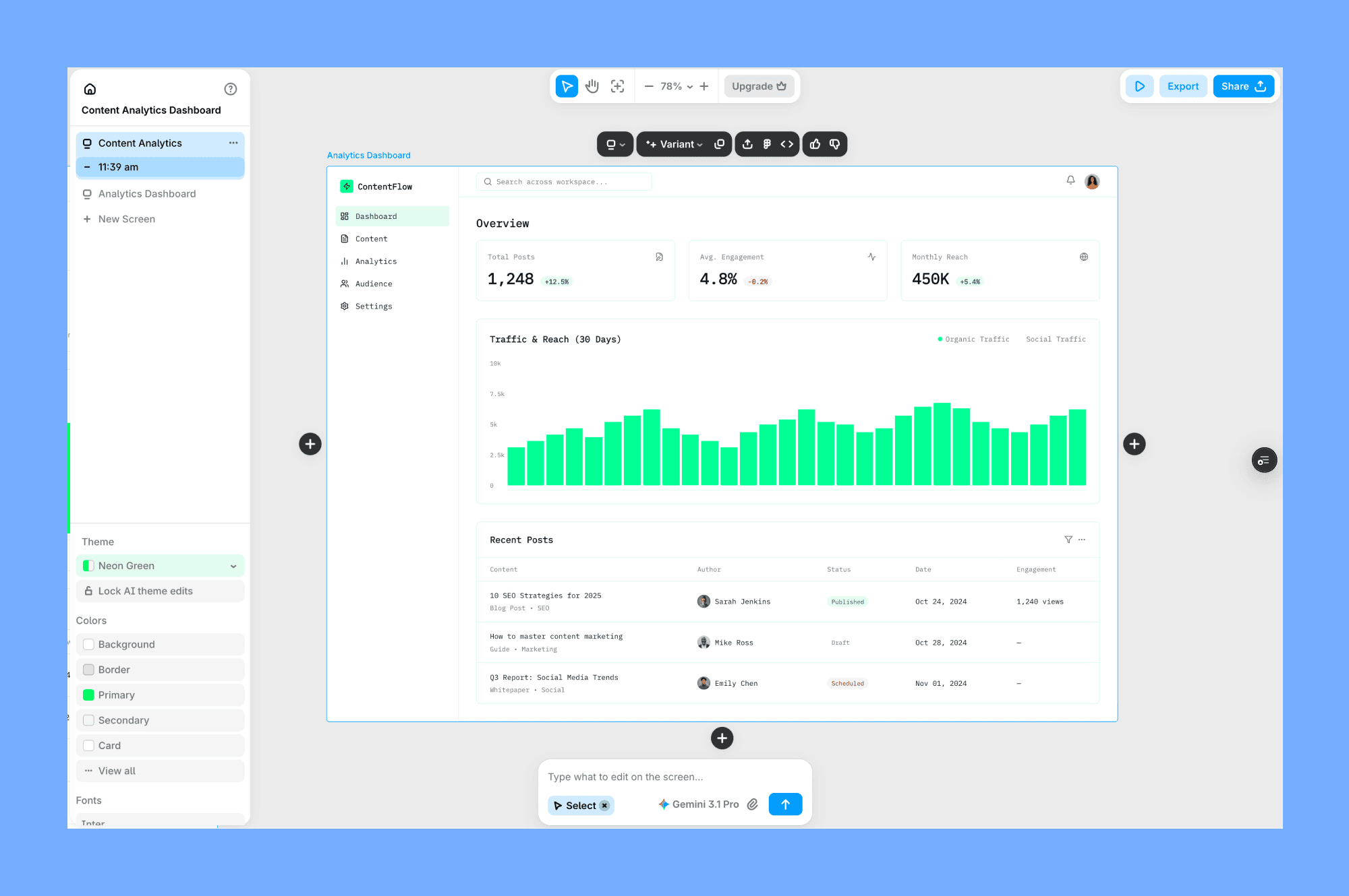
The component structure is clean, the cards have proper spacing, and the status badges actually use different colors for different states. The line chart rendered correctly, and the data looked realistic.
Here's my prompt for this test:
SaaS analytics dashboard for a content marketing web app. Use a light theme with a neon green as an accent. Make it feel like Linear or Notion. Layout should be dense, but not overpopulated with content.
It should have a sidebar navigation, a top bar with a search field + avatar. Main content area with three metric cards at the top (showing total posts, average engagement, and monthly reach), under them a stacked bar chart showing traffic over 30 days, and a table of recent posts with status badges as a separate section under.
Linear or Notion references landed quite well. Gemini avoided the chunky borders and heavy shadows that usually make AI dashboards look dated.
Mobile designs
Aside from testing desktop designs, I wanted to check how Gemini 3.1 can design mobile and app designs.
To do it, I again used references in my prompt, mentioning Uber, and thins time without going into details, to see how far it can go with little additional context.
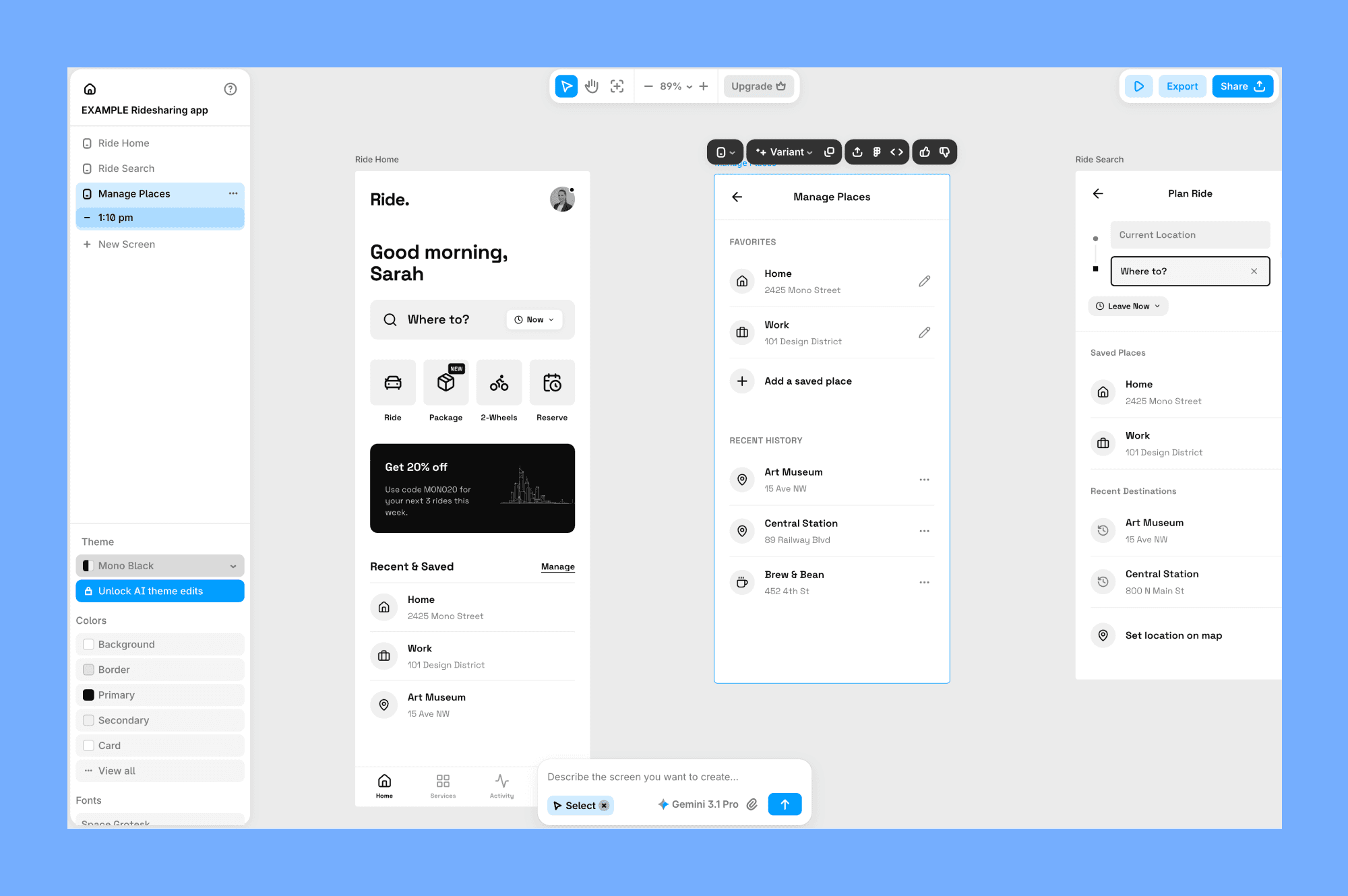
The prompt used:
Ride ordering app home screen in light mode but with mono black color palette inspired by Uber.
As you can see it has clean layout, with very clear and bold touch zones. Every interactive element is generously sized and easy to hit. Nothing competes for attention, hierarchy does the work.
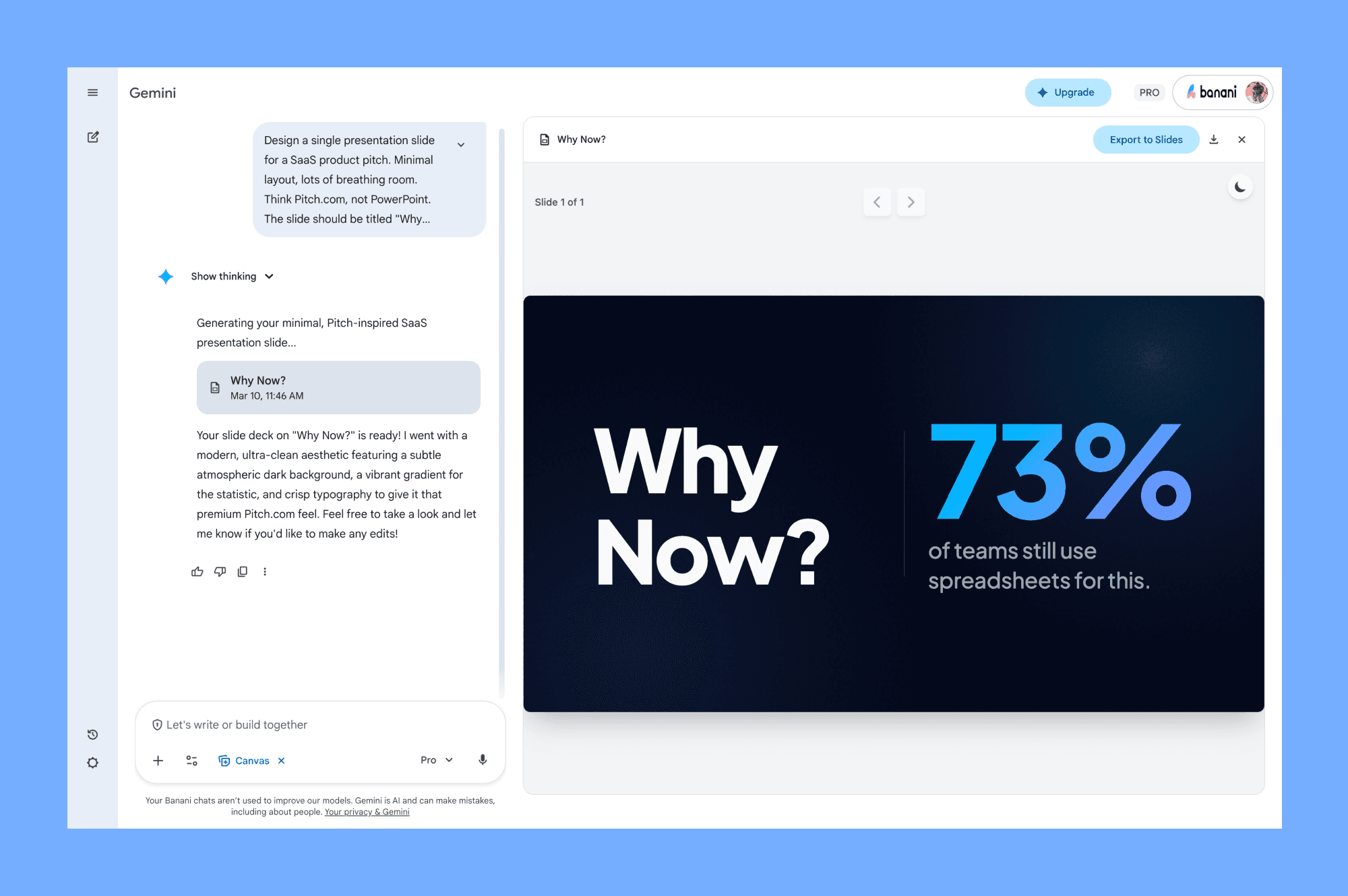
Deck slides designs
Aside from UI tests, I wanted to know how Gemini 3.1 could handle presentation slides.
The output is quite clean. Big headline, proper whitespace, the stat was styled with a large number and a muted label underneath. It looked like something you'd actually put in front of stakeholders or teammates.
Prompt used:
Design a single presentation slide for a SaaS product pitch. Minimal layout, lots of breathing room. Think Pitch.com, not PowerPoint.
The slide should be titled "Why Now?" and make the case for market timing. Dark background, bold oversized headline on the left, a key stat on the right, something like "73% of teams still use spreadsheets for this."
How to use Gemini 3.1 Pro
While you can use it in Google AI Studio or through the API, the best way to leverage it for UI design is through dedicated tools that have integrated the model.
Banani
Banani is a canvas-based UI generation tool that recently integrated Gemini 3.1 Pro as one of the models you can use. It lets you generate UI designs from simple text prompts and organize them.
Most of the examples you saw in this article were made directly there using Gemini.
It's a great choice if you want a Figma-like UI and the ability to interact with AI models like Gemini, GPT, Claude.
Plus, it keeps your regular workflow by allowing you to copy-paste designs to Figma, export them as code, or connect other coding agents via MCP.
Gemini Canvas
The most direct way to access Gemini 3.1 Pro is through the Gemini app itself. The app has a canvas feature that lets you preview what the model generated.
It's a nice starting point if you want to explore what the model can do for design before committing to a more specialized tool.
Note that it can be regionally locked (as of writing this article), so if you're outside the US, there’s a chance you can’t use this preview/canvas feature yet.
Stitch
Stitch is an experimental AI-powered design tool from Google Labs. It takes text prompts or uploaded images and generates complete UI designs with exportable code. You can use both 3.0 and 3.1 Thinking from there.
I've wrote an in-depth review of Stitch as well as a review of alternatives you can use for UI generation.
Best Gemini 3.1 Pro prompts
To get the best UI design results from Gemini 3.1 Pro, you need to shift how you prompt. Focus on the vibe, layout details and references.
Add a lot of details
The quality of the end design generated by Gemini highly depends on how many details you provide.
Be very specific if you already have some elements you want to be designed and have on the screen. Write those details. The model can’t read your mind.
Describe the feeling
Don't just ask for a "blue header". Gemini is a multi-modal model that can understand code and visual things.
You can describe an abstract theme or mood you want to explore for design. For example: "Build a landing page for a personal portfolio. The vibe should be moody, Victorian, but modern: use serif fonts, a deep charcoal color palette."
Give extra context
Similar to the first point, the more you give, the better results you’ll get. Attach image references, UIs that you like from Mobbin, screenshots of your current UI, or even napkin sketches.
You can tell Gemini to: "Replicate these screens as closely as possible. Match the layout, elements, and styles." It treats visual annotations as high-priority instructions.
Use Thinking
If you're using the Gemini App, you can set the thinking level to High for complex layouts. It will take longer to generate, but the model spends more time reasoning through the visuals and layout structure.
This results in much better layouts and visuals in the design.
What Reddit says
Vibe-coding and design communities on Reddit have been stress-testing the model since their recent pre-launch, and the consensus is mixed.
The Good
Many users report that Gemini 3.1 Pro scores higher than all other frontier models, specifically for frontend and design.
One user generated 50 different sites across 10 categories and noted that "the SVG logic and padding consistency are way better now," and it "finally understands 'aesthetic' instructions without needing 10 prompt revisions."
Another user compared it directly to Claude Opus 4.6 for web design, noting that Gemini's output looked "a level less AI-designed" and had better contrast and balance.
The Bad
However, it's not perfect.
The main complaint is the "endless thinking loop." On complex tasks, it can get stuck planning forever, writing long, repetitive reasoning before producing actual code.
Some users also noted that while it's amazing for single-shot reasoning, it struggles when used as an autonomous coding agent for complex applications, where Claude Opus 4.6 is still preferred for its reliability and lack of "planning fluff."
Conclusions
I've used it as my daily driver for most of the design-related tasks, and I usually start from it when generating UI using AI.
Gemini 3.1 Pro is definitely worth your time if you've been frustrated by the generic, purple gradient UI generations from other models.
It has a strong "spatial understanding", making it a powerful AI design model for prototyping and quick layout ideation.


