

Lovableは、2026年の注目AIアプリビルダーです!でも、ファンでさえLovableのUI生成力には不満があります。汎用的なTailwindの紫、グラデーション見出し、箱型ダッシュボードなどで、Lovableのアプリデザインは似通いがち。開発者にも非デザイナーにも、プロダクト開発の悩みの種です。特に、アプリ/サイトのUIに少し手を入れるだけでLovableクレジットをどんどん消費し、すぐ割高になるからです。
そこでAIプロダクトデザイナーの私が、LovableのUIデザイン機能を実際に試し、クレジットを節約しつつ、Lovable AIでユニークで美しいUIを作る理想のワークフローを探りました。
LovableのWebサイト例
まずは、2026年時点で公式サイトにある人気のLovable WebサイトUI例を見ました。作れるアプリやサイトの種類はかなり多い一方で、正直、LovableのUIスタイルはそこまでではありません。紫の悩ましさがずっと続きます。
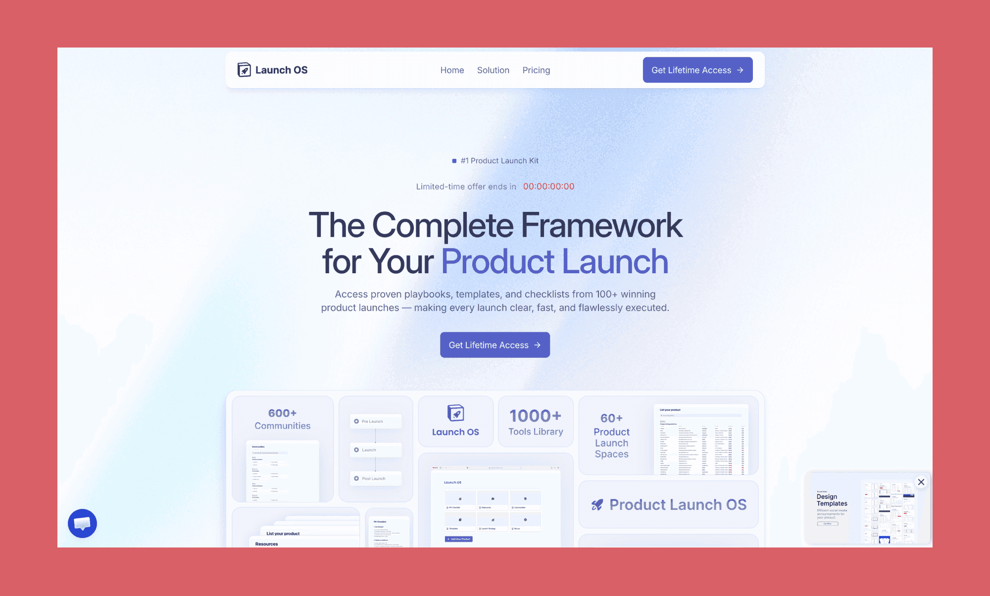
Lovableが作ったGTMフレームワークのWeb UI
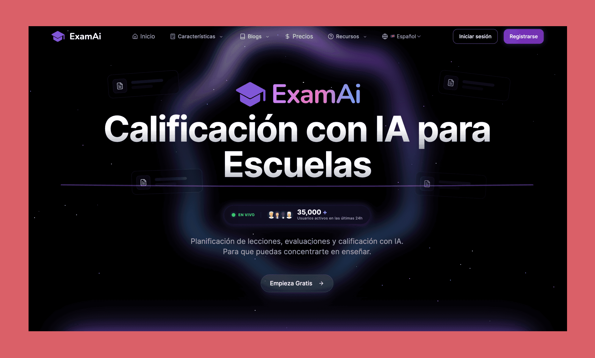
Lovableが作った試験対策AIサイトUI
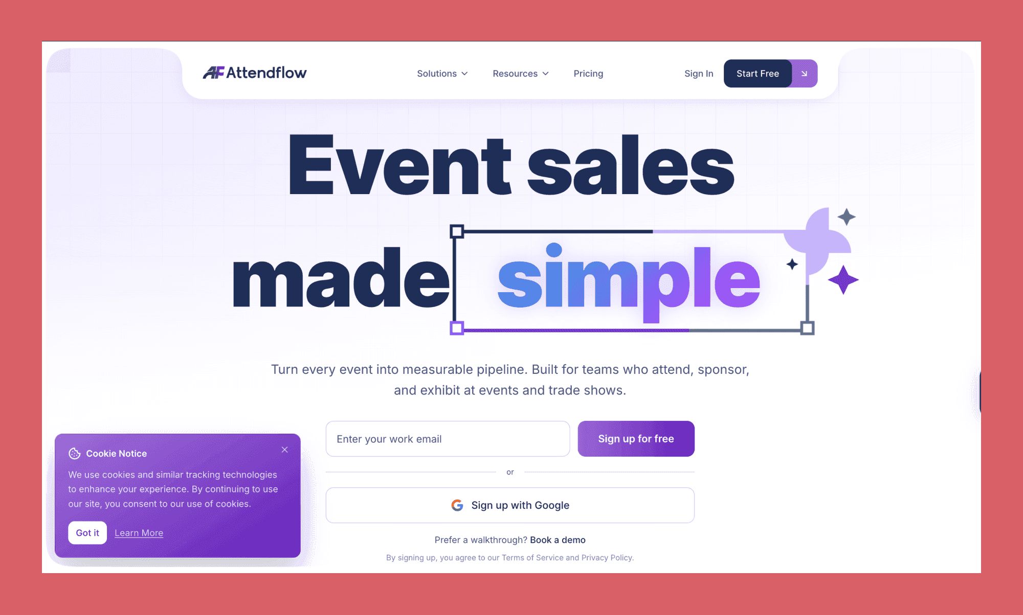
Lovableが作ったイベント販売プラットフォームのWeb UI
私のLovable UIデザイン体験
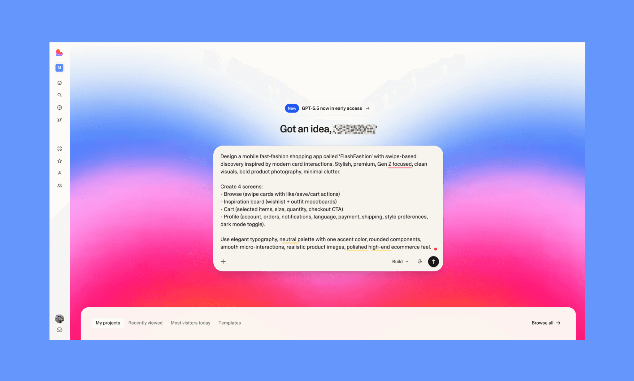
次に、Lovable UIジェネレーターを試すため、Tinder風UIのファストファッションアプリのモックをデザインしました。オンボーディングはシンプルで、Lovable Free Tierを始めるのにクレカも不要でした。
私のLovable UIデザイン用プロンプト
モダンなカード操作に着想を得たスワイプ式発見機能を備えた、‘FlashFashion’というモバイル向けファストファッション買い物アプリをデザインしてください。スタイリッシュで、プレミアム感があり、Gen Z向け、クリーンなビジュアル、大胆な商品写真、余計な要素は最小限。
4画面を作成:
- Browse(いいね/保存/カート操作つきのスワイプカード)
- Inspiration board(ウィッシュリスト + コーデのムードボード)
- Cart(選択アイテム、サイズ、数量、チェックアウトCTA)
- Profile(アカウント、注文、通知、言語、支払い、配送、スタイル設定、ダークモード切替).
上品なタイポ、ニュートラル配色に1色のアクセント、角丸コンポーネント、なめらかなマイクロインタラクション、リアルな商品画像、洗練されたハイエンドEC感を使ってください。
Lovableでの無料UI生成(そして所感)
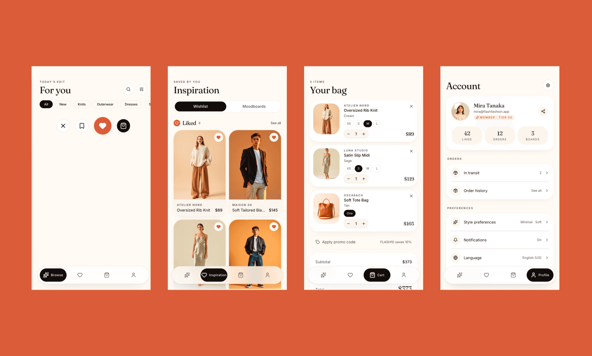
上の画面が、私のプロンプトに対してLovableが生成したUIです。2.9クレジットを消費しました(ただし、Lovableの特別オファーがあったからで、なければ約5クレジット)。色指定はなく、雰囲気だけでも汎用的な紫を避けたのはまず好印象。Light/Darkモードの切り替えも賢い工夫でした。
一方で、Lovable UIジェネレーターの最大の、しかも明白な欠点は、Browse画面にスワイプ購入UIがないことです。これがアプリの主機能なので、かなり痛い抜けです。そのほかは、UIがとてもクリーンで洗練されているぶん、少し既視感があります。CartとProfile画面は整理されていて使いやすいものの、目立つディテールや強いブランド性は弱め。Saved / Inspiration画面がいちばん良く、実用的で見た目もまとまっています。
全体として、Lovableは見栄えの良い画面を出しましたが、追加編集なしでは記憶に残るファストファッション体験にはなりません。(なお、LovableのUI編集にはVisual EditとAI Chat Editの2種類があり、下で両方試しました)。
Lovableの『Visual Edit』でUIを編集
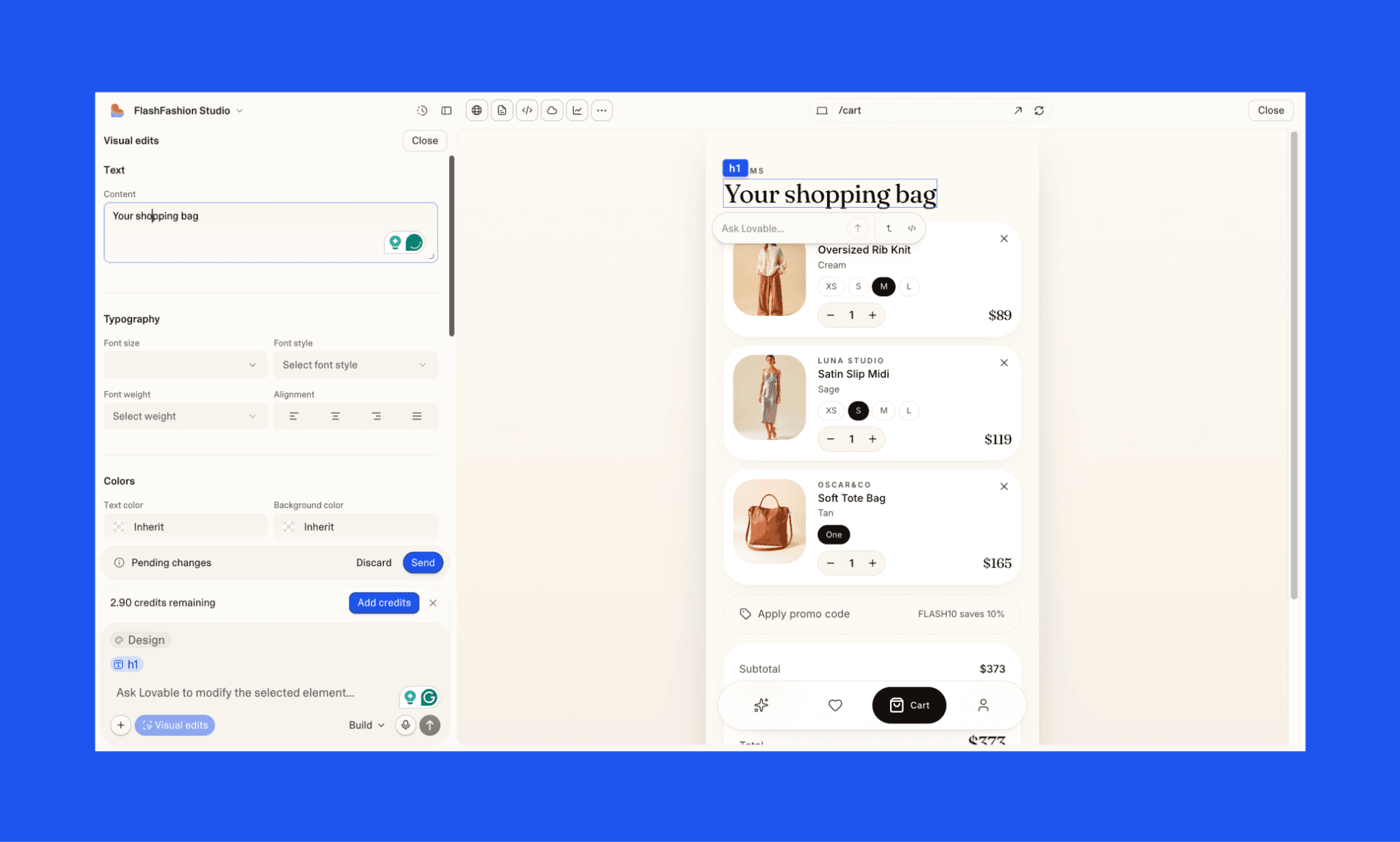
LovableにはVisual Edits機能があり、テキストやボタンなどのコンポーネントをクリックして、CSSプロパティを直接編集できます。
選択肢は多いですが、実際はかなり重いです。変更が反映されないこともあり、しかも元に戻しにくい。良い点はVisual Editsではクレジットを使わないことですが、残念ながら実用性も高くありません。
Lovable AIチャットでUIを編集
LovableのAIチャットで、UI編集を2回試しました。
i. 画面編集:
Browse画面だけを再設計し、スワイプ可能な商品カード、積み重なったプレビュー、モデル写真、価格、サイズ、like/skip/save/cart用のスワイプ操作を入れてください。
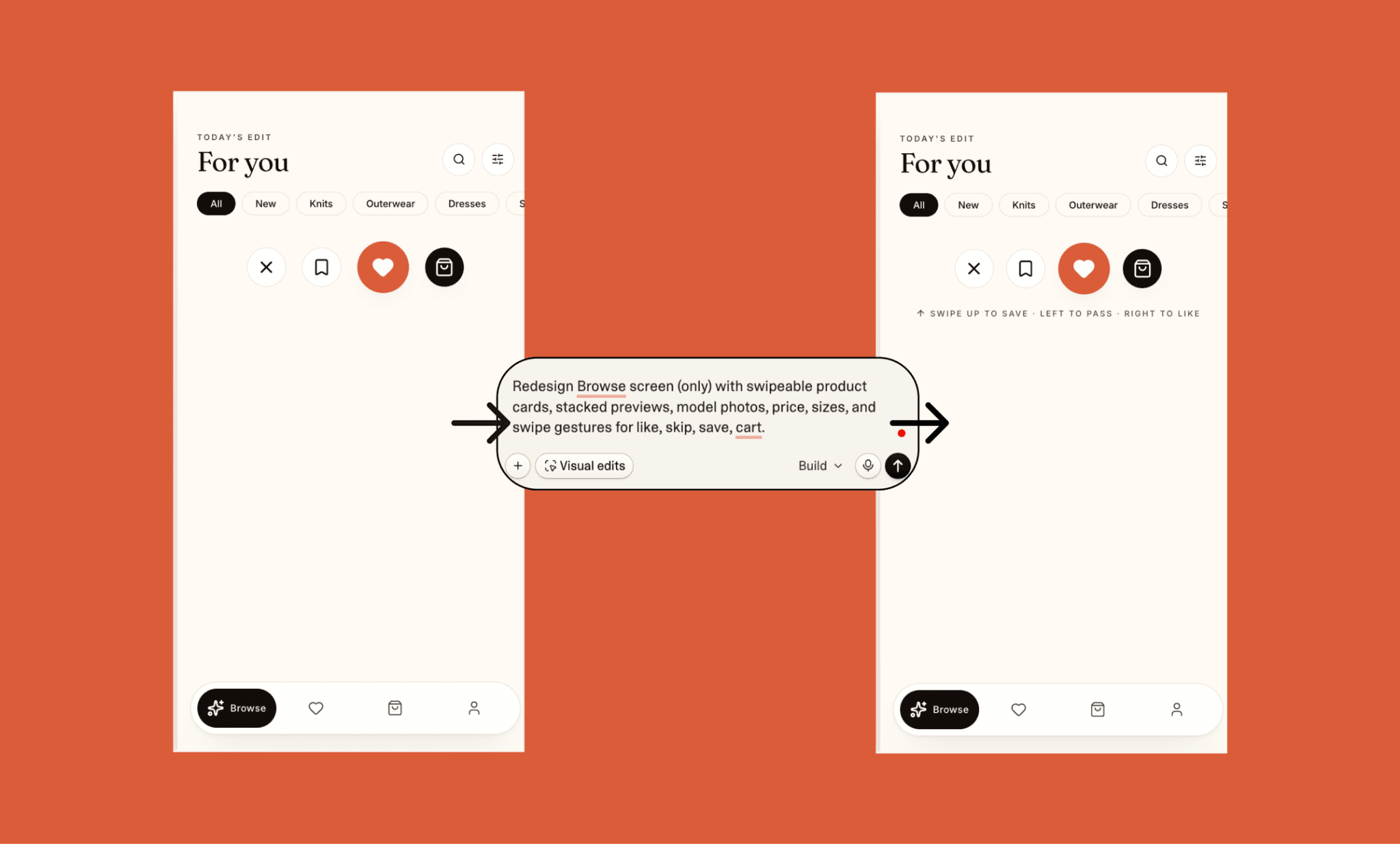
Browse画面に足りない要素を埋めたかったのですが、明確に指示しても動きませんでした。裏では動いていたのか、適当にいいね/よくないねをするとInspiration/Moodboard画面が更新されるのは確認できました。とはいえ、編集は失敗したのに、1.5 Lovableクレジットはしっかり消費されました。
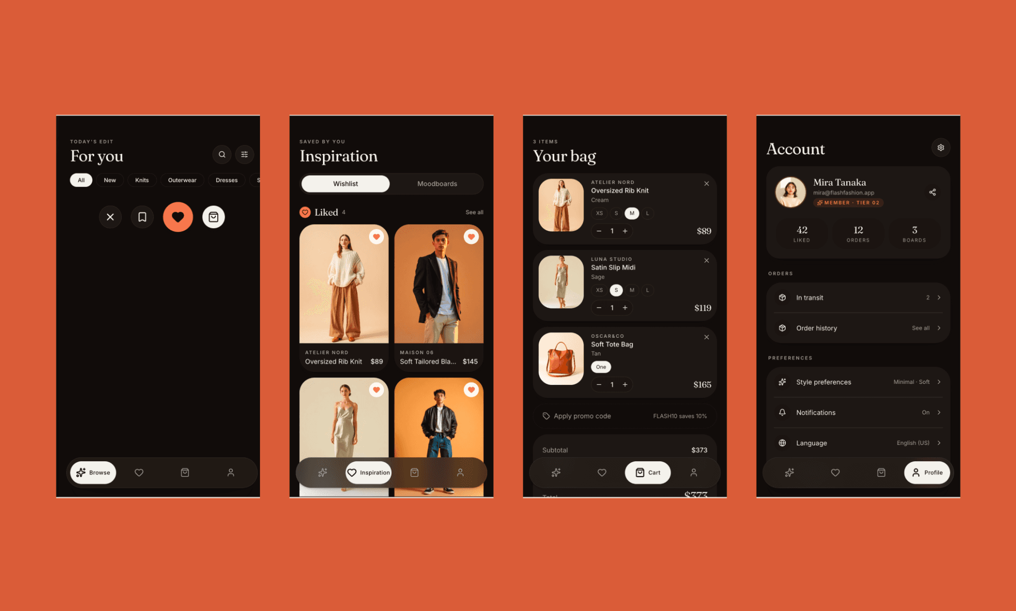
ii. コンポーネント編集
Didot Bold 48pxの見出し、Inter Medium 14pxのラベル、#F7F3ED背景、#2B2118テキスト、#C96A3Dの細線ベクトルのハートとブックマークアイコン、24px角丸の商品カード、16pxのグリッド間隔、56pxのタブバー、Vogue風ムードボード、シネマティックなスタジオ撮影、ラグジュアリーな小売感でInspiration画面を再設計してください。
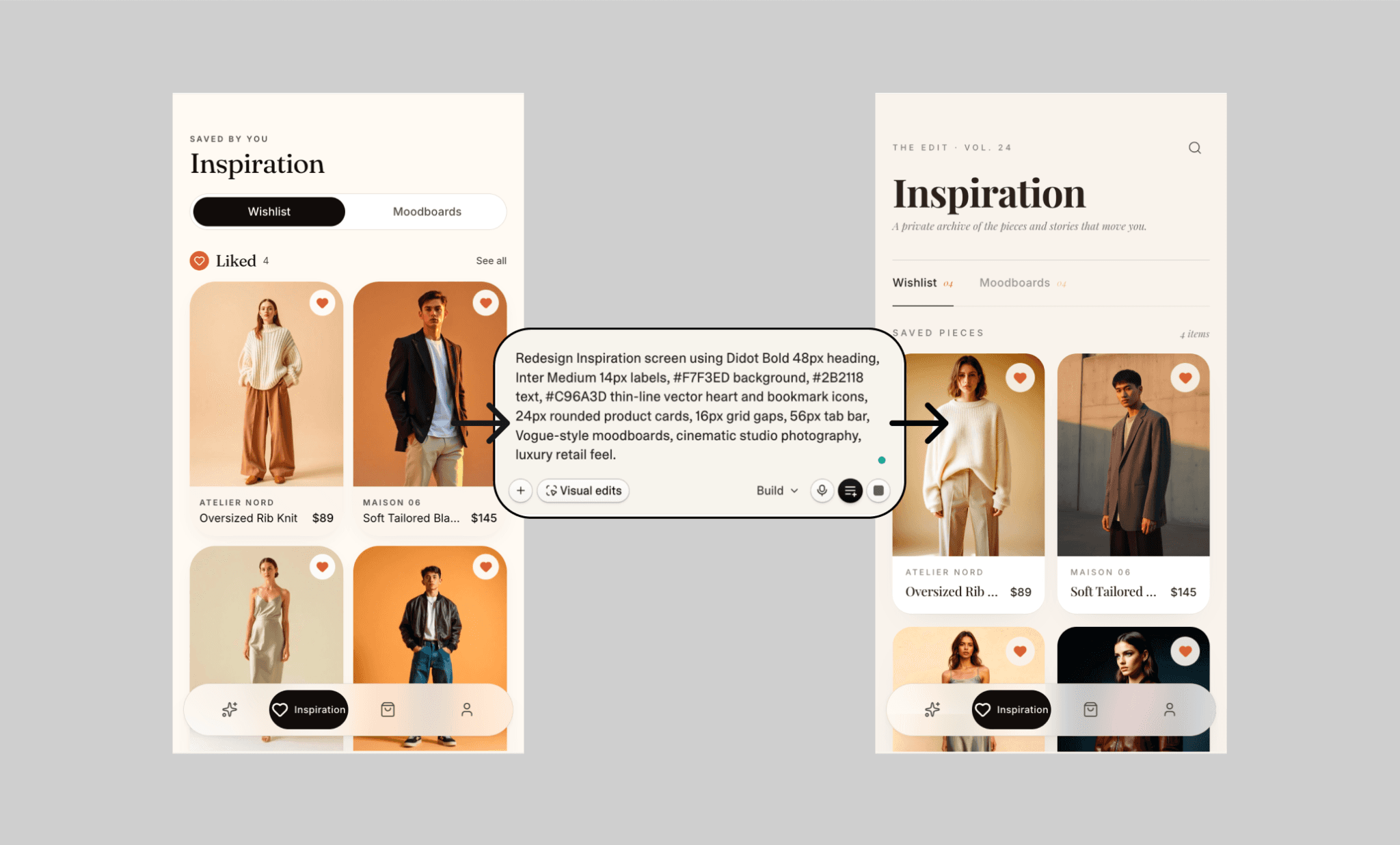
今度は、ブランド感がかなり改善しました。セリフ体タイポと編集っぽいラベルで、プレミアムなファッションらしさが出ています。ただ、商品カードはやや細く、テキストは詰まり気味、アイコンの変化はほぼなく、下部ナビは重たく感じます。見た目は良くなった一方、使いやすさは少し後退しました。
それでもLovableの他の編集と比べると、これはかなり満足できる実装でした。
Lovable.devにおけるUIデザインの限界
LovableのUIデザインは、プロダクト思考よりスピード優先になりがちです。私のテストと、AI UIジェネレーターとしてのLovableに対する広いユーザーフィードバックを見ると、MVPを出す用途には向いていますが、完成形のデザインツールではありません。
WebっぽいモバイルUI: しばしば、本物のネイティブアプリというより、縮小したWebサイトのような画面になります。
核となるコンポーネントの抜け: 明確な指示があっても、スワイプ操作などの重要なインタラクションを無視することがあります。
使いやすさとのトレードオフ: Visual Editでは、詰まったテキストや狭いレイアウトで、可読性が落ちることがあります。
クレジットの無駄: AIチャット編集は、変更が失敗しても、ほとんど改善しなくてもクレジットを消費することがあります。
LovableでユニークなUIを作る方法
Lovableは、多くの人が引き出している以上に良いUIを出せると思います。魔法の箱として扱うと、出力は凡庸になります。アートディレクション、参考例、明確な意図を与えると、結果は一気に良くなります。
Lovable UIデザイン用プロンプトテンプレート
プロンプト前に軽くリサーチしましょう。競合アプリのUIスクリーンショットを2〜3個集め、好きなレイアウトをメモし、対象ユーザー、ブランドの雰囲気、主要な操作パターンを決めます。そのうえで、具体性と自由度の両方を入れて指示します。
[業界]のニッチ向けに、[対象ユーザー]のための[モバイルアプリ / Webサイト]をデザインしてください。
スタイル: [ミニマル / ラグジュアリー / 遊び心 / 未来的].
[カラーパレット]、[フォントスタイル]、[アイコンスタイル]、[ビジュアルスタイル]を使ってください。
[画面一覧]の画面を作成してください。
[主要な操作]を含めてください。
[スピード / CV / 信頼 / ワクワク]を優先してください。
汎用的なSaaSレイアウトは避けてください。
LovableとのハイブリッドUIデザインワークフロー
Lovableで狙いのUIを安く作る別の方法は、先に vibe design、後で vibe codeです。このハックは、Lovableが本質的にはAIアプリビルダーで、AI UIジェネレーターではない、という考え方に基づきます。なので、まずはBananiのような専用AI UIデザインツールでアプリ設計を始めましょう。テキストや画像のプロンプトから、高精細な複数画面を横並びで作成し、UIとのチャットで編集します。そして、最終デザイン(PNGまたはFigma)をLovableへ出して開発に使います。
これなら、Lovableの開発クレジットを無駄にせず、UIレイアウトとユーザーフローをかなり低コストで詰められます。
LovableはUIに十分か?
はい、十分だと思います。LovableはUI生成に向いていますが、現実的な期待値は必要です。作られる画面は、社内ツールや素早いローンチには使える、見栄えの良いプロトタイプです。ただし、プロダクション品質のアプリ向けではありません。弱いのは独自性と、細かなプロダクト思考。強いプロンプトがないと凡庸に見え、編集には追加クレジットがかかることもあります。そこでBananiのようなAI UIツールが役立ちます。まずそこでユニークで高精細なUIを磨き、次にその方向性をLovableへ持ち込んで、より速くアプリを作る、という流れです。
LovableのUI生成に関するFAQ
LovableはUIをデザインできますか?
はい。Lovableは、レイアウト、ナビゲーション、ダッシュボード、フォーム、ランディングページを含む、使えるアプリやWebサイトのUIをテキストプロンプトから生成できます。
UI作成はLovableとFigma、どちらが上ですか?
LovableとFigmaを比べると、解く問題が違います。Lovableは、動くMVPアプリ向けのUI生成が速いです。Figmaは、プロダクション品質のアプリに必要なピクセル精度のUI制御に強いです。
LovableでUIを改善するには?
既存のLovable UIを改善するには、編集プロンプトをかなり具体的にしましょう。レイアウト、ブランドトーン、余白、タイポ、色、コンポーネントのスタイル、参考アプリまで入れてください。一度に全部ではなく、画面ごとに指示するのがコツです。
LovableのUIをFigmaにできますか?
はい。AIを使って、Lovableで生成したUIを編集可能なFigmaファイルとして再作成・変換できます。 また、FigmaデザインをLovableに取り込んで、UIの参考にすることもできます。
LovableのUIデザインは無料ですか?
LovableではUI生成を無料で試せますが、頻繁な生成や編集、大きめのプロジェクトには、Lovableの有料プランや追加クレジットが必要になることが多いです。
LovableでUI生成のクレジットを節約するには?
LovableでUIを生成・編集するときに一番節約できるのは、vibe codingの前にvibe designすることです。まずはBananiのような専用vibe designツールで画面を安く磨き、そのあと完成したUIの方向性をLovableに持ち込んで、アプリ構築と開発に使います。これで無駄なクレジットと手戻りをかなり減らせます。


