

Anthropic’s Fable 5 model releases, gets banned within days, then makes a comeback like a Phoenix[1]. And with it, revives the speculation of its spectacular UI/UX and frontend sorcery. So, I put its one-shotting to the test using Claude Design: ran prompts of some common app/website interfaces, remixed widely-referenced UIs, and analyzed frontend code quality to assess its place in a product team’s workflow. You can judge for yourself from my examples of UI by Fable 5.
Spoiler Alert: At UI/UX game, against Gemini 3.1 PRO and GPT 5.4, Fable 5 is the final boss.
Claude Design Free Alternatives >
Text-to-UI with Fable 5
Minimalist Meditation App (Mobile)
Prompt
"Design a minimalist meditation app screen for mobile: Calm, breathing-space UI with soft gradients, one primary CTA to start a session, session length picker, and a streak tracker. Keep it clean, low-stimulation, mostly whitespace."
Design Output

Time taken: ~3 minutes
While prompting, I had the Calm app UI in mind. But Fable 5 took it to another level of minimalism. Nails the brief almost exactly — soft gradients, breathing-circle CTA, length picker, streak footer all present. The choice of colors and typography is in line with the experience expected. But goes a step ahead by adding light animation. I didn't ask for it but don't mind either.
Browse & Edit Calm App UI with AI >
Maximal SaaS Dashboard (Desktop)
Prompt
"Design a busy fintech SaaS dashboard for desktop. Dense but organized — top nav, sidebar, KPI cards (revenue, active accounts, transaction volume, churn), a large revenue/cashflow chart, a recent transactions table, and a notifications/alerts panel. Data-heavy, multiple widgets, real enterprise-tool density."
Design Output

Time taken: ~8 mins
This time, Claude Design asked me some clarifying questions like a typical AI UI Agent, so must give a disclaimer: Fable 5 had some help at deciding its creative direction.
As for the output, it’s genuinely busy and big, so that's why it took so much time, I guess. Looks pretty corporate-ish but smartly curated without clutter. However, I noticed a couple of pills that could be resized to match the cards. Also, it didn't satisfy each of my directions individually; instead synthesized them into one consistent product like a designer with a taste.
Browse & Edit Fintech App UI by Banani AI >
Multi-screen onboarding flow
Prompt
"Design a multi-screen onboarding flow for a dating app, mobile. Include: welcome/value-prop screen, photo upload, basic info (name, age, location), interests/prompts selection, and a final 'ready to swipe' screen. Bold, modern, high-energy."
Design Output

Time taken: ~5 mins
This time, too, Claude Design had some creative questions that I answered for Fable 5, but intentionally to steer it away from the intuition of going with a Tinder-like UI.
The multi-screen prototype looks exciting and is filled with playful micro-interactions. All screens and components are there as asked. And the color, the typography, the copy, the flow, the works — all implemented like a pro. If I were to build an MVP for this dating app, maybe all I’ll take is AI UX research tools for real human input and ask the Fable 5 to redesign accordingly.
At the risk of nitpicking, though, I feel for a true creative edge, Fable 5 could have created an image in the homescreen and also the logo could be a vector rather than a stylized font.
Screenshot-to-UI with Fable 5
A screenshot-to-UI AI is used to edit an app interface we like. But as the same use case typically extends to using that remixed design to create new screens, I wanted to see how Fable 5 understands, edits, and remixes it. For it, I uploaded some Duolingo UI screenshots, ask it to add a new feature screen, plus generate some images as well — in two steps.
Prompt
“Step 1 — Nav bar icon swap:
Match this Duolingo screenshot's design system exactly. Replace the leaderboard/shield nav icon with a new 'Culture' icon — a simple globe or postcard, same line weight and style as the others. Keep everything else unchanged.
Step 2 — Feature screen:
Same design system. Design the 'Culture Cards' screen this icon opens — a scrolling feed of cards, each with a real photo (street, market, café, landmark) from a country that speaks the language, a short caption tying it to a vocab word, and a 'Practice this word' button. Keep Duolingo's card style and colors, but let the photo be the focus."
Design Output

Time taken: ~12 mins (in two takes)
The first thing that popped out to me – no vector, no images. Not good. However, Fable 5 did replicate the Duolingo screen’s outline to match the rest of the UI, created the new feature screen outline, and also intelligently chose a color that feels like from within Duo’s world. So, I asked to fix the missing details specifically, it took ~ 6 mins more to process and included vectors and images. Interestingly, it seems to have sourced the images from Wikimedia Commons instead of generating them. Although the vectors are not a 100% replica of those of Duolingo, I suppose those UI assets should be provided separately.
(*Note: And, by the way, at this point I ran out of my daily Claude credits. Guess, Fable 5 really consumes a lot of it.)
Is Figma Weave Worth it for UI Assets Generation? >
Design System Fidelity of Fable 5
In 2026, Design MD is the new design brief. To check how well Fable 5 can create app UI design sticking to one, I upload Airbnb UI design MD and ask to generate an imaginary app ‘Deskbrb’ along the same line.
Prompt
"Using the attached Airbnb design system/style guide as reference, design a mobile app called DeskBrB. It is an Airbnb-style marketplace for booking coworking desks and meeting rooms by the hour. 3 screens: Home/search feed (with filters and listing cards), Listing details (photos, amenities, pricing, availability), and Seller profile (ratings, reviews, verification badges — matching Airbnb's trust-signal patterns)."
Design Output
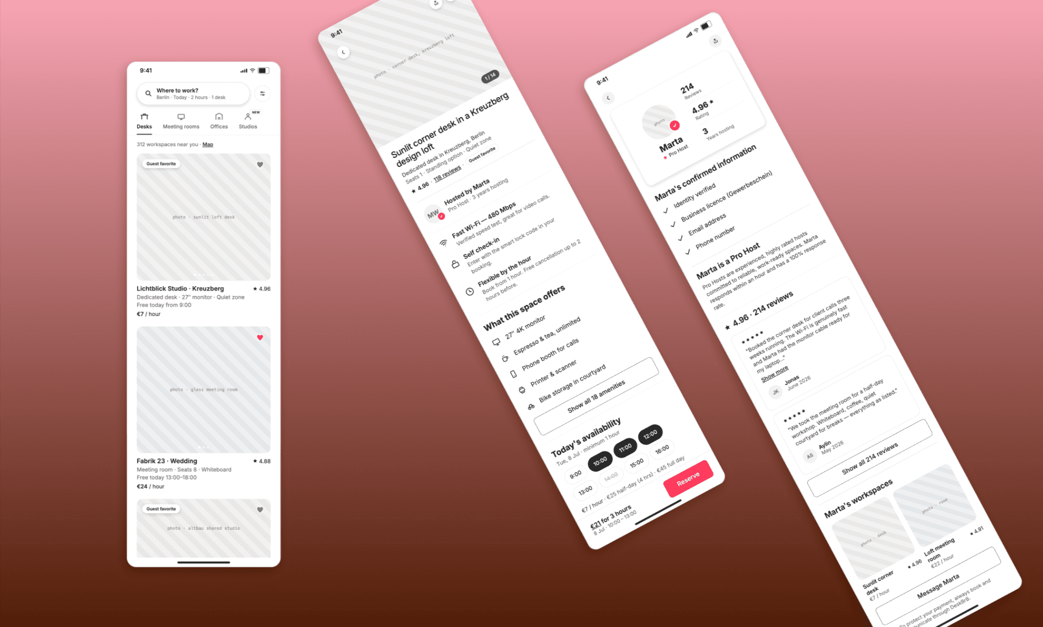
Time taken: ~5:30 mins
Now, this one is interesting because here it acted more as a rigorous PM than an indulgent designer. It got the icons, typography, and curves right. But more importantly, it got the layout and elements so spot on one can mistake it as Airbnb UI altogether. Fable 5’s limit of image generation/sourcing is double-checked here, but the UI/UX is fabulous nonetheless.
Free Design System Generator AI >
Frontend Code Quality of Fable 5
Web design with Claude Fable 5 is only half the pitch as a product design AI, the other half is the frontend code generation. So I pulled the code for two of the earlier builds: the meditation app (standard HTML/CSS/JS) and DeskBrB (modern React + Tailwind).
Meditation app: HTML/CSS/JS in a single file
It has no framework, and everything is inline. Semantic markup (header, footer, main), CSS custom properties for the color system, aria-pressed state handling on the picker, prefers-reduced-motion respected on the breathing animation. Reads like a developer wrote it with accessibility as a habit.
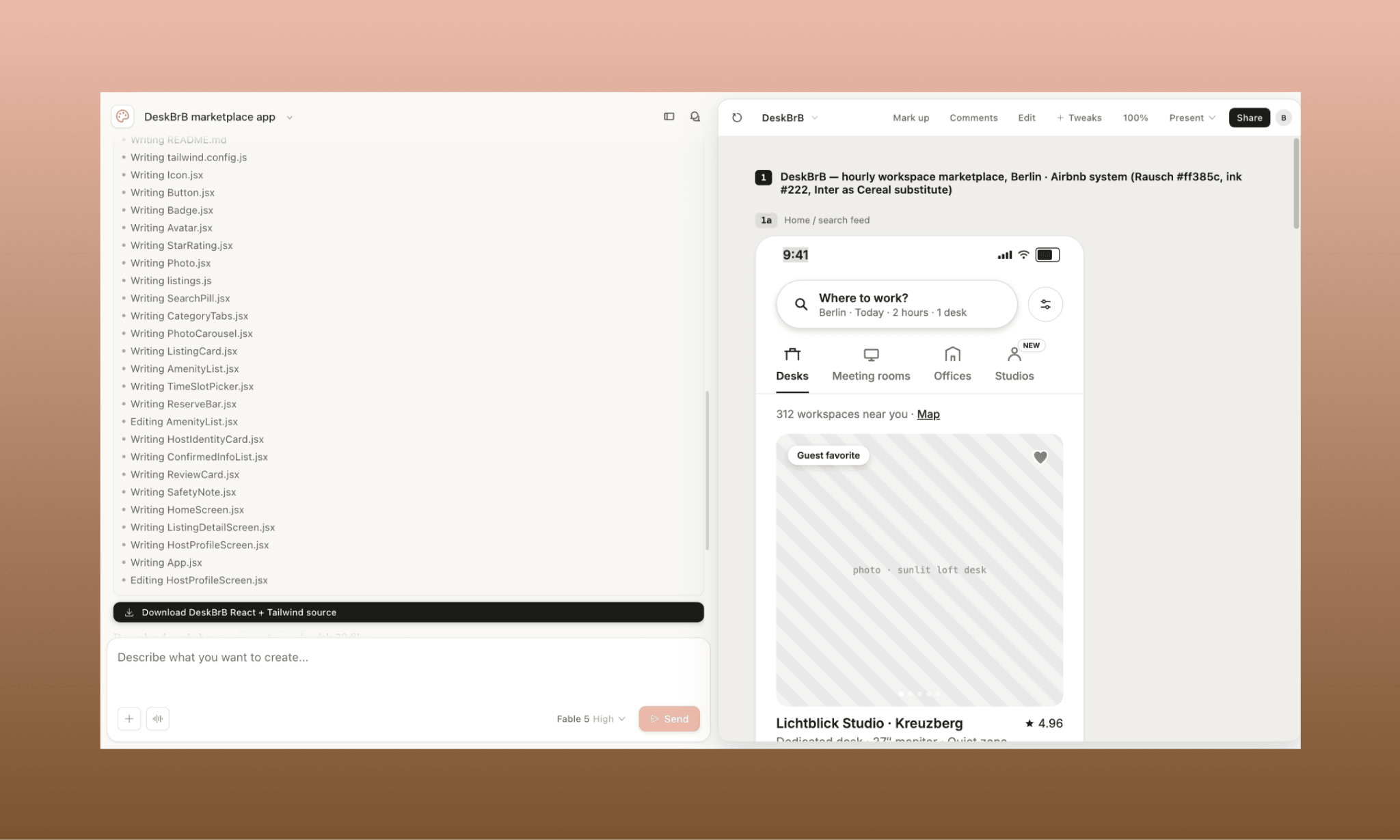
DeskBrB app: Componentized React + Tailwind
This is where it stopped feeling like a design tool exporting code and started feeling like a small team's actual repo. 18 files. Real component boundaries — Button, StarRating, ListingCard, PhotoCarousel — each reusable, each props-driven.
The Tailwind config extends Airbnb's actual tokens (Rausch red, ink/muted scale, one shadow tier) pulled straight from the design MD. It even shipped a README with Vite setup steps and a licensing flag. Also, since Airbnb's Cereal font is proprietary, it defaulted to Inter and said so. Neat.
Output analysis
Across both samples, the Fable 5 frontend code quality holds up regardless of scale or stack. They include accessibility attributes, semantic structure, and design-token discipline that aren't one-off flourishes but a consistent baseline. Design fidelity carries through cleanly too. This is genuinely closer to a frontend developer handoff, rivaling dedicated Design-to-Code AIs of 2026.
Fable 5 vs Gemini vs GPT at UI
In 2026, two AI models dominating the UI/UX and frontend game were Gemini 3.1 PRO & GPT-5.4. To demo Fable 5’s contention, I pit all three together by running the exact same prompt through all. And for a quite complex one that requires generating a mobile and desktop interface of a single fintech app screen.
Am running Fable 5 on Claude Design, and Gemini & GPT models on Banani AI UI Designer.
Prompt (identical across all three, no references)
"Design a mobile banking app screen called 'My Card' — user-side. Show a virtual debit card, balance, quick actions, spend stats, and a recent transactions list. Fill in the details and copy as suitable. As for aesthetic direction, go for a dark, bold look that feels premium but not loud. Gradient and translucent surfaces (glassmorphism-leaning) with modern typography and one accent color doing all the work."
Design Output (all three side-by-side)

View & Edit Gemini 3.1 PRO design | View & Edit GPT 5.4 design
All three of them asked me clarifying questions (Banani’s AI UI Agent needed less handholding though). And UI designs by Banani were done in under 2 minutes (a minute each for mobile and desktop), Fable 5 inside Claude Design took ~6 minutes for the same.
As for the design itself, firstly, all of them got my mobile view brief right. Interestingly, Fable 5 and GPT 5.4 chose a similar green-black combo while Gemini 3.1 PRO took a different route, viz. Purple-Black. The decisions on fonts, icons, and layout is also commendable for all three. Yet, for me, Fable 5’s translucent card has a more premium look. Its desktop view smartly packs a lot in less, in a single screen. Not to say the other two are not good, but GPT misses the side nav-bar, and Gemini seems a bit crammed.
Tough call comparing the trio indeed, but the Fable 5 UI comes out with an edge.
Design UI with Gemini or GPT for Free >
Verdict: Is Fable 5 Good for UI/UX?
Yes, Fable 5 is a class apart in web design. Its understanding of the brief, design quality, and code output is genuinely strong. It can build static screens, include micro-animations, and interactive multi-screen prototypes. However, it's expensive in terms of credits and slow (at least inside Claude Design).
If, alongside stunning UI by AI, you need a seamless design-to-code workflow, get started with Banani for free! It supports multiple models (latest Gemini + Claude), has deep Figma integration, and one-click HTML/CSS export or MCP connectors.
FAQs on Fable 5 for UI/UX Design
How to access Fable 5 in Claude Design?
Once you’re in Claude Design, in the prompt box, you’ll see models drop down. Select Fable 5 from there and also choose its effort applied (from low to max).
How to get the frontend code from Fable 5 in Claude Design?
In the AI chatbot, you can ask directly for the standalone code of your Fable 5’s design in any language. Or, on the top right corner, click Share → Send to Claude Code for a developer handoff package.
Is Fable 5 frontend code quality good?
Yes, it is. Per my review of multiple frontend code files generated by Fable 5, I’ve found semantic & accessible HTML/CSS/JS at a small scope, and genuinely componentized, token-driven React + Tailwind at a multi-screen scale. Pretty close to a real developer handoff.
Can Fable 5 create images for UI?
Not reliably. During testing Fable 5 inside Claude Design for UI, despite multiple tries, it did NOT generate the images; instead, it sourced real photos from Wikimedia Commons. However, custom vector icons could be generated from specific prompts.


