
Opus 5 | Fable 5 | |
Prompt Adherence | 4/5 | 4/5 |
Visual Polish | 3.5/5 | 4.5/5 |
Interactivity & Animation | 4/5 | 3.5/5 |
Design System Fidelity | 4/5 | 4.5/5 |
Best For | Fast, budget-friendly UI iteration | Polished, client-ready final designs |
Nano Banana PRO vs 2 at Image Generation >
Opus 5 is out with a bang[1]. And Anthropic calls it close to Fable 5, at half the price. Meaning better bang for the buck, too. I had juried that Fable 5 is the final boss of UI/UX. So worth seeing how close to awesomeness is Opus 5 UI design skills. Below I put Opus 5 vs Fable 5 – in Claude Design – by running a set of prompts to check their one-shotting, design referencing, and animation handling. I have my perception, but invite you to make your decision from my examples of UI by Opus 5.
Claude Design Free Alternatives >
Text-to-UI Comparison
Single-screen Dashboard (Desktop)
Prompt
“Design a minimalist desktop dashboard for a stock brokerage app built for everyday retail investors, not professional traders. Show portfolio value, today's gain/loss, current holdings, an open chart, and a watchlist at a glance. Use an off-white background, and an aqua-green for accents. Typography should be a clean sans-serif with clear size hierarchy: large for the portfolio total, medium for section headers, small for row-level data. Favor generous whitespace and card-based grouping over dense tables.”
Designs
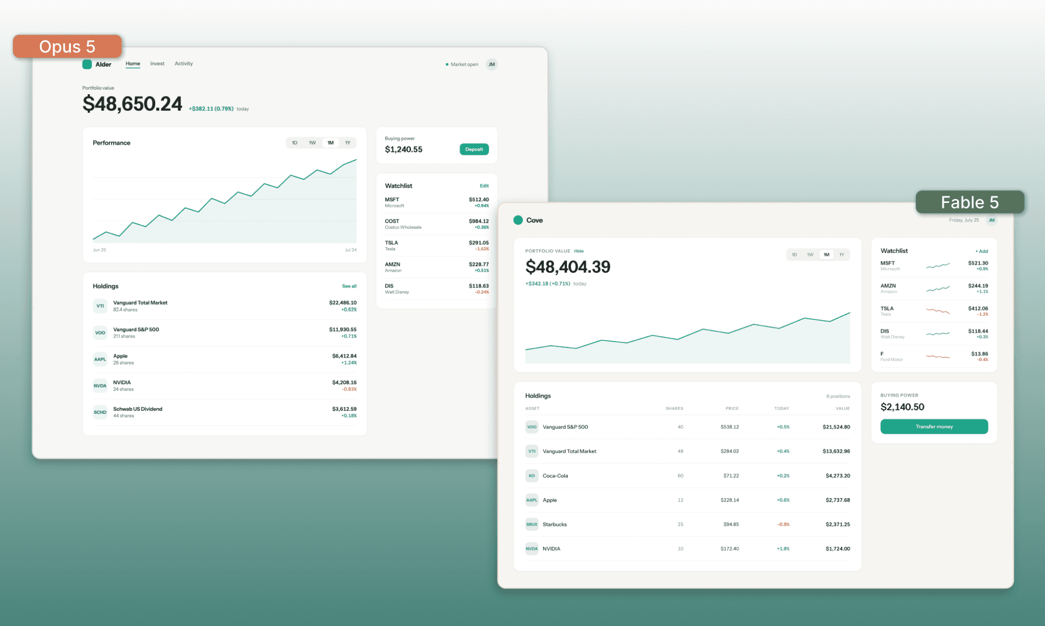
The directions were quite explicit and prompts were followed by both to the same degree: not to the t, but broadly. Their color choice, typography, elements used are quite similar. But Fable 5 is adding some extra information while still maintaining minimalism.
Edit a fintech app template with AI >
Multi-screen onboarding flow (Mobile)
Prompt
“Design an interactive 4-screen mobile onboarding flow for a fitness tracker app: a welcome/home screen, a profile setup screen, a preferences screen, and a start/paywall screen. The paywall screen should feel like an invitation to commit for long-term gain, with the option of starting free casually. Make sure the four screens feel like one cohesive flow in design and copy both.”
Designs
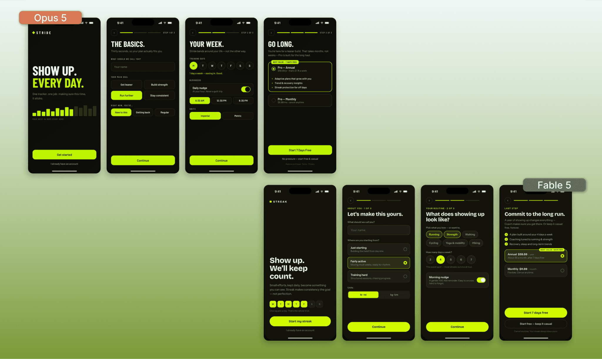
This time the design direction was quite open-ended and Claude Design – for both Opus 5 and Fable 5 – asked me clarifying questions. I told them both in all cases ‘decide for me’. Both models stuck to the prompt have decent design and here, too, the Opus 5 has a leaner look and copy than Fable 5.
I am beginning to see the pattern why they say Opus 5 is ‘close’ to Fable 5.
Screenshot Remix Comparison
The two comparisons of above between Opus 5 and Fable 5 were for them to create something from scratch. But product teams typically take inspiration from existing UIs and build upon it. So I decided to give the two a Duolingo screenshot and asked to remix a new feature without losing the look-n-feel.
Prompt
“Step 1 — Nav bar icon swap: Match this Duolingo screenshot's design system precisely. Swap out the leaderboard/shield nav icon for a new "Culture" icon (a postcard) matching the same line weight and visual style as the rest. Leave everything else as is.
Step 2 — Feature screen: Build the "Culture Cards" screen this icon leads to — a scrollable feed of cards, each featuring a real photo (street, market, café, landmark) from a country where the language is spoken, a brief caption linking it to a vocab word, and a "Practice this sentence" button. Preserve Duolingo's card style and color scheme, but make the photo the visual anchor.”
Designs
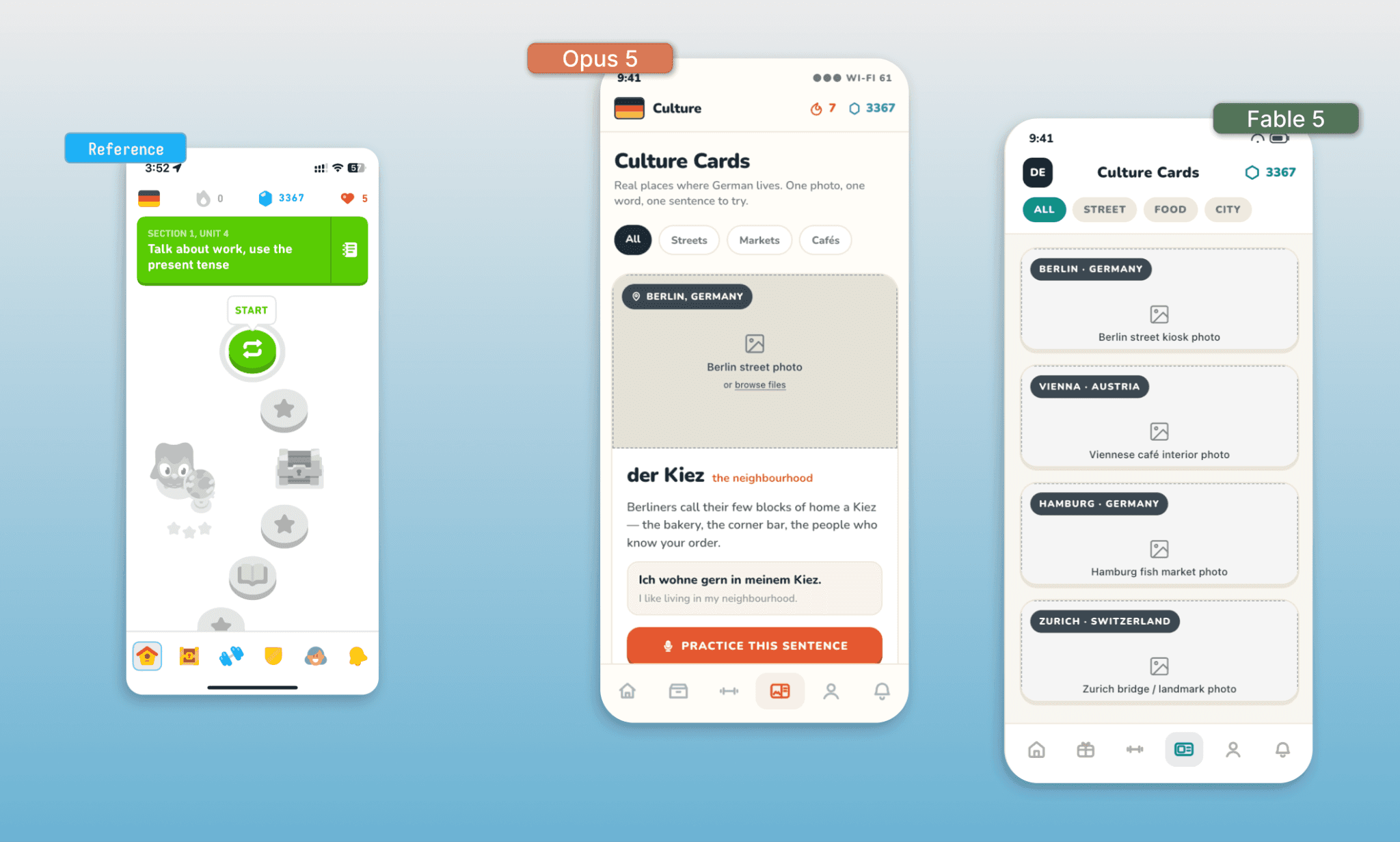
Neither of them made a precise replica from the screenshot given as evident from the difference in the nav bar icons, but they both got the typography and style right. This time, Opus has an edge with more copy and better prompt adherence (quiz format in contrast to Fable 5’s plan image list).
Neither Opus 5, nor Fable 5 generated images on their own (inside Claude Design) and instead required the user to upload licensed photos.
Design.MD Fidelity Comparison
In 2026, designers go a step forward from referencing UI and instead reference a design.md (a markdown file with design tokens of a brand). So the design AI should be able to understand and make intelligent design decisions in line with the prompt. I uploaded the design MD of Anthropic and asked to generate a gig-worker hiring app UI for both Opus 5 and Fable 5.
Prompt
“Reference the uploaded @design.md file for all colors, typography, spacing, and component styling. Using that design system, design a 3-screen gig-worker hiring app, similar in spirit to TaskRabbit. Screen 1: the user browses/finds an available runner nearby, seeing basic info like name, rating, and ETA. Screen 2: once a runner is assigned, the user tracks live progress on the task. Screen 3: after completion, the user rates the runner and leaves optional feedback.
Decide layout or information for me but do NOT deviate from the design MD tokens.”
Designs
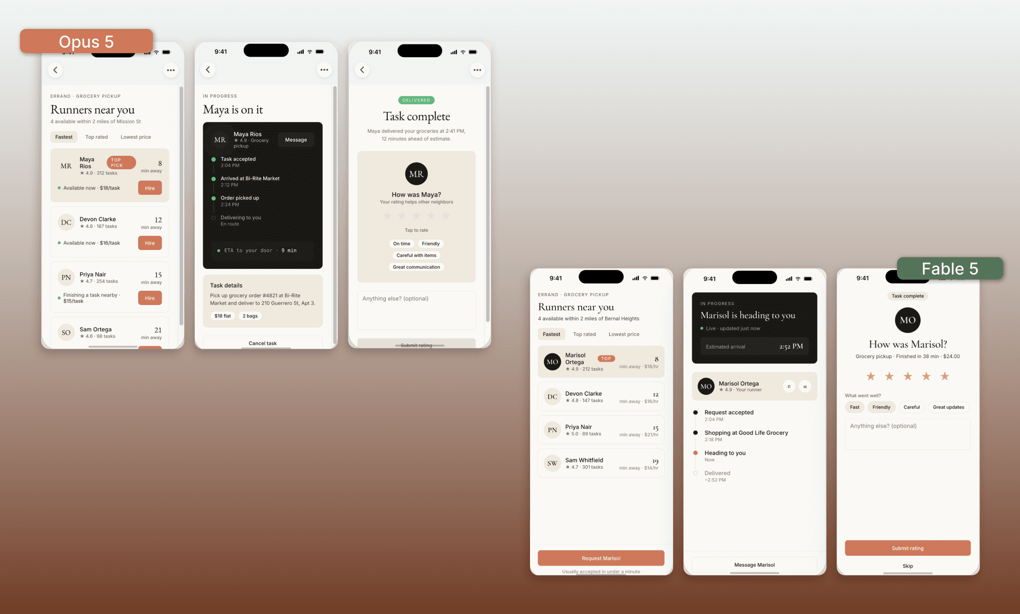
Firstly, both sets of UIs look like something Anthropic would release. But this Opus 5 has indulged in more detailing than Fable 5. The latter looks more minimal and polished, while the former has ,albeit minor, some alignment issues.
Try a Design System Generator Free >
Animated Design Comparison
Unlike light-weight & free AI UI Generators, a key advantage of using Claude Design is that it can generate interactive/animated UIs. So for my last round of Opus 5 vs Fable 5 for UI design, I created a web tool that I can interact with.
Prompt
“Build a single-page interactive web tool that teaches kids how trigonometric graphs (sine, cosine, tangent, etc.) are formed. On the left, show a live graph of the selected function. On the right, show draggable controls or sliders for parameters like angle, amplitude, and period. Changing a control should animate the graph in real time, and dragging a point directly on the graph itself should update the control values in sync — the two should stay linked in both directions. Include a function selector so kids can switch between sine, cosine, tangent, and others. This should feel like an educational toy, not a technical plotting tool.”
Designs
It was impressive to see both the models nail it in the first go. And here I feel Opus 5 has better interactivity, but lags in looks. For the looks, you can see Fable 5 arranged the layout in a way to have it all in a single page-view; unlike Opus 5 which has part of the customization under the fold. But Opus 5 offers ‘Pick a Wave’ that genuinely works unlike Fable 5.
GPT 5.6 Interactive Design Example >
Opus 5 vs Gemini 3.1 vs GPT 5.6
We’ve seen how Opus 5 and Fable 5 compare to each other on design grounds. But they are not the only competing AI models in a product designer's kit. Two equally popular ones are Gemini 3.1 PRO and GPT 5.6. So I pit Opus 5 against those two as well.
Prompt
“Design a mobile home screen for a health tracker app that connects to a smart ring, showing the wearer's key health data at a glance. Include today's sleep score, readiness or recovery score, and steps or activity level, along with a simple visual (like a ring graphic or chart) representing the ring's sync status and battery. The screen should feel calm and premium, in line with a device worn to bed and throughout the day — not gamified or cluttered like a typical fitness app. Prioritize a clear visual hierarchy so the most important score is immediately obvious, with supporting metrics taking a secondary role. Keep the overall layout minimal, with room to breathe rather than packing in every possible data point.”
Designs
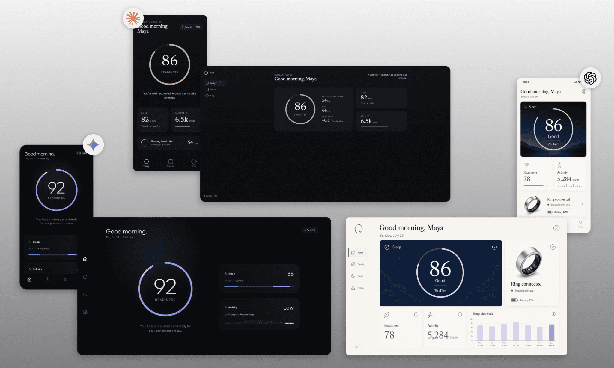
Interesting how Gemini and Opus went with a dark design by default while GPT took a light-mode approach. While that does not factor into the points, but GPT 5.6’s detailed screen with focus on ‘ring’ data steals the show for me. Gemini 3.1 PRO design is neat but too minimal to be informative. While Opus 5 mobile screen works for me but the desktop one is simply not a good responsive layout.
Design UI with Gemini 3.1 PRO for Free >
Is Opus 5 Better Than Fable 5 at UI?
Not necessarily better, but Opus 5 definitely earns its "close to Fable 5" reputation. Because across my four rounds of comparing Opus 5 and Fable 5 at various design challenges, they kept landing in nearly the same spot, just from different angles. Opus 5 consistently brought leaner copy and better prompt adherence, while Fable 5 stayed more minimal and polished, occasionally adding thoughtful extra detail unprompted. On the animated graph tool, Opus 5's controls were more genuinely functional, but Fable 5 arranged the layout more cleanly. Since Opus 5 is half the cost of Fable 5, it makes for a smarter, economical choice over Fable 5.
That said, if you’d rather start with a free AI UI designer, try Banani AI. It is powered by Gemini and OpenAI models, can export to Figma, and ships handoff-ready via MCP.
FAQs on Fable 5 for UI/UX Design
How to access Opus 5 for design?
Opus 5 is available from 25 July 2026 across Claude.ai, Claude Design, Claude Code, and the Claude API.
Is Opus 5 in the Claude Code?
Yes, Opus 5 is available in Claude Code, where it's built to handle long-running, multi-step coding and design work. You can also set the effort from Low to Ultra.
How much does Opus 5 cost?
Opus 5 is priced at $5 per million input tokens and $25 per million output tokens on the API (the same as its predecessor Opus 4.8)[2].
Can Opus 5 create images for UI?
No, Opus 5 doesn't generate original images inside Claude Design. It needs uploaded photos or assets to work with, same as Fable 5.
References
[1] https://www.anthropic.com/news/claude-opus-5
[2] https://platform.claude.com/docs/en/about-claude/pricing


