Compare AI Models for UI Design
Pick up to 3 AI models to compare side by side across 4 design scenarios.



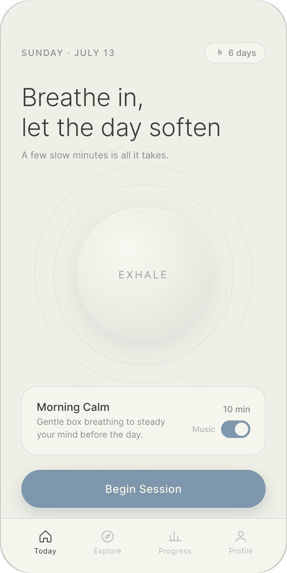
Minimal single screen
PROMPT
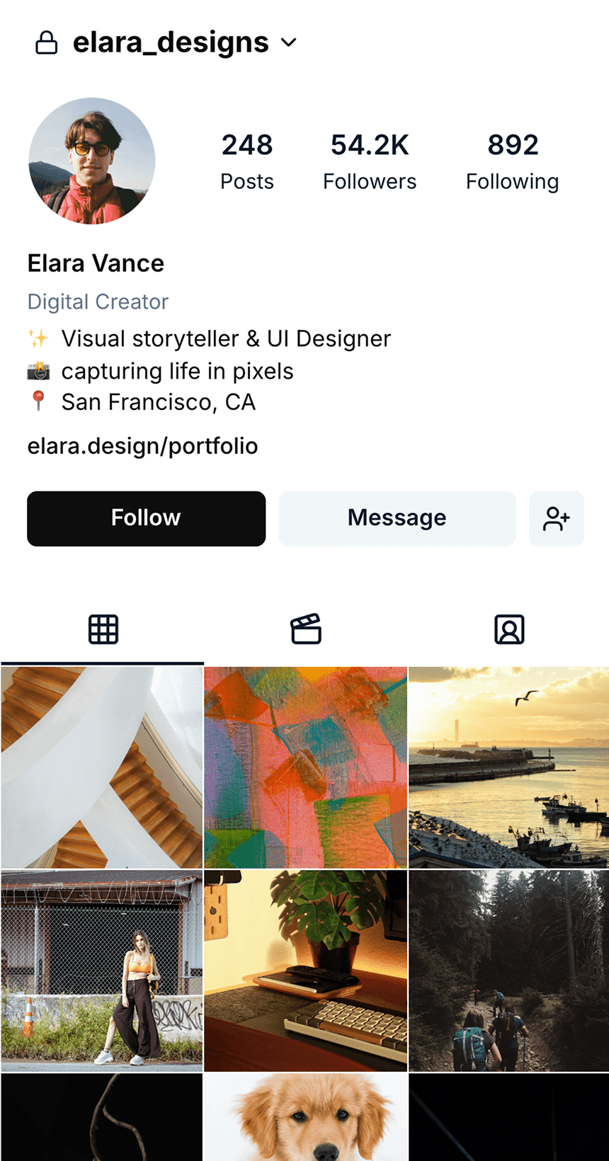
Design a mobile app screen for a meditation app: starting a guided breathing session.
Typography: one clean sans-serif (Inter/SF Pro style). Large, light-weight headline. Small muted body text.
Colors: soft, desaturated — pale sage or cream background, one gentle accent (dusty blue or terracotta) used only for the primary action. No pure white/black, no saturated colors.
Elements: circular breathing-animation centerpiece, today's session card (name, duration, one-liner), music on-off, understated streak indicator, one pill-shaped primary button ("Begin Session"), simple 3-4 icon bottom nav.
Icons: thin-line only, consistent stroke, one color.


Maximal single screen
PROMPT
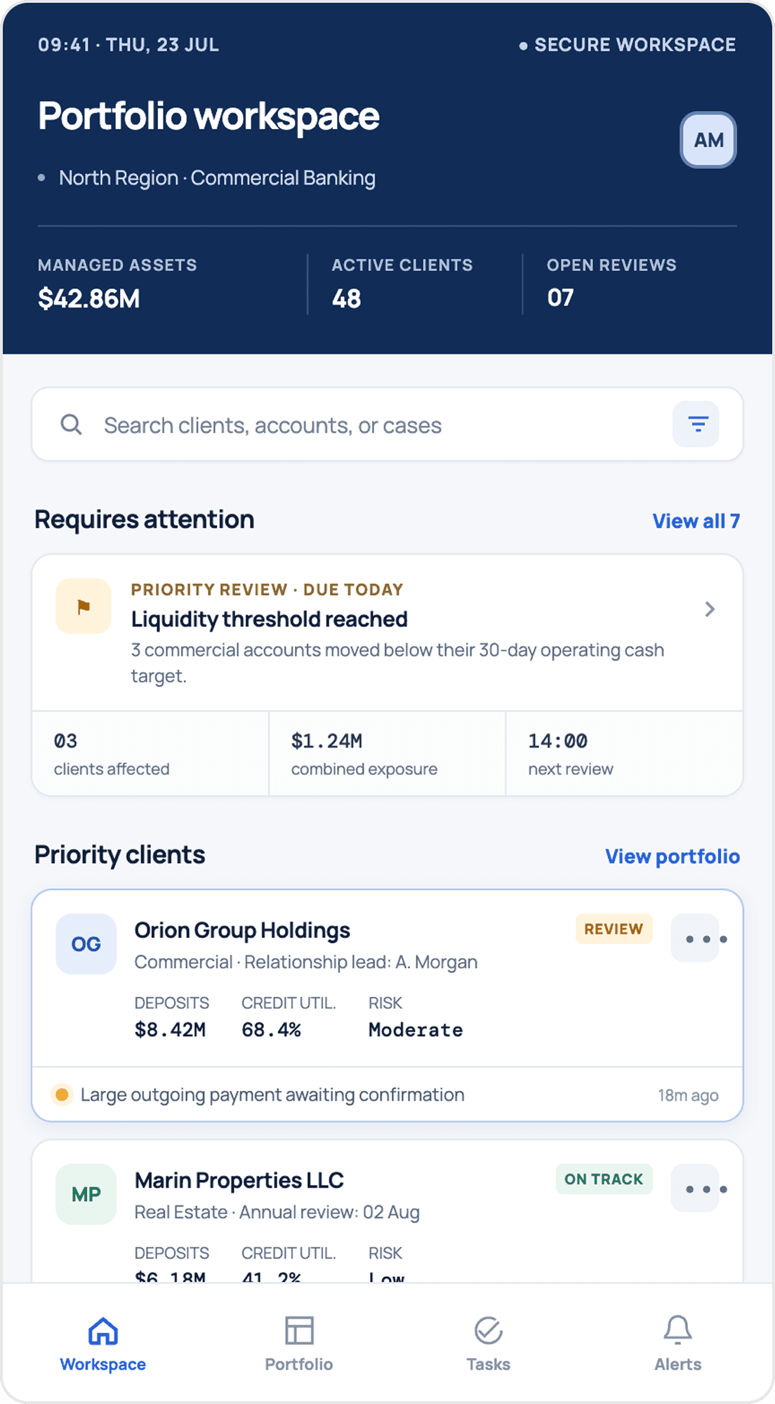
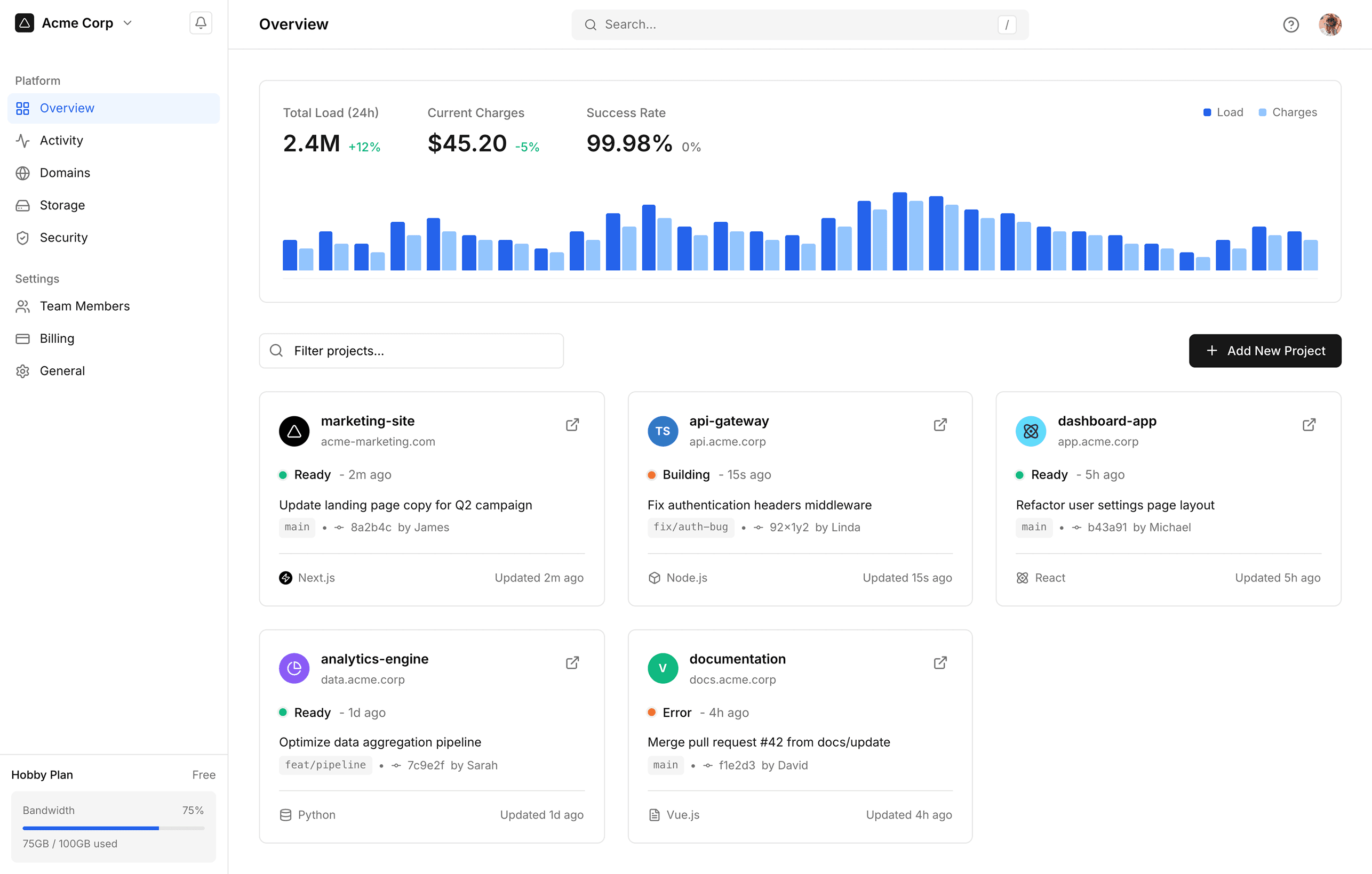
Design a dashboard screen for internal banking software — used by a relationship manager or banker to review client accounts, not a consumer-facing app. Light mode.
This is the main workspace screen they see when reviewing their portfolio of clients. Make it information-dense with relevant client account cards, risk/flag indicators, transaction activity, and quick actions (e.g. schedule a call, flag for review, view full profile).
This should feel comprehensive and data-rich without feeling chaotic — strong visual hierarchy is the priority, not minimalism.


Multi-screen flow
PROMPT
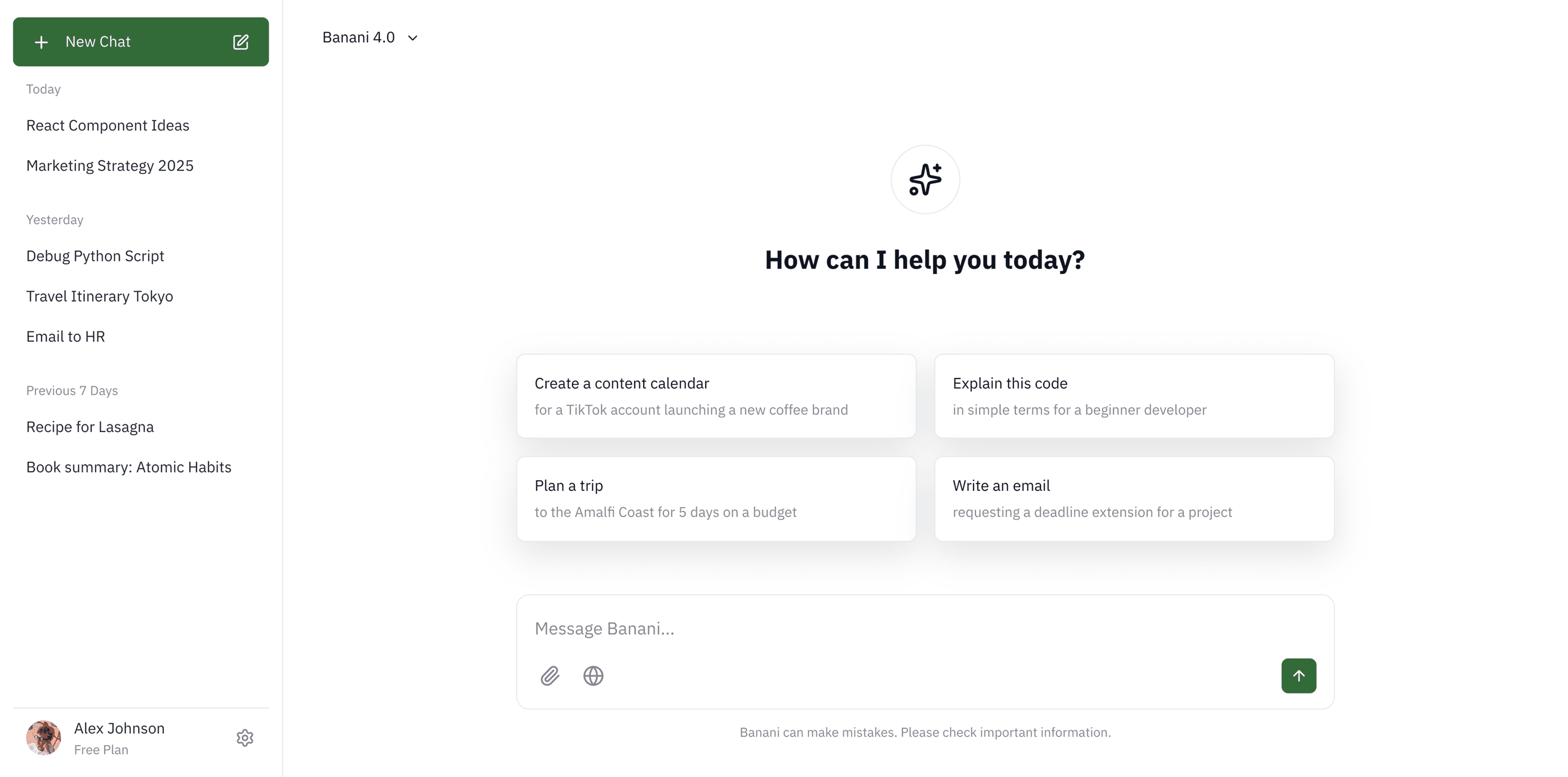
Design 4 connected onboarding/entry screens for a community app where young adults find local meetups for retro/couch co-op gaming and group game nights. Think "gather your party" energy, nostalgic for Nintendo-era childhood friendships; NOT a dating app though.
Screens: (1) welcome/value proposition, (2) profile setup (gamertag, favorite games/systems), (3) interests/preferences (game genres, playstyle, availability), (4) get started / paywall.
Strictly follow the attached design system file of Nintendo 2001.

Animated screen
PROMPT
Design a single-page portfolio website for a senior growth marketer working across writing, social, SEO, affiliate, YouTube, and newsletters.
Content-forward, editorial feel: intro/bio, a work showcase (case studies or channel highlights, not just a logo grid), a results/impact section (numbers, outcomes), a short personal letter, and a contact section.
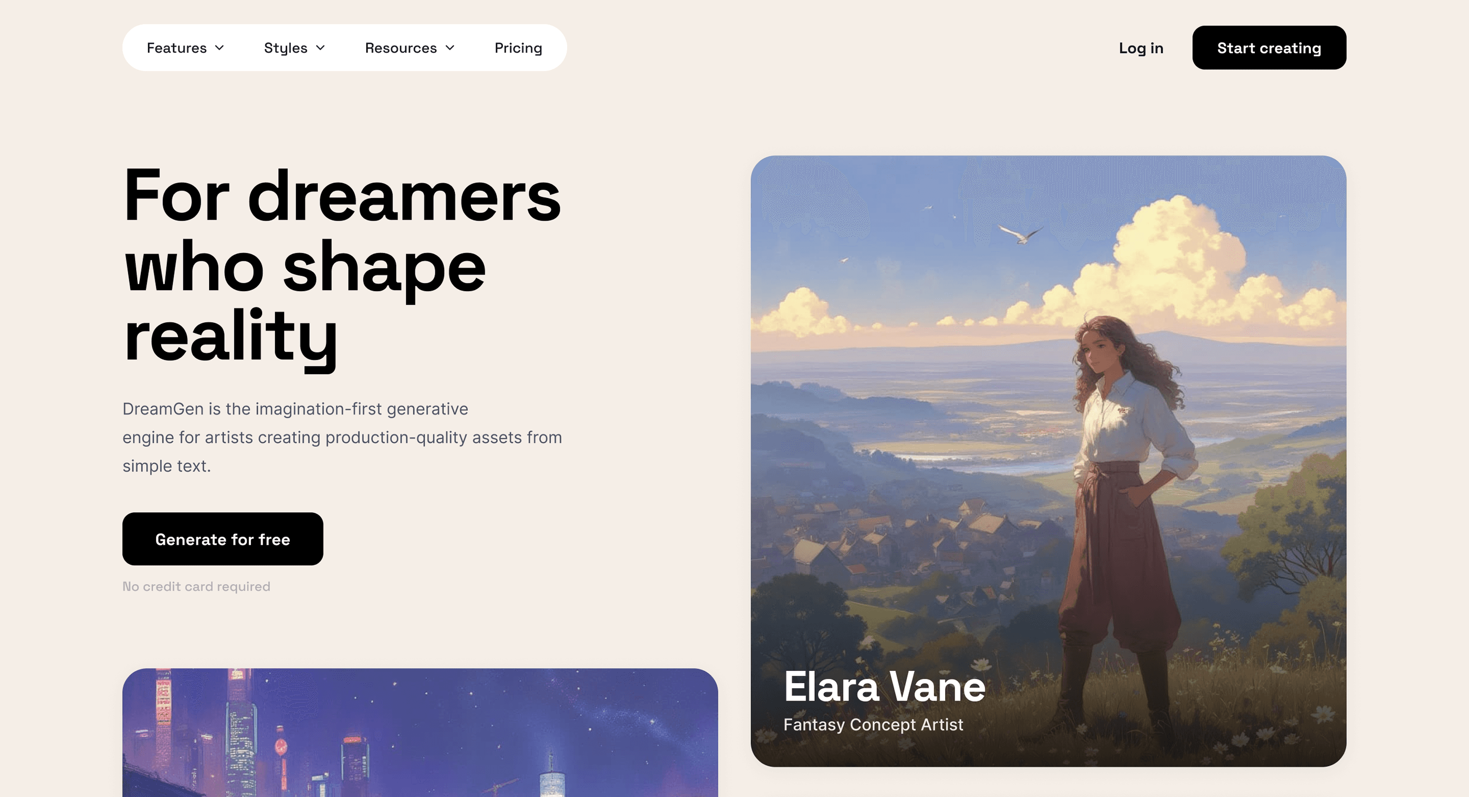
Include one deliberate animation or transition on the home/hero area (scroll-triggered reveal or smooth section transition) and an intentional cursor interaction (custom cursor state, hover-triggered movement, or magnetic effect). It all should feel sophisticated, confident; not gimmicky.


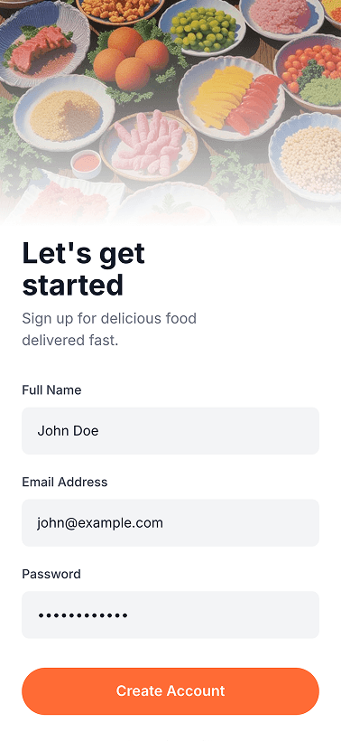
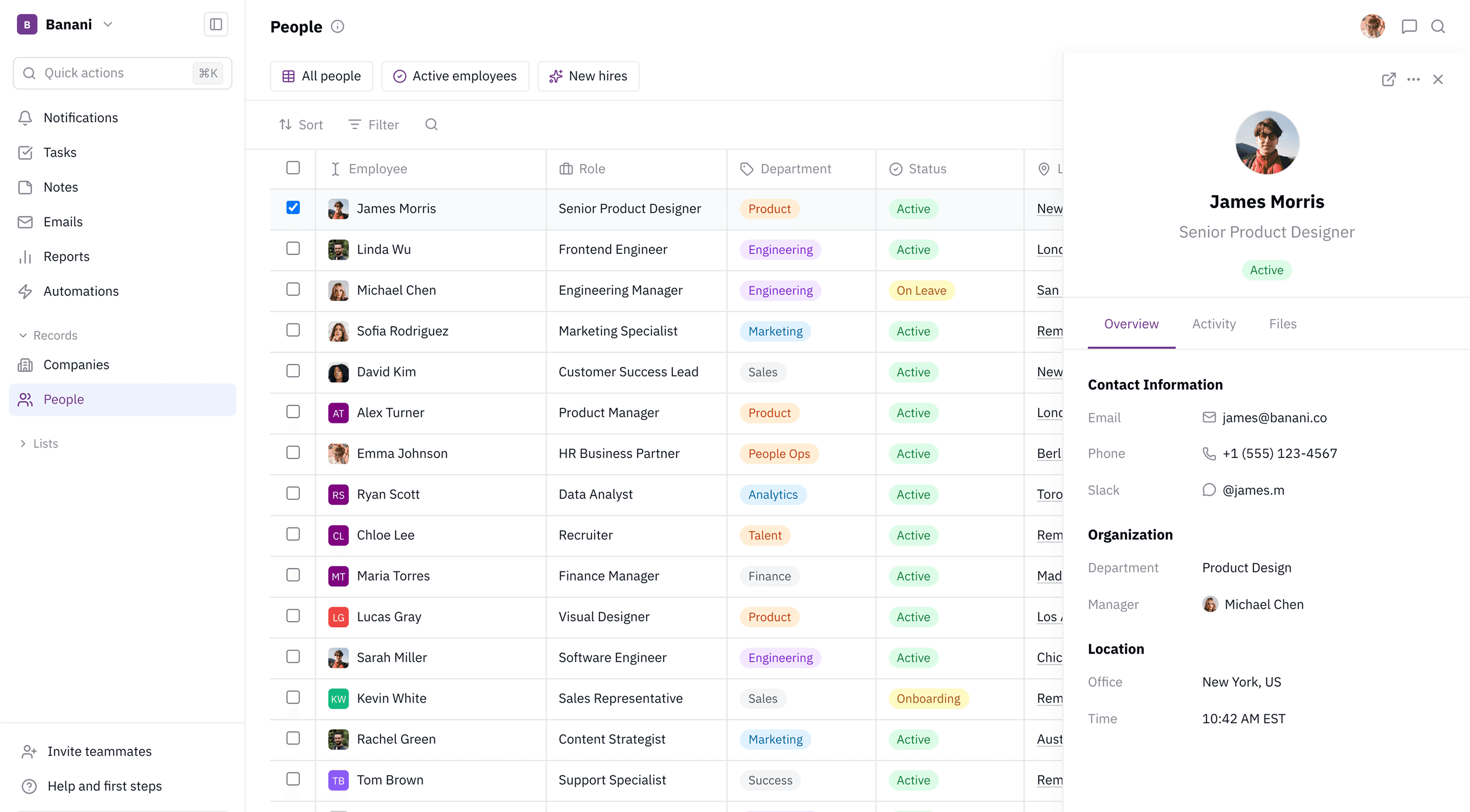
Tem uma ideia para o design de uma app? Seja para mobile ou desktop, temos uma IA para isso.
PRODUTO
FERRAMENTAS
Imagem para Figma
LEITURA
IDIOMA