

OpenAI made a specific claim about its GPT-5.4 frontend design capabilities[1]: focus on improved UI capabilities with use of images, and trained to avoid weak visual hierarchy. Sounds like they heard user complaints or decided to better Gemini 3.1 at design. Either way, the proof should be in the pudding. And I decided to taste (or test) it. How? Using Banani's UI design canvas with GPT-5.4 set as the model.
I ran prompts across a few common UI/UX scenarios to see how the model hits in one-shot with a baseline prompt, and how it improves with edit prompt per their own guideline.
Try GPT 5.4 for UI Design, free >
Mobile App UI with GPT 5.4
Baseline Prompt
Design a mobile app called DeskBrB, an Airbnb-style marketplace for booking coworking desks and meeting rooms by the hour. I want 3 screens: Home/search feed, Listing details, and Seller profile.
Browse & Edit AirBnB UI with AI >
Output
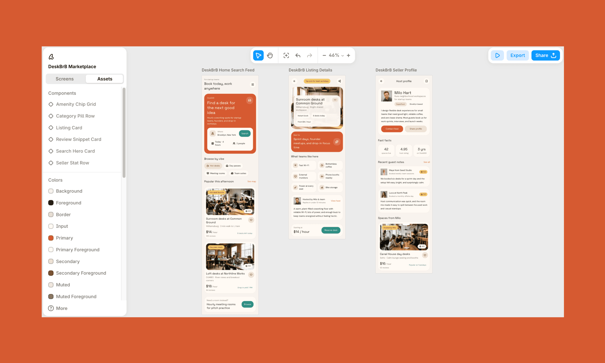
Time Taken: ~1 minute (for all 3 screens) | Design Rating: 3.5/5
Edit Prompt
I like the existing copy and flow but want a few UI corrections:
- Shift palette from terracotta/orange to soft pastels — muted lavender, blush, sage on the existing off-white base
- Make headlines slightly bolder/larger for more presence
- Break the listing feed out of the uniform stacked-card grid into a staggered, asymmetric layout
- Fix listing detail hero: title text currently overlaps the photo — move it below the image instead
- Replace the boxed "what teams like here" grid with a looser, tag-style layout
- Add a small DeskBrB logo mark in the top nav, and a footer/tab bar (Explore, Bookings, Messages, Profile) on home and listing screens
Edited Output
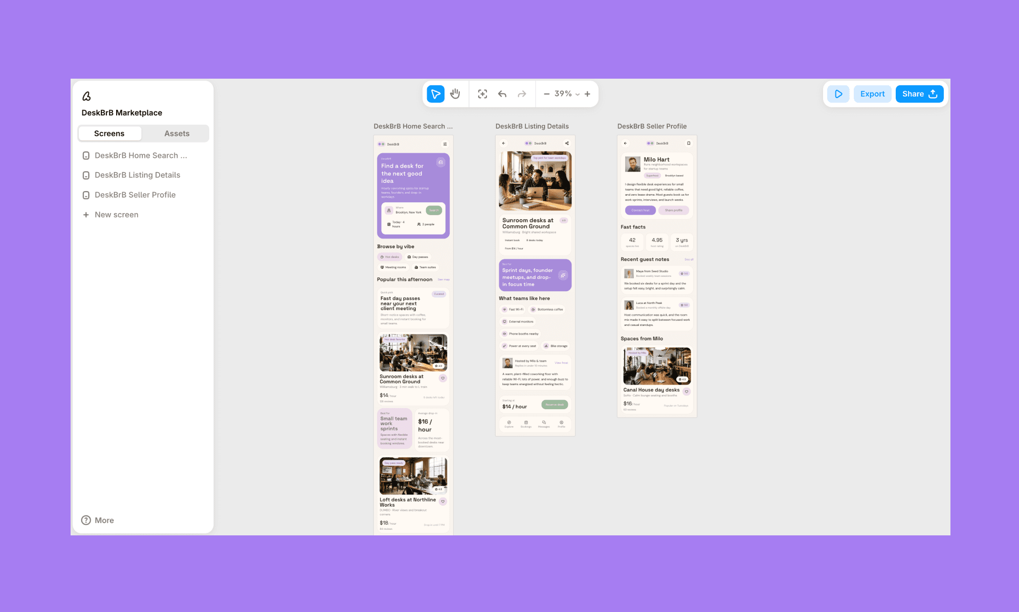
Time Taken: ~1 minute (for all 3 screens) | Design Rating: 4//5
Assesment
GPT-5.4's baseline nailed flow, content relevance, and brand-appropriate copy, but missed basics. For instance, it has an overlapping hero title on the second screen, no logo, no footer. The guided edit fixed all three and softened the palette successfully, though the "asymmetric" layout request came back fairly conservative.
Design a Mobile UI with GPT-5.4, Free >
Landing Page UI with GPT 5.4
Baseline Prompt
A product photographer's website homepage: hero with headline and CTA, services/specialties row, portfolio grid, client stats, and footer. Show various products’ photos. Give bold/minimal personality.
How Squarespace AI Builds Landing Page >
Output
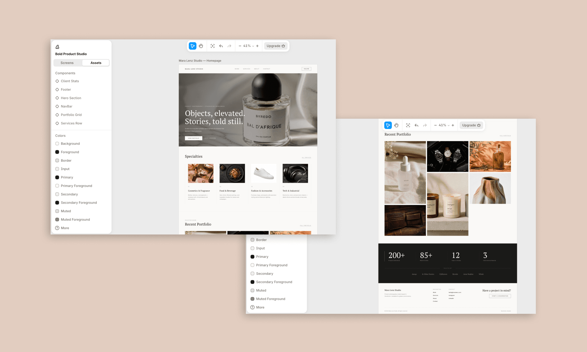
Time Taken: ~1:30 minute | Design Rating: 3.5/5
Edit Prompt
Keep all existing copy, images, and page structure, but push the visual design to feel less safe and more editorial:
- Make the hero full-bleed and let the headline type be more expressive so it reads as a stronger brand signal
- Break the Specialties and Portfolio grids out of their perfectly even rows — introduce varied image sizes or a slight offset/overlap for intentional imperfection
- Add one unexpected layout moment somewhere on the page — for example, a portfolio image that breaks the grid edge.
- Introduce subtle motion cues (e.g., a hover state on portfolio images, a soft parallax on the hero) since static perfection is part of what's making this feel rigid
- Loosen the column alignment slightly so it doesn't feel like a spreadsheet
Edited Output
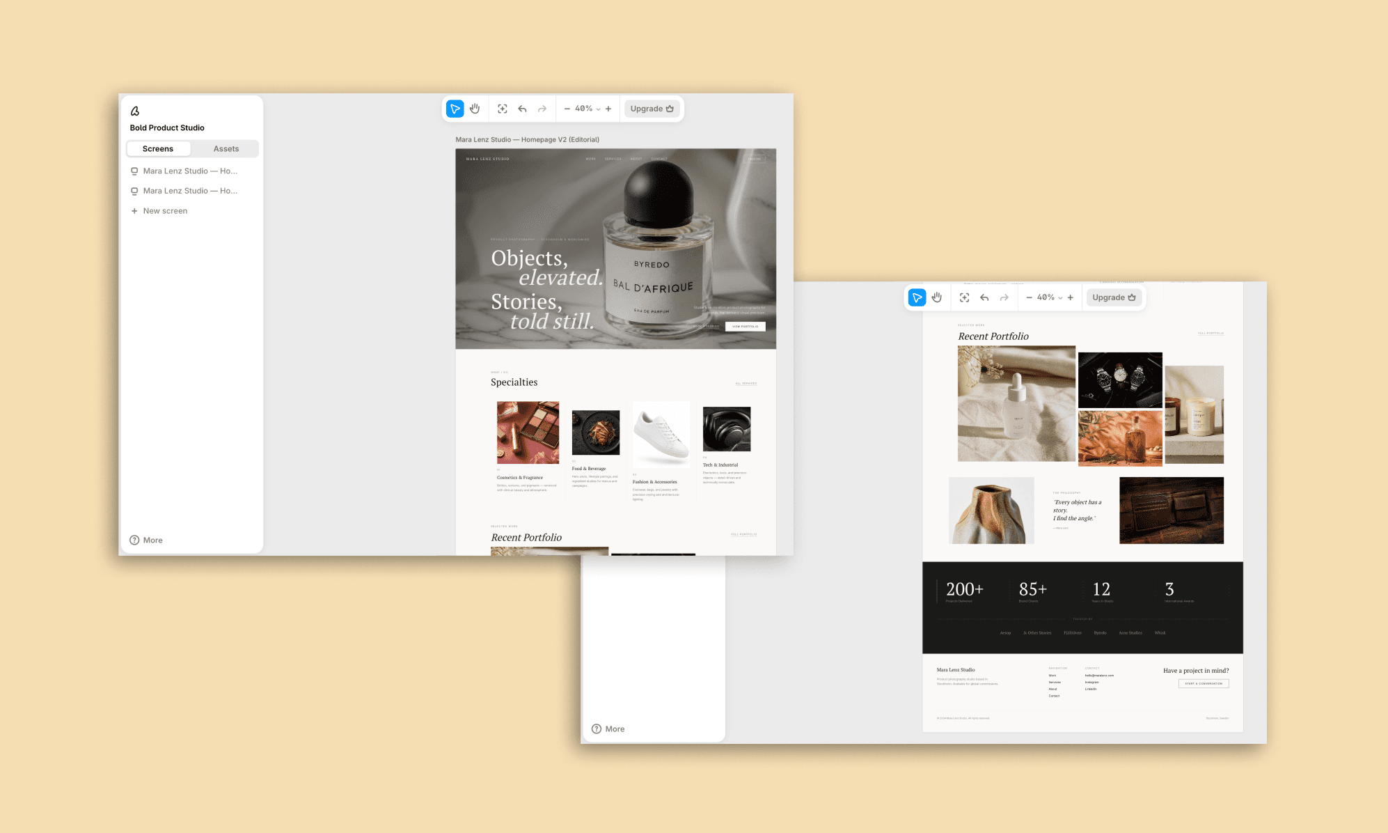
Time Taken: ~1 minute | Design Rating: 4.5/5
Assesment
Baseline output was clean and image-led but textbook-safe. Following OpenAI's own anti-genericism rules (full-bleed hero, broken grid rhythm, intentional imperfection) unlocked a genuinely more editorial result; proof that GPT-5.4's "good design" ceiling is real, but also reachable with explicit prompting.
SaaS Dashboard UI with GPT 5.4
Baseline Prompt
A SaaS analytics dashboard for a content marketing platform. Sidebar navigation, top bar with search and avatar, three metric cards (posts published, engagement rate, monthly reach), a traffic chart, and a recent posts table with status badges.
Output
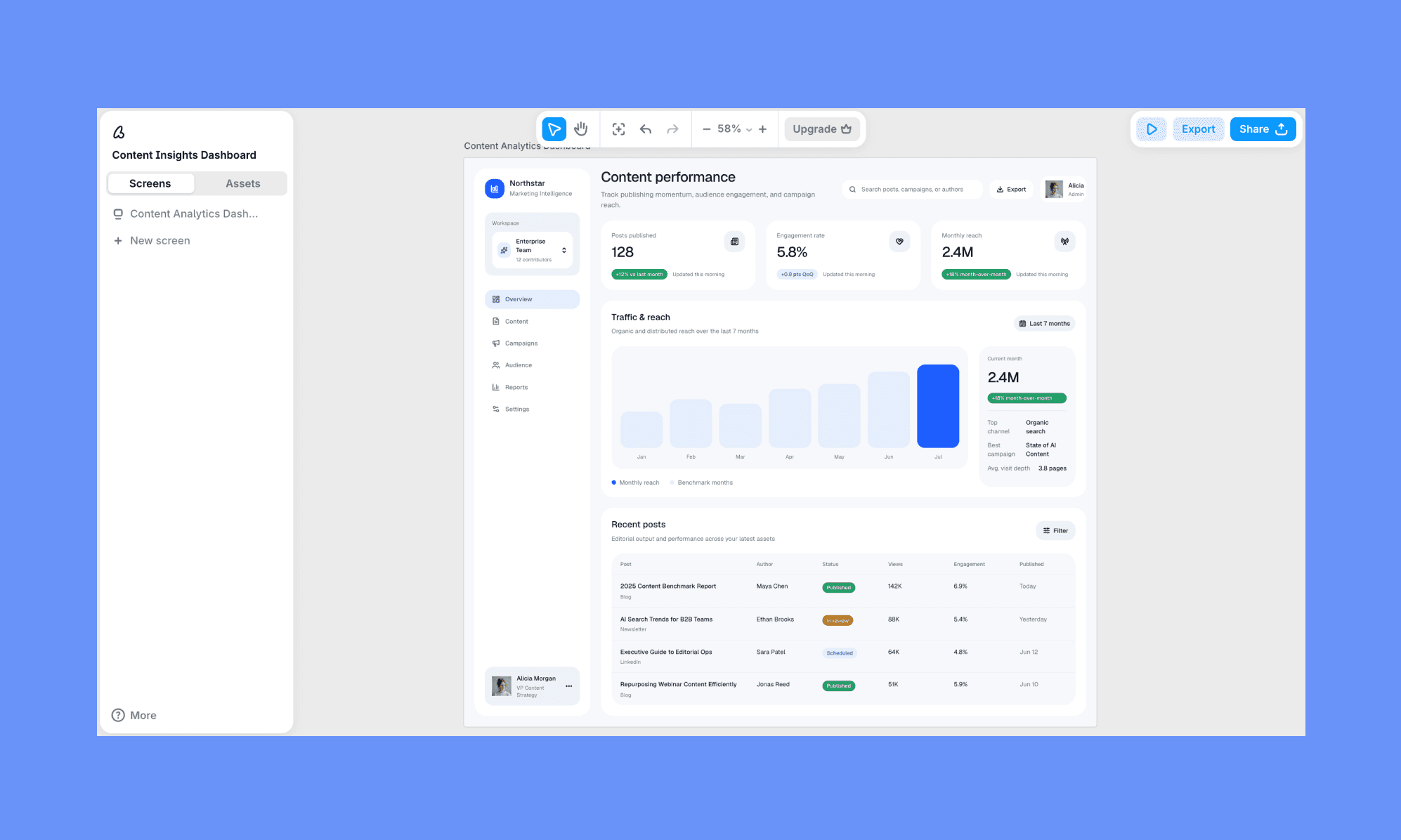
Time Taken: ~1 minute | Design Rating: 4.5/5
Edit Prompt
The current version is too conservative — push it toward a punchier, more visual dashboard style:
- Turn the metric cards into bold gradient blocks (e.g., coral-to-pink, blue-to-teal, mint-to-green) with white text, not flat white cards with a small badge of color
- Replace the bar chart with a richer multi-series line or bar chart using 3 distinct vivid colors instead of one muted blue tone
- Add a donut/pie chart breaking down traffic or engagement by channel, using bold multi-color segments
- Keep the sidebar and table layout, but let the dashboard feel more colorful and energetic overall — less restrained, more visually rich
Edited Output
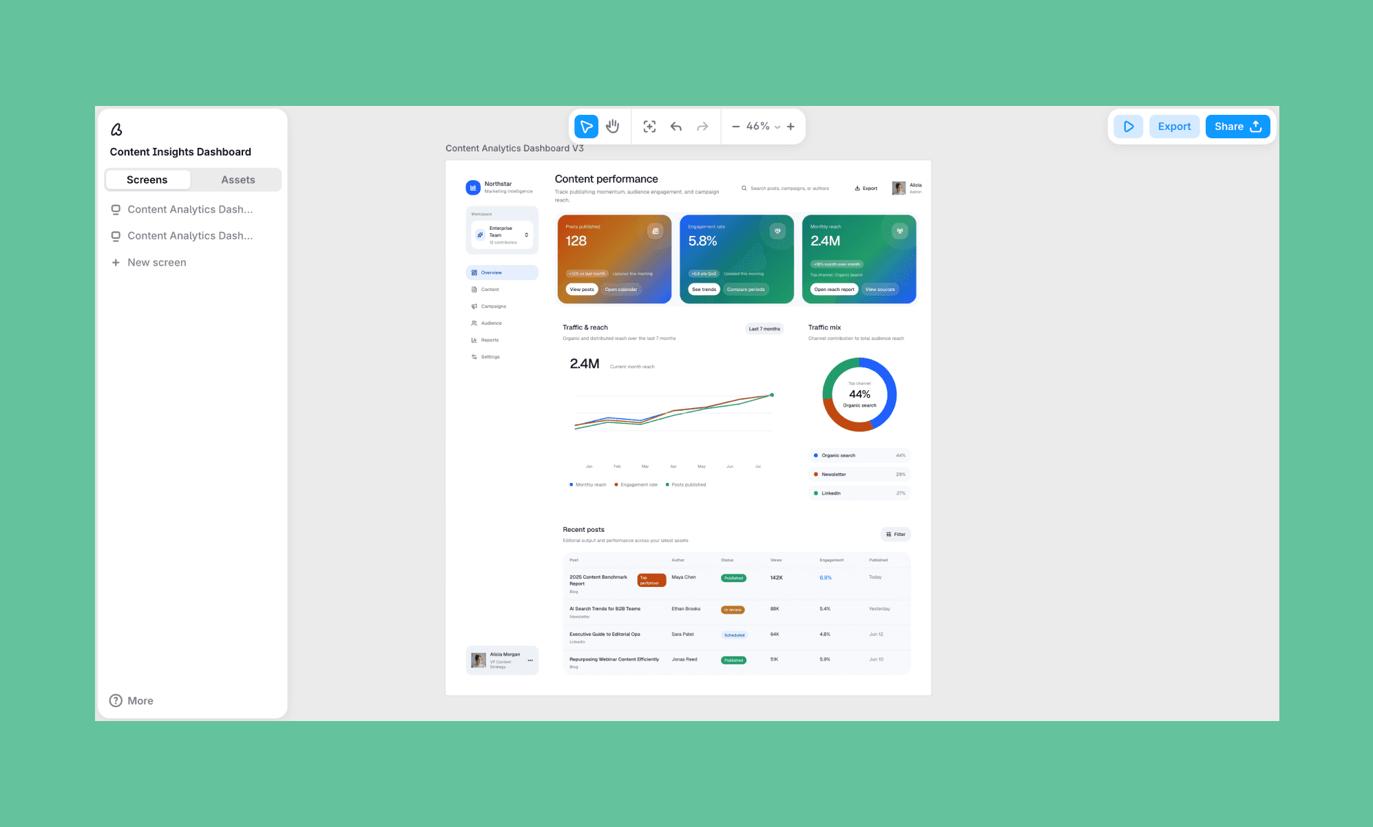
Time Taken: ~1minute | Design Rating: 5/5
Assesment
This was the widest swing of the test. Baseline gave a sensible but flat duo-tone dashboard with no visual hierarchy. The edit pushing gradients, multi-color charts, and a donut breakdown transformed it into a genuinely sharp, energetic dashboard.
Business Deck Designs with GPT 5.4
Baseline Prompt
A pitch deck for an AI UI design startup, pitching an enterprise client. 4 slides: title/cover, the problem (slow design cycles), the solution (AI-native design canvas with Figma/code export), and a closing CTA slide.
Output
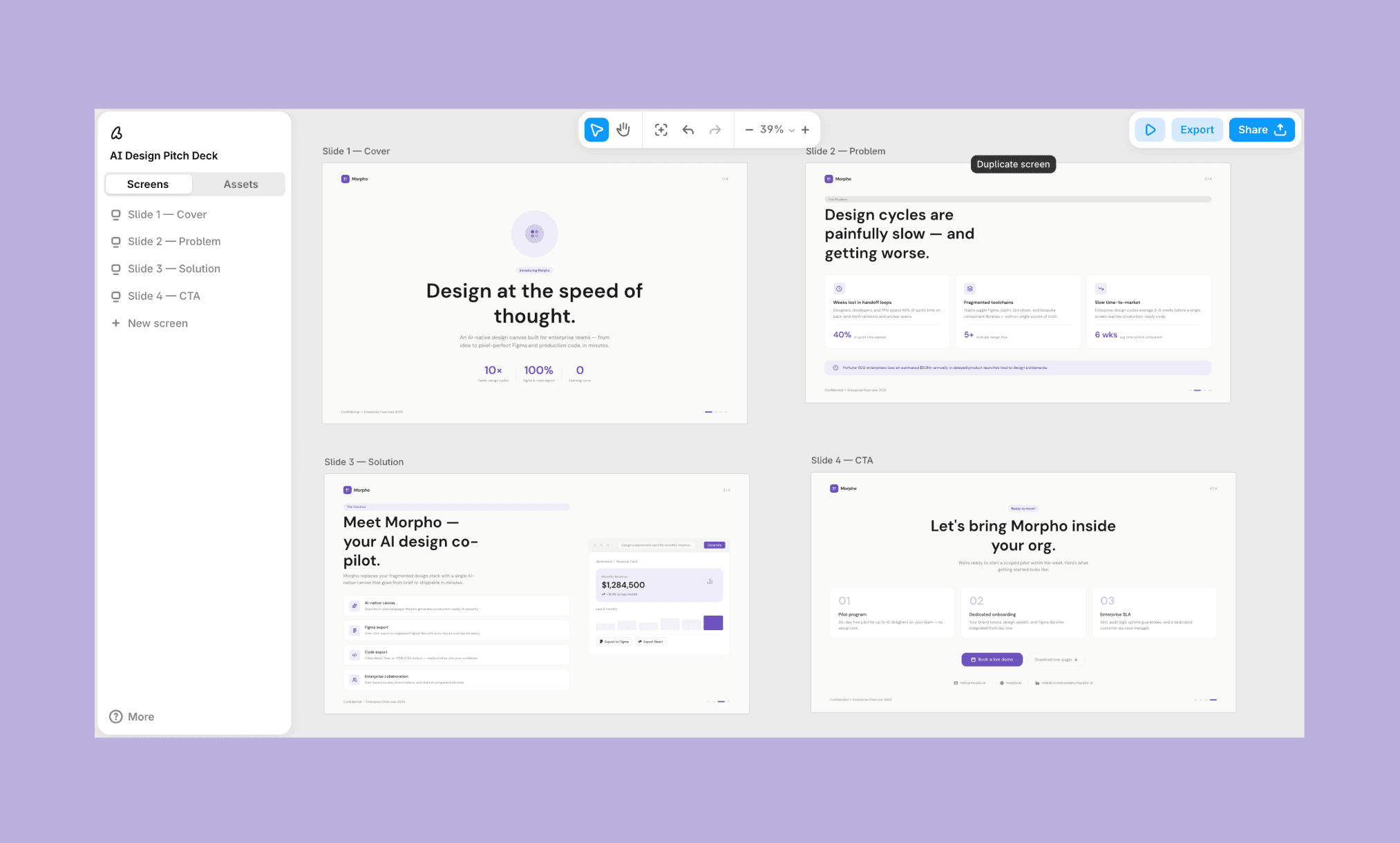
Time Taken: ~2 minutes | Design Rating: 3.5/5
The flow is smart, the content is great, I like the minimalism too
But feel for a design company its a littel too plain. And all deck screens are not of the same dimension. It must be. Also has the classic purple design problem
Edit Prompt
Keep all copy, data, and slide content as is, but elevate the visual design; it currently reads too plain for a design company's own pitch:
- Fix all 4 slides to the same fixed dimensions/aspect ratio (16:9), since they currently don't match
- Move off the default purple accent entirely. Choose a more distinctive color direction (e.g., deep ink/charcoal with a warm amber or electric blue accent) paired with a bold, expressive display typeface for headlines instead of the current safe sans
- Add a strong full-bleed visual moment on the cover and CTA slides. Like a gradient mesh background, abstract generative pattern, or large editorial graphic.
- On the problem and solution slides, give the stat/feature cards more visual weight: subtle depth (shadow, glass, or gradient fill) instead of flat white boxes
- Make this feel like a premium, high-conviction enterprise pitch deck that’s confident and visually rich, not a minimal SaaS landing page
Edited Output
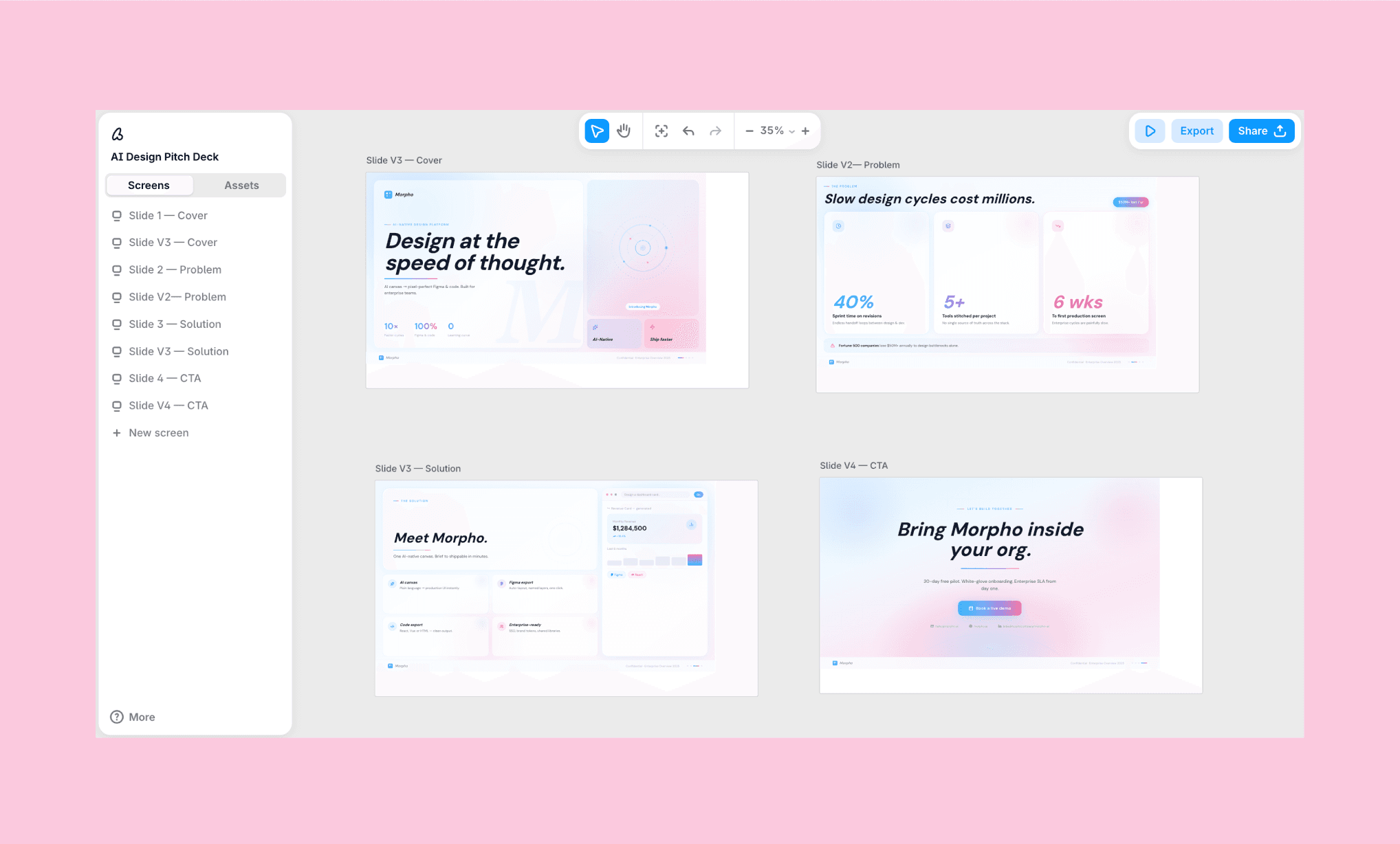
Time Taken: ~3 minutes | Design Rating: 5.5/5
Assesment
Baseline content and structure were strong, but execution was generic. The edit enforcing fixed dimensions, a real color direction, and visual depth produced the highest-rated output of my entire GPT-5.4 UI test. It confirms that the structure comes free, but premium visual polish needs deliberate direction.
Testing Gemini 3.1 for Web and UI Design >
Prompt Tips for Best GPT 5.4 UI/UX
Across all four UI/UX demos of GPT-5.4, I notice a repeating pattern: baseline output was functionally solid but visually safe. The jump from a mediocre to a marvellous came down to specificity, not a different ask. OpenAI's own blog admits underspecified prompts make the model default to generic, high-frequency patterns[1].
Considering this, use the following prompt template to design beautiful UI/UX in GPT-5.4:
Design [screen/page type] for [app/brand name], a [one-line concept]. [Number] screens: [list them].
Color: [specific palette] — avoid [default/purple/flat blue-on-white]
Typography: expressive/display headline, not a default system font
Layout: avoid uniform grids — include one asymmetric or broken-edge moment
Depth: gradient/glass/shadow on key elements, not flat fills
Structure: must include [logo, footer/nav, consistent dimensions]
Avoid: [generic dashboard clichés / overused stock layout / whatever's specific to your use case]
How to Generate Unique UI with Lovable >
Turning GPT-5.4 UI to Frontend Code
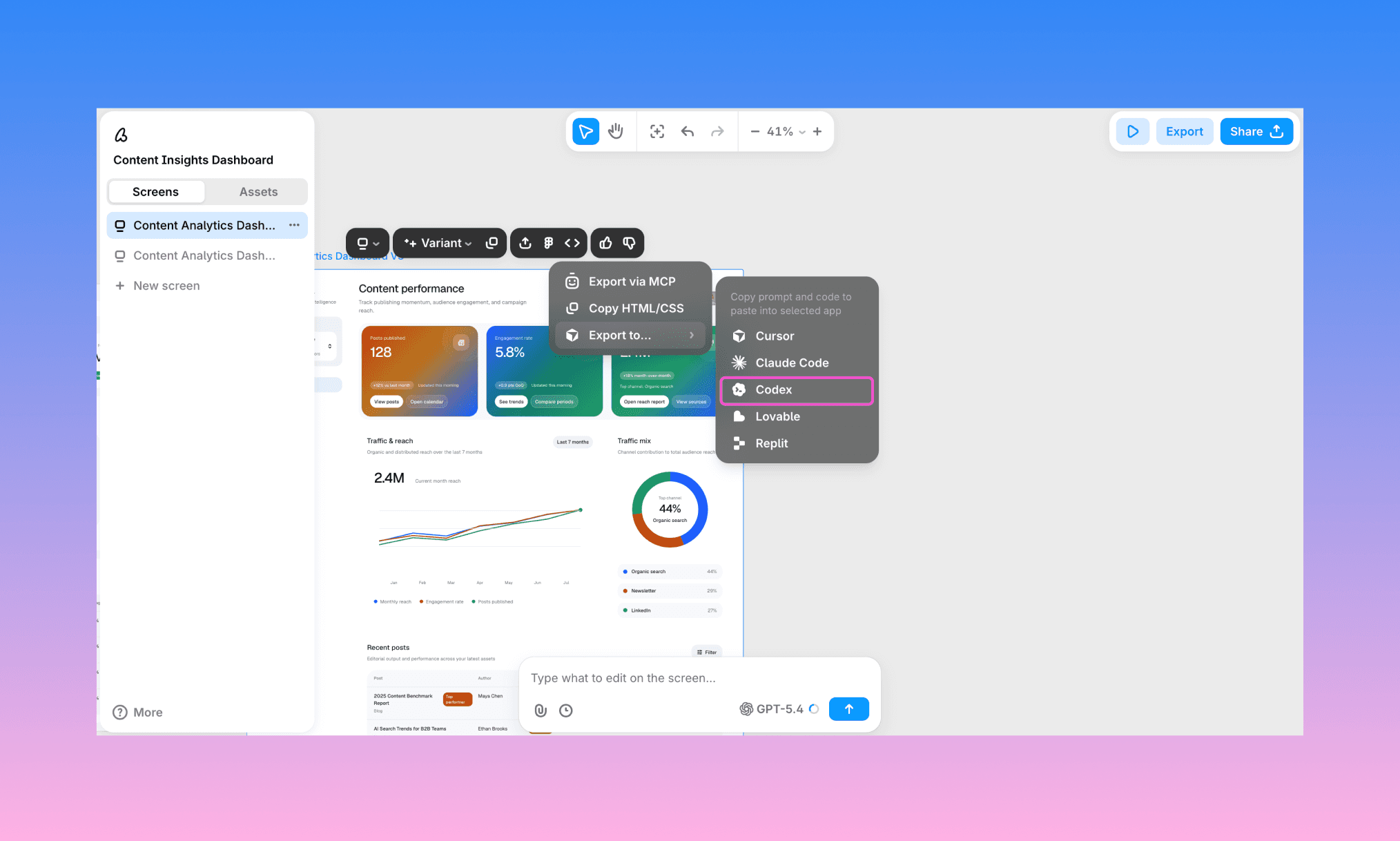
Once happy with the UI generated by GPT-5.4, you can push it for frontend development right from Banani’s design canvas. You have 3 options to go from design-to-code with AI:
Export to Figma and hand off via Dev Mode, just like a normal design file
Copy clean, production-ready HTML/CSS directly with one click
Push the design straight into a coding agent (including Codex) via MCP
Turn GPT-5.4 UI to Code, free >
So, Is GPT-5.4 Good for UI?
Yes, it is. Albeit with a caveat revealed in my review of GPT-5.4 for UI generation: GPT-5.4 will execute almost anything you ask precisely, but it won't invent taste on its own. So be specific to the point that you tell what you want, and not both.
Ready to test the UI/UX generation capability of GPT 5.4? Start it for free in Banani AI. No terminal setup, API, or coding required. Just sign up, choose GPT 5.4 as the model, and go from prompt-to-UI right into the canvas.
FAQs on UI/UX with GPT-5.4
Can ChatGPT design UI/UX?
No, ChatGPT (even with GPT-5.4) cannot generate UI/UX layouts in its chat-based interface. You have to use an AI UI Tool powered by GPT for it.
Can GPT-5.4 generate images?
Yes, GPT-5.4 has native image generation and image search built in. They can be used to create UI assets too.
See how Flora AI is used to create images for UI >
Which GPT model is best for UI design?
GPT-5.4 is OpenAI's strongest model for UI/frontend work so far, trained specifically for visual hierarchy and image understanding. Earlier GPT-5 versions can still generate layouts but lean more generic without detailed prompting.
How to use GPT 5.4 for designing app UIs?
The easiest way is through a design tool with GPT-5.4 built in, like Banani: describe the app and screens you want in a prompt, and it generates editable UI.
Can I design UIs using GPT 5.4 for free?
Yes. You can do so through Banani AI UI designer whose free plan includes GPT-5.4 as a model option. You get free ~170 screens/edits per month before you'd need a paid plan.
References
[1] developers.openai.com/blog/designing-delightful-frontends-with-gpt-5-4


